+- Kodi Community Forum (https://forum.kodi.tv)
+-- Forum: Support (https://forum.kodi.tv/forumdisplay.php?fid=33)
+--- Forum: Skins Support (https://forum.kodi.tv/forumdisplay.php?fid=67)
+---- Forum: Aeon MQ (https://forum.kodi.tv/forumdisplay.php?fid=68)
+---- Thread: [RELEASE] Aeon MQ 4 (/showthread.php?tid=135045)
Pages:
1
2
3
4
5
6
7
8
9
10
11
12
13
14
15
16
17
18
19
20
21
22
23
24
25
26
27
28
29
30
31
32
33
34
35
36
37
38
39
40
41
42
43
44
45
46
47
48
49
50
51
52
53
54
55
56
57
58
59
60
61
62
63
64
65
66
67
68
69
70
71
72
73
74
75
76
77
78
79
80
81
82
83
84
85
86
87
88
89
90
91
92
93
94
95
96
97
98
99
100
101
102
103
104
105
106
107
108
109
110
111
112
113
114
115
116
117
118
119
120
121
122
123
124
125
126
127
128
129
130
131
132
133
134
135
136
137
138
139
140
141
142
143
144
145
146
147
148
149
150
151
152
153
154
155
156
157
158
159
160
161
162
163
164
165
166
167
168
169
170
171
172
173
174
175
176
177
178
179
180
181
182
183
184
185
186
187
188
189
190
191
192
193
194
195
196
197
198
199
200
201
202
203
204
205
206
207
208
209
210
211
212
213
214
215
216
217
218
219
220
221
222
223
224
225
226
227
228
229
230
231
232
233
234
235
236
237
238
239
240
241
242
243
244
245
246
247
248
249
250
251
252
253
254
255
256
RE: [RELEASE] Aeon MQ 4 - sidewalksuper - 2012-07-10
Marcos, would it be easier for you if we start doing bugreports @ http://code.google.com/p/mod-skin/ again?
RE: [RELEASE] Aeon MQ 4 - MarcosQui - 2012-07-10
Remote Control V2, all the buttons with the same size and in columns, semi-transparent base. Please give opinions.

sidewalksuper, only after the final version.
RE: [RELEASE] Aeon MQ 4 - newoski - 2012-07-10
Personally, I still prefer the old style from MQ3.
No matter how it is laid out, a "remote" style menu requires pressing UP, DOWN, LEFT, RIGHT way too much to reach the desired buttons.
I think when it comes to this menu, simple will always be best.
Thanks for everything,
Owen
RE: [RELEASE] Aeon MQ 4 - micheel - 2012-07-10
i agree with newoski , i liked the mq3 style

Its just easy for the eye , neat , and simple for navigating.
I love how you try to switch things up , but personaly i think you should let this be like the prev version.
Thanks again for the hard work !
RE: [RELEASE] Aeon MQ 4 - st graveyard - 2012-07-10
Hey Marcos,
I too prefer the MQ3 style, it's easy on the eyes and it looks good. I understand it sometimes is cool to create new things, but for me personally regarding the remote control I would say ... If it ain't broke, don't fix it ;-)
I use MQ4 now to watch TV shows and Series and using the remote is the only "bad" thing for me compared with MQ3.
That being said, the new remote does look better, blends in more with the skin, but it will not solve the fact that it is less user friendly as the MQ3 solution.
Just my 2 cents ...
Cheers,
Grave
RE: [RELEASE] Aeon MQ 4 - GreenEyez - 2012-07-10
I also like the layout the old style OSD, but like the clean design of the new buttons on the new one (V2, posted above). My suggestion would be to create a new one using the textures from the new one but with the layout of the old MQ3 bar.
RE: [RELEASE] Aeon MQ 4 - Wanilton - 2012-07-10
Well my turn, I like new style, because have more buttons (more functions), and no have more text scroll for show function, is very good. For me navigate is easy too,
This is my "user" opinion only,
RE: [RELEASE] Aeon MQ 4 - st graveyard - 2012-07-10
(2012-07-10, 20:08)GreenEyez Wrote: I also like the layout the old style OSD, but like the clean design of the new buttons on the new one (V2, posted above). My suggestion would be to create a new one using the textures from the new one but with the layout of the old MQ3 bar.
This I find a good solution, the functionality/visibility of the old with the look of the new!
RE: [RELEASE] Aeon MQ 4 - e9657 - 2012-07-10
Hey Marcos,
I'm using the July 7,2012 nightly build of XBMC on my mac mini with the latest aeonmq4-0.0.2 with the latest home.xml patch. Every attempt to restart or shutdown XBMC from the bottom menu (down twice) causes XBMC to crash and I need to force quit the program. Not sure if its a problem with the nightly or the skin itself.
RE: [RELEASE] Aeon MQ 4 - RavenNL - 2012-07-10
(2012-07-10, 17:52)MarcosQui Wrote: Remote Control V2, all the buttons with the same size and in columns, semi-transparent base. Please give opinions.
sidewalksuper, only after the final version.
Well it looks better then the previous one.
However I don't like it, I have a remote control in my hand. I only need the OSD sometimes to change a setting in Video or Audio. With this remote I have a feeling that I need to press more buttons to get there. Personally I would rather see the old version but then more evolved that blends with the skin.
RE: [RELEASE] Aeon MQ 4 - micheel - 2012-07-10
btw does anybody have problems with changing new fanart or thumbnails ?
I know about deleting the textures.db and everything, but thats a tough cookie for everytime i wanne change something
The artwork downloads fine , and put its self in the right directory ( but it doesnt update within xbmc )
i tryed updating database , clean library etc etc
RE: [RELEASE] Aeon MQ 4 - CutSickAss - 2012-07-10
(2012-07-10, 19:28)newoski Wrote: Personally, I still prefer the old style from MQ3.
No matter how it is laid out, a "remote" style menu requires pressing UP, DOWN, LEFT, RIGHT way too much to reach the desired buttons.
I think when it comes to this menu, simple will always be best.
Thanks for everything,
Owen
I was about to write a comment of my own regarding the remote interface, but the above sum up exactly what I wished to say. Also, from the looks of it, it seems one cannot know exactly where a button is located before moving on top of it, or if he/she remembers it by memory.
It would be nice if the simple MQ3 controls where at least available as an option.
RE: [RELEASE] Aeon MQ 4 - Lockos - 2012-07-10
Personnaly, I'm also in favour of the old MQ2/3 OSD style ! Nevertheless your work is great Marcos

I tried to use Alpha 2 with official Eden release and i have a couple of questions :
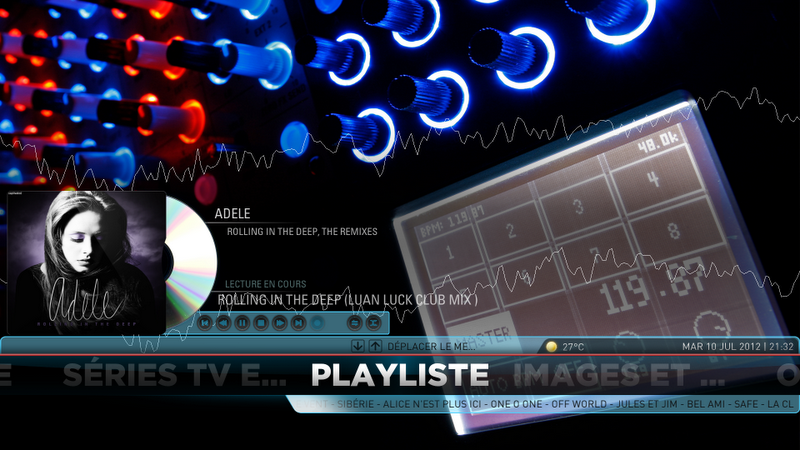
In MQ2, when you were playing a song (or a playlist), you had an integrated playlist menu of "currently playing" songs in MQ2, and this feature was integrated (that means you didn't have to create any new menu)

The "playliste" item that you see on the picture was appearing since i played any song/playlist, I didn't had to create anything !!!
Why don't we have this cool feature anymore ? Can someone tell me how to create an add-on which could bring back this feature to life, it was so cool ?
Another thing / bug that I noticed was some missing flags in MQ4 (codec flags and ratio aspect), see the difference between MQ2 and MQ4 :
MQ2

MQ4

Am I missing something ?
Thanks for your help/explanations !

RE: [RELEASE] Aeon MQ 4 - chippie - 2012-07-10
@Marcos,
Sorry, but I am with the majority here, I much prefer the old style remote. It fits in with the whole skin layout and is much easier to use, left, right, enter... rather than left, up, right....
Please take this as constructive criticism, we all love your work and the skin is great but the new style remote (despite all your hard work) just does not fit in with the whole concept. Please could you consider bringing back the old horizontal OSD remote.
If we have to be different here how about the old style but in a narrow horizontal bar with the same textures as the V2 remote that goes across the center of the screen. I would probably prefer it top or bottom but just throwing things out as I feel you want it to be different to the MQ3 one.
Thanks.
RE: [RELEASE] Aeon MQ 4 - chippie - 2012-07-10
Bug:
If a TV Show, Series or episode does not have any actors you cannot bring up the Top Menu Bar under the Info Screen.
For exmple, Highlight a TV Show that does not have any actors (TVDB issue not user or skin), hit the "i" to get the info page up. You cannot move cursor up to get to the "Get Director Info" or "Get Writer Info" or similarly cursor up again to get to the top dropdown menu with "Smart Shortcusts", "Media Info", "Playback", "Art".
Thanks.