
+- Kodi Community Forum (https://forum.kodi.tv)
+-- Forum: Support (https://forum.kodi.tv/forumdisplay.php?fid=33)
+--- Forum: Skins Support (https://forum.kodi.tv/forumdisplay.php?fid=67)
+---- Forum: Skin Archive (https://forum.kodi.tv/forumdisplay.php?fid=179)
+----- Forum: Serenity (https://forum.kodi.tv/forumdisplay.php?fid=104)
+----- Thread: Serenity (/showthread.php?tid=44469)
- Livin - 2009-03-02
I'd say do the larger poster + the smaller info window together.
- rwparris2 - 2009-03-02
Livin Wrote:I'd say do the larger poster + the smaller info window together.How about zero posters? F*** 'em, fanart is better.
- paul - 2009-03-02
I agree i would prefer to just see fanart myself it's cleaner that way

- digitalhigh - 2009-03-02
I've definitely not forgotten the fact that a lot of you prefer to have minimal screen real-estate taken up whenever possible. My intentions with the views presented were to have one view that does take up some room, but displays a lot of cool stuff. Studio Logos, TV-MPAA rating, and cover/CD images as provided by MIP.
So, what I think will be the end option is to have like I do in the movies section, where you can pick between having a tiny little box that just shows a synopsis; a tiny box w. synopsis and poster; or the large view with all the trimmings. This is pretty well implemented in movies already. What I wound up doing was just taking the large view for movies and duplicating that view.
So for those of you who want description + fanart only...you can have it. For myself and anybody else who prefers a bit more eye candy...we can have that too.
Oh, and if if you haven't caught it already, this skin is also wide-icon friendly as well.

- paul - 2009-03-02
digitalhigh Wrote:I've definitely not forgotten the fact that a lot of you prefer to have minimal screen real-estate taken up whenever possible. My intentions with the views presented were to have one view that does take up some room, but displays a lot of cool stuff. Studio Logos, TV-MPAA rating, and cover/CD images as provided by MIP.sounds good to me i do like all that eye candy stuff but i soon get bored with it. thats why i would prefer just a plot/info box and the fanart behind that but if your going to let us have a choice then thats perfik keep up the good work mate
So, what I think will be the end option is to have like I do in the movies section, where you can pick between having a tiny little box that just shows a synopsis; a tiny box w. synopsis and poster; or the large view with all the trimmings. This is pretty well implemented in movies already. What I wound up doing was just taking the large view for movies and duplicating that view.
So for those of you who want description + fanart only...you can have it. For myself and anybody else who prefers a bit more eye candy...we can have that too.
Oh, and if if you haven't caught it already, this skin is also wide-icon friendly as well.
- TerranQ - 2009-03-03
Not to be a pain, but is there an ETA for Serenity? This and Stark are going to be my skins of choice, and the screenshots are making me salivate

- digitalhigh - 2009-03-03
TerranQ Wrote:Not to be a pain, but is there an ETA for Serenity? This and Stark are going to be my skins of choice, and the screenshots are making me salivate
You know, I'm really not that far off from having a basic version that does all the necessary stuff, plus some of the extra features I've mentioned. I'd say that a safe wager would be somewhere in the neighbourhood of 2-4 weeks?
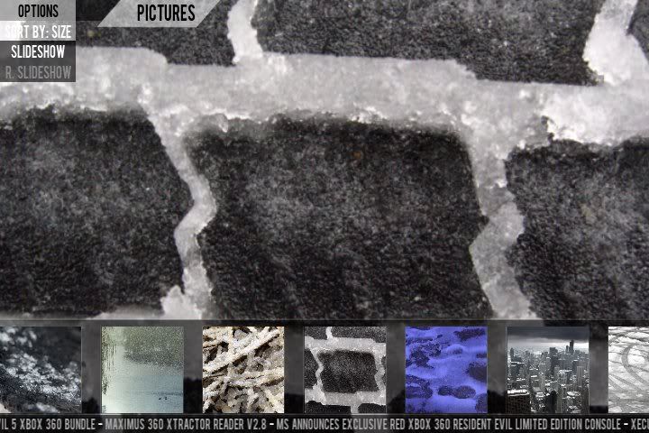
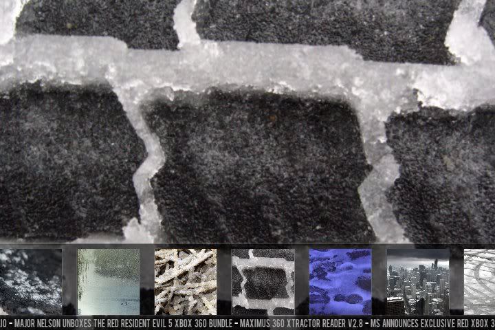
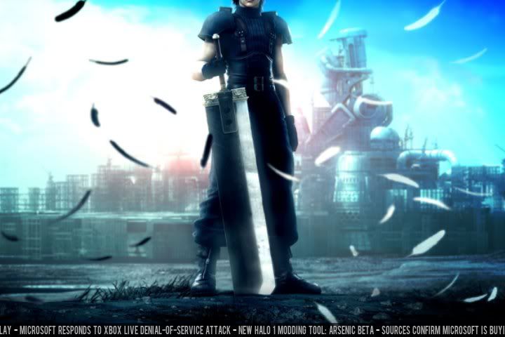
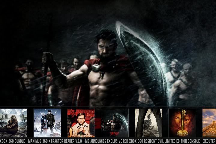
In the meanwhile, here's a few pics of the photos section, for those of you who use XBMC for viewing pics. The movie ones are actually cool enough that I may consider using something like that as an extra view for the movies section...eventually. I know I like it a lot.

The cool thing is that when you press down, the thumbnails go ofscreen, and the image just displays directly in the background...but you can still scroll between pictures. Press up, and you see the thumbnails. Press up again, and the options menu is displayed.
- paul - 2009-03-03
2 to 4 weeks blimey thats dam quick..
I can't wait to test it out on my xbox and pc
- digitalhigh - 2009-03-03
paul Wrote:2 to 4 weeks blimey thats dam quick..
I can't wait to test it out on my xbox and pc
Thanks. One of the benefits of being a construction worker during the summer is that you're afforded a lot of time in the winter to work on whatever your little heart desires. Seeing as how I'm most likely going to re-enroll in school next year to get a degree doing what I like, this is prolly the last winter where I'll have the time to do stuff like this.
So...I'm hitting it as hard as I can. Most days I spend at least 5-6 hours working. I'm up at 7AM, clacking away...
- paul - 2009-03-03
If your not carefull you will end up with square eyes. hope you take regular breaks from the monitor as they do screw with your eyes / posture / and ya head

- digitalhigh - 2009-03-03
paul Wrote:If your not carefull you will end up with square eyes. hope you take regular breaks from the monitor as they do screw with your eyes / posture / and ya head
Don't worry about me. My workstation has three monitors for me to stare at, plus a bigscreen to test on, so my eyes get quite the variety of things to look at. Plus, I've still gotta get up and take bathroom breaks, so I get my exercise in as well.

Edit:
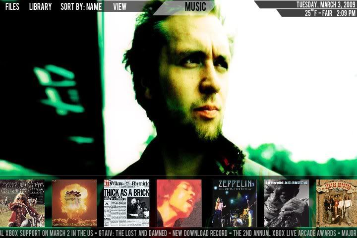
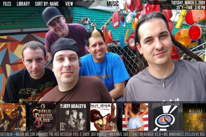
Here are a few screenshots of the secondary tile view in Music FILES. Same thing is in video files.
- quake101 - 2009-03-03
I really like this view, but I have one question. Looking at the screenshots I can't really tell what title is currently selected. As in, bigger image or border around the currently selected item. Is it just my eyes? Maybe this is the way you planned it, I'm just asking...

Anyways, keep up the awesome work man!
- digitalhigh - 2009-03-03
quake101 Wrote:I really like this view, but I have one question. Looking at the screenshots I can't really tell what title is currently selected. As in, bigger image or border around the currently selected item. Is it just my eyes? Maybe this is the way you planned it, I'm just asking...
Anyways, keep up the awesome work man!
No, you're right. I just haven't made a separate overlay image for the selected item. It works good in pictures view because the image is displayed in the background, but I already noted that this isn't the case in other screens.
- quake101 - 2009-03-03
I had a feeling you where already aware of this. You "da man".

- keeganl - 2009-03-04
Glad to see we are getting a lot of attention on this skin. DigitalHigh is in fact a beast of a coder. I am having a nearly impossible time creating screens for the new sections fast enough. As soon as i have one together, DigitalHigh has coded it, and has a working example of my artwork.
This is my public thank you to DigitalHigh for your incredible dedication to this project that spawned from 2 concept screenshots.
I hope everyone is excited about Serenity. It's shaping up very quickly and as Ben said, we are looking at an early alpha test version to be put out in the near future for you all to tell us what you think about the functionality so far. So stay with us. We'll have a test version coming to you sooner than later.