+- Kodi Community Forum (https://forum.kodi.tv)
+-- Forum: Support (https://forum.kodi.tv/forumdisplay.php?fid=33)
+--- Forum: Skins Support (https://forum.kodi.tv/forumdisplay.php?fid=67)
+---- Forum: Skin Archive (https://forum.kodi.tv/forumdisplay.php?fid=179)
+----- Forum: Serenity (https://forum.kodi.tv/forumdisplay.php?fid=104)
+----- Thread: Serenity (/showthread.php?tid=44469)
- xbs08 - 2009-03-11
Any release date ?
- digitalhigh - 2009-03-11
xbs08 Wrote:Any release date ?
Not too far off. My birthday is the 7th of April...hoping to be done before then.

Edit:
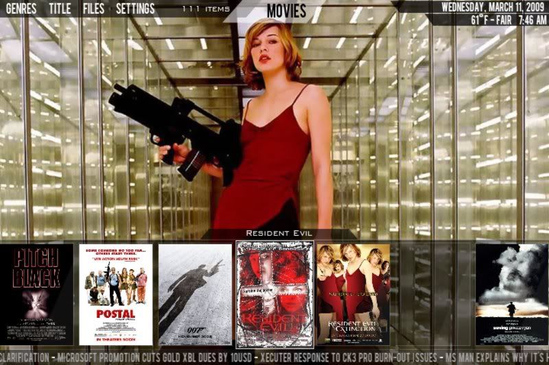
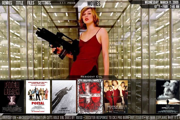
Standard Poster View is coded:

- kizer - 2009-03-11
I personally think that looks much better than the original square one. I know you had your reasons before, but this just looks complete.

- xbs08 - 2009-03-11
Two sugestion to that great looking view. Reduce the non focused posters and give the possibility to hide the posters, moving them down, letting visible only the focus movie name, for full fanart showoff.
- paul - 2009-03-11
xbs08 Wrote:Two sugestion to that great looking view. Reduce the non focused posters and give the possibility to hide the posters, moving them down, letting visible only the focus movie name, for full fanart showoff.Sounds like a good idea to have the none focused posters slide out of view assuming it is possible to code if not reduce the size of them by say 25% or 50%? either way the posters look better than the strange square cropped ones.
Digital what poster size do you use as i am resizing all mine down to 800high x 533 wide
as i think 1500x1000 is a little overkill don't ya think.
- digitalhigh - 2009-03-11
Quote:Two sugestion to that great looking view. Reduce the non focused posters and give the possibility to hide the posters, moving them down, letting visible only the focus movie name, for full fanart showoff.
Are you thinking of having the nonfocused items slide out after delay x, or on a buttonpress?
Because, like the tile view, this group is already programmed to slide offscreen on a downpress. Only problem is that when that happens, the infoboxes are set to come on screen, but you can still scroll between movies.
So it would require a bit of a modification to make it work on a buttonpress.
And on that note, a control bar for scrolling was requested. I'm thinking of trying to hang it either at the top or bottom of the poster window. Prolly the bottom, so that when the posters go ofscreen, it's still visible and usable.
paul Wrote:Sounds like a good idea to have the none focused posters slide out of view assuming it is possible to code if not reduce the size of them by say 25% or 50%? either way the posters look better than the strange square cropped ones.
Digital what poster size do you use as i am resizing all mine down to 800high x 533 wide
as i think 1500x1000 is a little overkill don't ya think.
Yeah, the tallest you'd ever need a poster for this skin would be 720px, 1080x if you're running at 1080. And the only time a poster is shown fullscreen is in the movie info view accessed from the context menu...otherwise half the screen is more than adequate.
For HTPC, I haven't seen any severe delays using fullsize posters, but for xbox, I'd wager that 800x would be more than sufficient.
Edit:
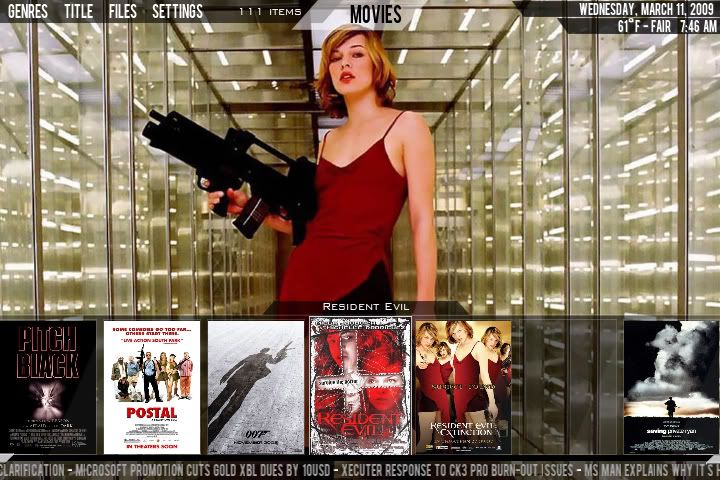
Two possible concepts with the slidebar/scrollbuttons enabled. The posters would then slide ofscreen, leaving the buttons (or bar?) visible for all yall IR-remote people.


Opinions?
- joebrady - 2009-03-11
So you push down once and the scroll bar would be selected, then again and the group of covers disappears, showing the movie info, but the focus still stays on the scroll bar? Am I correct? If so, My Likey.
- digitalhigh - 2009-03-11
joebrady Wrote:So you push down once and the scroll bar would be selected, then again and the group of covers disappears, showing the movie info, but the focus still stays on the scroll bar? Am I correct? If so, My Likey.
In appearances, yes, that's the idea. In practice, it'd be a little more complex, as the infoboxes visibility is determined by whether or not the scrollbar has focus or not. So, I would have to set a flag for a downpress on that scrollbar to tell it to now hide the panel and show the info.
Sorry, just thinking aloud there.
Yes, that is the idea. It's a headscratcher, but I think I've got it pegged.
- kizer - 2009-03-11
Uh I looked at both images above and I honestly can't tell the difference. I'm 38 so maybe I'm too old.

Please don't take away my IR remote. I loves it.

- digitalhigh - 2009-03-11
kizer Wrote:Uh I looked at both images above and I honestly can't tell the difference. I'm 38 so maybe I'm too old.
Please don't take away my IR remote. I loves it.
Only difference between the two is that the first? one has a scrollbar, while the second one is just two buttons for previous/next.
Either way, this addition is for those people with IR remotes, as I just use the triggers on my XB1 controller for scrolling. Yeah...I'm a creature of habit.

- xbs08 - 2009-03-11
I was thinkin that the focused poster would stand out a bit, on selection, making it larger than the unfocused ones.
Now a crazy idea
 imagine a wall view but... where you only see a row of poster, pressing down would go next page, up previous page and left/right scroll thru posters. This wouldn't require a scroll bar at all. Last, a botton press would hide the posters row, showing the fanart.
- Waffa - 2009-03-11
Perfect, like the scrollbar in movie and covers do look better like this.
Did you also add a scrollbar to the music section ? There is it more needed and also what I mend when requested for scrollbar
- kizer - 2009-03-11
I don't recall which skin had the wall view, but honestly it was kinda blah in my opinion. Of course it doesn't mean others like yourself didn't like it.
I guess what I'm thinking is digitalhigh and company needs to finish a view or two and move on to the rest of the skin so they can get it out. Of course release the heck out of new views and other addons later, but get the skin to a warm and fuzzy state before tons of requests are filled and never released.
 Lord only knows I have a few ideas and others do too.
- theophile - 2009-03-11
One poster view suggestion:
Rather than a row of posters (in the screenshot, seven of them) along the bottom, maybe just show three. The currently selected one would be in the middle and the ones on either side would be smaller. That way you see what's selected and what you can select by going back one of forward one. If you go forward one, the left-most poster slides off the bottom, the large middle poster shrinks and slides to the left, the right-most poster grows and slides to the left, and a new one rises from the bottom to take the place on the far right.
It would be like a circle rather than a slide. The whole thing could be moved to the bottom right corner, leaving more fanart visibility.
- xbs08 - 2009-03-11
I' not suggesting a wall view, i do not like it either, i'm suggesting a "wall view navigation system".
Instead of having a bar to jump pages you can go to previous pages when you press up, next pages when you press down and left/right are used to scroll.
You wouldn't see a wall view, you'll see a row of posters like the screens posted above.
The row of posters would act like the "showcase view" in mediastream but... up and down jump pages and a button press would hide them.