2009-09-14, 19:58
jtap06 Wrote:I am really loving that landscape TV show view djh just posted!
+1

jtap06 Wrote:I am really loving that landscape TV show view djh just posted!

CF2009 Wrote:
jaytyler Wrote:I'm liking the idea of these. However, I'm thinking that with the minimalist style of Alaska perhaps we don't need to have all that information or all of those buttons displayed all of the time? I think it would be best to use the same osd for music/movies/tv shows as far as possible to ensure consistency. How often to we actually use all of the buttons that come up? I'd bet not often. Perhaps we could have just a couple but if you then scroll along the less used buttons animate in?
jaytyler Wrote:I'm liking the idea of these. However, I'm thinking that with the minimalist style of Alaska perhaps we don't need to have all that information or all of those buttons displayed all of the time? I think it would be best to use the same osd for music/movies/tv shows as far as possible to ensure consistency. How often to we actually use all of the buttons that come up? I'd bet not often. Perhaps we could have just a couple but if you then scroll along the less used buttons animate in?

jaytyler Wrote:Oh, and could we add the current time and end time for tv & movies?I'm just playing with Music right now but i think current time and end time will be on the Video OSD...
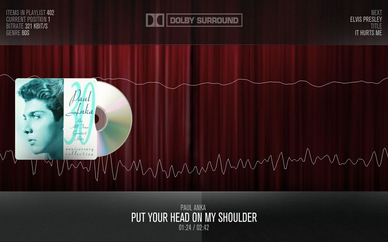
CF2009 Wrote:On the MusicVisualisation screen having the MP3 info on the side is a bit more then anyone would need so i will make that optional...
Out of the buttons on MusicOSD i do not use is the visualisation settings one all of the others i use onec in a while and it nice to have them there, but if more people would like to it more minimalist then the othere buttons can be optional
I'm just playing with Music right now but i think current time and end time will be on the Video OSD...

CF2009 Wrote:Nice work there mate.
Hitcher Wrote:A life.


joebrady Wrote:The preview you gave looks fine to me, but, it also looks pretty much like every other skin IMO. I'd like to see something Big, Bold and Simple.I would second a 'big, bold and simple' approach. I think keeping Alaska as clutter free as possible is a good goal to have. Do we really need to know the codec, bitrate, sample rate and how many channels are playing? Personally I'd like to see the album cover 600x600 and have no actual visualisation in the background just the normal off white gradient background of the rest of the skin but I know others like to see the visuals.
Quote:Looking for some feedback On the MusicOSD and MusicVisualisation screens
jaytyler Wrote:I'm liking the idea of these. However, I'm thinking that with the minimalist style of Alaska perhaps we don't need to have all that information or all of those buttons displayed all of the time? I think it would be best to use the same osd for music/movies/tv shows as far as possible to ensure consistency. How often to we actually use all of the buttons that come up? I'd bet not often. Perhaps we could have just a couple but if you then scroll along the less used buttons animate in?
weavus Wrote:i would second a 'big, bold and simple' approach. I think keeping alaska as clutter free as possible is a good goal to have. Do we really need to know the codec, bitrate, sample rate and how many channels are playing? Personally i'd like to see the album cover 600x600 and have no actual visualisation in the background just the normal off white gradient background of the rest of the skin but i know others like to see the visuals.
Also, i think the osd should at least include the album cover if possible to keep it consistent with having it globally displayed everywhere else in the skin.
Nice work so far though.
Weavus Wrote:I would second a 'big, bold and simple' approach. I think keeping Alaska as clutter free as possible is a good goal to have. Do we really need to know the codec, bitrate, sample rate and how many channels are playing? Personally I'd like to see the album cover 600x600 and have no actual visualisation in the background just the normal off white gradient background of the rest of the skin but I know others like to see the visuals.
Also, I think the OSD should at least include the Album cover if possible to keep it consistent with having it globally displayed everywhere else in the skin.
Nice work so far though.