Kodi Community Forum

Full Version: HORIZONZ: Discussion and Support Thread
You're currently viewing a stripped down version of our content. View the full version with proper formatting.
The fanart-delay makes browsing much more responsive in file-mode. I asked for this feature a long way back, but I got the comment that it wouldn't make a difference....

Well, anyhow it IS working ;-)
And it's much softer to the eye as well... These big full screen changes are enough to induce an epileptic seizure..

But now I'd like to decrease the delay. I think a delay of about 0.4 seconds is enough to have the benefit while browsing....

Have a nice holiday ;-)
frater Wrote:The fanart-delay makes browsing much more responsive in file-mode. I asked for this feature a long way back, but I got the comment that it wouldn't make a difference....

Well, anyhow it IS working ;-)
And it's much softer to the eye as well... These big full screen changes are enough to induce an epileptic seizure..

But now I'd like to decrease the delay. I think a delay of about 0.4 seconds is enough to have the benefit while browsing....

Have a nice holiday ;-)

I would like to know how to decrease this delay as well.
Also, I would like to make the font for the movie info a little bigger, which file and font do I edit?
UND3R ACHI3V3R Wrote:I meant an option to have the rss show (or not) when it's in lower position Tongue

It's already added in, so it'll be there for Vol. IV
KevinSartori Wrote:Hey! As I've said before, you've done some incredible work on this, XB2IRIS!

I just have a few quick comments. I've just started using XBMC on AppleTV. There are a few issues that are related to the fact that the AppleTV remote only has six buttons: Up, Down, Left, Right, Play/Pause/Select (all one button) and Menu. XBMC Beta 2 adds two other button functions: Play/Pause/Select (held for 2 seconds) is Title (Context Menu) and Menu (held for 2 seconds) is Back.

I think you are aware of the lack of a separate stop button and added Stop to the Menu during video playback. Thanks for this! AppleTV users are currently missing the pop-up shutdown (Quick Commands) menu, Info, Display and the music control OSD that pops up when you hit the Start Button on the controller. Without that music control OSD, once you start playing music, you can't easily stop it. I had some ideas that would make life easier for AppleTV users that I don't think would disturb regular users much.

I was thinking that you could implement some of this missing functionality to key presses that don't seem to be used otherwise on the Home screen. Right now, activating the context menu on the Home screen doesn't do anything, perhaps this could bring up the shutdown (Quick Commands) menu instead? Similarly, hitting Back on the Home screen also doesn't do anything, so maybe this could bring up the music control OSD? Also, on the Home screen, hitting the Info button brings up a really cool System Info screen. Any chance you could add a button link to that in the Core menu?

It took some doing, but when I was using XBMC on Xbox, I edited the keymap.xml to add the ability to Page Up and Page Down with my Monster MCC AV 100 universal remote using discrete codes. Right now, without the ability to Page Up or Down, navigating through 800+ albums in Music is crazy and time consuming. I know you don't like the side navigation bar, so is there any way you could add Page Up and Page Down to the top navigation bar in Music? I don't think that most users have a way to Page Up or Down by default, so while it would clutter up that bar a little, it would be pretty useful for most users.

One other general suggestion/bug fix I've been meaning to mention is on the Info screen for movies. The Trailer button is available for selection whether a trailer is actually available from IMDb or not. It would be more intuitive if the button was blank or gone entirely if there is no trailer available.

Thanks again for all of the work you've put into this Aeon mod! We all really appreciate it and I understand that you'll be taking a break for a while. While XBMC on AppleTV isn't exactly the big upgrade I hoped it would be, I think there is good potential there and as time goes by, I expect they'll be more and more users of this platform. It would be great if Horizonz could better accommodate these users as well.

Enjoy your break, you deserve it!

hey man, keymap.xml is the only way to specify button usage... for instance... the context menu is coded in a way that means all u can do is specify how it looks and not where it appears... u can tell it not to appear somewhere, but you can't get it to appear somewhere it doesn't, because it's xbmc defined... sorry, same with the back button... u can't really define button functions in skin xml code, unless its meant to be done that way... so unfortunately, u'll have to wait for better support for appleTV...

about the page up/page down idea... thats an idea i'll think about... i'll probably just create a page control for all views... something uniform... i'm not really a fan of page controls or scrollbars... but we'll see what happens... no way i'm gonna have page controls/scrollbars in showcase or info views though... it'd spoil it completely i reckon... but as i said, i'll look into it when i'm back from my holi...

jarod71 Wrote:Well , I am no expert, but a earlier version had the current dvd case which I love, and the pictures had a modified version of that dvd case that would also look great for music cd's. you could use the same dvd case and cd case for games. pictures, i love how you have it now but maybe more translucent? like the dvd case is now? not sure. tv show banners had a long modified version of the dvd case as well, not sure if that is still in this release, so screenshots for thumbnails of tv shows, hmm, maybe a translucent frame? or ditch the dvd/cd case isea altogether and make the frame with the little arrow like on the homepage now playing icon. hope you understand what I am trying ot say. I cannot wait to tweak this out with fanart etc, cuz this is going ot be my main skin going forward....

i reckon the universal frame/case would be the way forward... a really sexy, really cool frame across the skin, would make everything so much more universal... although, certain covers look great don't they... i'll have to try a few ideas, but maybe i'll stick with what i got and change one or two frames a bit, like the episode one... we'll see... the way forward is through inovation and ideas...

Doraemonn Wrote:Thanks for the quick reply! By item count I mean unwatched item count. A very useful feature of Mediastream (which so far is the only one I miss out of Aeon) is being able to go down the list of TV shows and immediately see the count of unwatched episodes in the right-hand column. It's a bit like this:

American Dad | e 20 | u 1

Where e is the total number of eps (which you currently display) and u is the number of unwatched eps. So I can scroll down the list and immediately look for anything that doesn't have a "0" on the rightmost column of the list, and that means a new episode. Visually e and u are represented by subtle icons which are also used as overlays on episode thumbnails, but that's besides the point.

The only other small issue I have is that when cycling from one movie/show to another in Info views the fanart for the item I'm moving to flashes for an instant before disappearing and then fading in properly. It's a little jarring, but no big deal.

Otherwise I think your skin is superb, and I look forward to using it more in the future. Smile

i get what your saying about the unwatched total... maybe i'll just put it in brackets or something... don't really have space on most of the views info sections... but we'll see how i can accomodate it... and the flashing fanart image is the same across every skin which has a delay for fanart to show... that's a bug with fade out animation, because if you move away from an item, when it fades away it is pointing at another item before it fades away completely, hence the split second of that items fanart... nothing can be done about that... sorry dude... wish i had a solution, but no one had any idea when i mentioned it to djh back in the day...

midgetspy Wrote:I didn't have a chance to go through much last night but I did notice that pressing Info (i) during video playback still doesn't show the progress bar, it shows the movie info in the middle of the screen instead. Other than that it looked great. I love the new "Now Playing", I'd love something like that for the fullscreen music vis too instead of the huge info in the middle, hehe.

I did come across a question too: if I enable "Full screen media backdrop" (or whatever that option is called) then if I go to the home screen while I'm playing music or a movie it shows the vis/movie instead of my fanart. If I go to any screen except the home screen, though, my fanart shows again instead of the media that's playing. Is this intentionally how it works or should the music vis/movie keep playing in the background?

And lastly I'd love support for PgUp/PgDn too for quicker scrolling.... or some kind of scroll bar.

ok, during playback of videos, info buttons logically should show info about the file being played... while when ur navigating or want to know info about location, you do something location orientated... makes sense to me... i kinda like the idea... messed around with a few other ideas... but this is what i got stuck on... hope u can learn to live with it... coz i'm sick of messing with the osd's now... hehehe...

scrollbar and pgup/pgdn could be done though... i'll look into that... and the home page media backdrop is only for the home screen... that's the section that function is in in the aeon options... hahaha... makes sense... don't think it would at all look good in the showcase view... wow... thats an idea...!

joebrady Wrote:Here's the link that covers trainers in the wiki and gives some screen shots of PMIII usage.

ok cool, will look into it when i'm back ok... hopefully i can sort it out...
UND3R ACHI3V3R Wrote:I meant an option to have the rss show (or not) when it's in lower position Tongue

yeah, but if u disable the rss panel, it won't show anywhere... and if u want it to show, u re-enable it, and it'll show in which ever position the scroller is in... hope that makes sense now... don't need an option to disable rss panel, because it's in there already...

lexbox Wrote:Not long ago I updated to Beta 1 and discovered the new potential with Fan Art and everything. I started with PM3.HD. Then MediaStream. Then Aeon. And Im sure you already know where I stopped.

xb2iris.... you are the shit good sir. Thank you very much for your time. I would love to reimburse you for your time with a kind donation if you ever need it.

Im running perfect on an Xbox in full glory, no Xbox-mode crap. I have no issues at all. Cant wait to load the new update.

thanks for that comment... finally a (make me feel cool) comment amongst all the requests and suggestions... yippee... nyways, yeah sure, bring on that donation... horizonz does take too much time for me to make any money... so, donations are always welcome Smile

ash77 Wrote:Thank you XB2IRIS! This is a great skin.

Currently I'm testing XBMC on my linux laptop. Hoping to replace my mediacenter running MediaPortal. So far so good.

One thing I noticed is that the backgrounds are not scaled down to the resolution XBMC is using. I'm running XBMC in 480p mode and only see about 1/4 of the background image. The image fills up the screen but only the top-left of the orginal is visible.

Not sure if this is a XBMC setting or perhaps a bug.

Keep up the good work!

yeah, horizonz it made at 720p... thats why ur getting backdrops looking like that... all backdrops are coded to fit on a 1280x720 display... should stretch to ur resolution, so, all i can imagine it that it doesn't work so well on 480p... Is anyone else having this problemHuh? because i've tried this skin on 720p, 16x9, and 1080i and they all look great... no idea, but not convinced it's a bug... wait i just tried it on a pc at 480p and it works fine... looks fine... so, no idea whats going on... maybe its a linux issue... try reseting the settings in aeon... does mediastream do this as well?

Zelgadis Wrote:i like the showcase icons for movies/tvshow, but how do you change the games showcase icons to dvds covers?

it takes time... but your welcome to do it... i don't think it would compliment the skin enough... we'll see when the frames get changed at a later stage...

tuckbodi Wrote:Very nice job XB2IRIS. I'm running your mod on Atlantis Beta 2 on an AppleTV.

First off a question/comment. I love your Iris background graphic but in my media room, where I keep the lights down, it just seems a little too bright and takes attention away from the media content itself. So what I did was take a screenshot of your image and toned it down a little bit (hope you don't mind - added some hue & saturation - attachment). I then tried to add it manually as my backdrop (Aeon/Backgrounds) but it doesn't seem to appear everywhere I set it at. Example...Movies, it's there on the Home screen and when I go into Movies/List View & Poster View it's there as well. But when I go to Info or Showcase View it switches back to your original graphic. Is this supposed to happen? Those two areas are the main view I want to use for Movies. For TV Shows and Pictures it shows your graphic in Showcase View while Music and Games it shows my graphic in Showcase View (all other views for all four show my graphic).

In Movies/Info view the black info box, to the right of the DVD box, flickers on and off sporadically (do not see this in other views).

Date and Time location...I don't care either way but if you were taking a vote, I'd say it should be in the top left. The eye travels left to right, top to bottom and it just seems odd with that space empty, especially in the Home screen.

Lower Home Scroller position....I love it! But as I said above, the Date & Time would look better up on top (graphic flipped upside down of course).

Other than some of the animations being a little jerky (same in other skins -- AppleTV issue?) I find this skin just simply amazing. And being a new XBMC user as of just a few weeks ago I'm blown away how this has breathed new life into my AppleTV! Thanks!

Image

your version looks great... really smooth... may use it as default... not sure... i hope u know its relevance... hehehe... nyways... about the fact that it shows (my version) in showcase and info views... because its hard coded into the "disable fanart cycling" option in aeon's feature settings... if u click un-select this option... mine won't show anymore...

for the flickering issue... turn on flicker filter in the screen options, set it to 1 or 2... this should remove that problem... and we're moving to the future of this skin, so new things will pop in as a surprise... some like the new time panel position, others don't, but unfortunately for you, more people like it, so i can't go and change it... plus, it took a while to do, so, backtracking isn't an option... nyways, glad u like the skin... and sorry i can't be overly helpful with requests...
pletopia Wrote:i noticed that in V3 .. while pausing a movie .. now the progress bar appears at the bottom just like i asked for, thx Smile. However, i sort of miss the info panel that popped up before (in V2). Did you try to maybe have both panel's appear, or does that clutter up the screen a bit too much.?

Also, how do you get that info panel to pop up during playback? When i hit 'I", i get the spec's info at the top (ie, bitrate, fps, frame drop count, etc)

i thought, after u mentioned it, that i've got to think of a logical way of doing things osd wise... so, info shows media info (it's not i that shows info in full screen media on the pc... that shows debug info... there's another button assighned to info for fullscreen info)... any form of navigation including pausing which is a navigation function shows the navigation window with movie navigation info... makes sense doesn't it... and thats why its the way it is... don't fancy having the media info showing when navigation info shows... doesn't make sense to me anymore... although it was an idea at one point... clutters the view too much as you said...

midgetspy Wrote:pletopia, i works for me...

My suggestion for those panels:

fast forward/rewind/skip : only bottom panel
pause : both panels
info/i: only bottom panel

I can't see why you'd want info/i to cause the huge info to show during playback... you can't even see the movie, hehe. The bottom panel makes more sense IMO, to check how much is left in the movie without pausing, and to see all info just pause and read it.

The actor/cast info works perfectly, great job xb2iris and thanks very much! I noticed tonight that the time was getting cut off on the home screen (Thursday Oct 16 10:00 PM, but no PM was showing just ...) so maybe that could be a little wider. Also it seems that words with accents don't show correctly in the font. It looks like there are no international CAPS characters in the font so it shows a lowercase instead, like LéON (lowercase é). MediaStream recently had this problem too, I think the font just needs additional characters?

Also a suggestion, can you add the library counts to each view (total # of items) like MediaStream has? Just a small number in the bottom right corner so we know how many items we're scrolling through.

Thanks xb2iris and great job again, this skin rocks!

again as i mentioned to pletopia... info shows media info and any navigation buttons whows navigation details... makes logical sense... and thats the way i want to keep it for now... i'm finally happy with the way it is... sorry u guys want it to be different, because i like it the way it is, and i guess i have the final say, hahaha...

about the time panel getting cut off... dam... i keep forgetting to change that... will do... its on my todo list... and i'm going to change the home screen font, so hopefully the international accents issue will be cleared up when i do that... and that count exists in most views, just none of the fullscreen views... so, will add it to those views then... maybe just a replica of the letter offset, but somewhere else...

eQUIV Wrote:I agree, I'd like to see the info OSD to simply show the title of the video, the movie poster/episode thumb, progress bar, THE CURRENT TIME (clock), and then maybe the controls (bookmarks, pause, stop.. etc).

And perhaps have it just along the bottom of the screen, the floating box in the middle of the screen looks a little silly IMO, because it does block the video. Usually when i hit the info button it's just to see how far along in the video I am and/or to check the current time, or to set a bookmark.

Anyways, again.. I love the skin. Keep up the good work.

changed that osd too many times... not a priority anymore coz i'm finally happy with the way it is... makes sense to me... so, maybe the only thing that'll change there is the graphics for now... if i even choose to look at it again... it works... so, lets be happy with it until it gets priority again... and info buttons should show media info like it does when u click it in the libraries... makes sense to me...

tyche Wrote:Beautiful skin that is now my new default. I was amazed at how responsive it is. Thank you for putting so much effort into making this. It's a true showcase for XBMC.

thanks man... appreicate it... need more comments like that one...
frater Wrote:The fanart-delay makes browsing much more responsive in file-mode. I asked for this feature a long way back, but I got the comment that it wouldn't make a difference....

Well, anyhow it IS working ;-)
And it's much softer to the eye as well... These big full screen changes are enough to induce an epileptic seizure..

But now I'd like to decrease the delay. I think a delay of about 0.4 seconds is enough to have the benefit while browsing....

Have a nice holiday ;-)

trust me... that delay is perfect... it was way shorter for awhile... something like 500ms... but it started to irritate the heck out of me, because i stop on a movie sometimes by mistake... but yeah... it's been tried... and it wasn't favorable... Wink

jarod71 Wrote:I would like to know how to decrease this delay as well.
Also, I would like to make the font for the movie info a little bigger, which file and font do I edit?

don't have the files here, but its something to do with the Fonts.xml and DialogSeekBar.xml... figure it out... I'm not touching xml until I'm back from my holiday... and dropping that delay has very bad concequences... irritating as hell, trust me... tried it and failed...

Tension113 Wrote:It's already added in, so it'll be there for Vol. IV

thanks to u of course...
No requests here......

My Xbox is now Complete despite the credit crunch, awesome job!!!

Have a good holiday and drink plentyConfused

Cheers!!!Big Grin
Quote:it takes time... but your welcome to do it... i don't think it would compliment the skin enough... we'll see when the frames get changed at a later stage...
i will wait and hope for that time, right now i couldn't understand how it works? i did try but i gets something else instead.
PJ_Hooker Wrote:No requests here......

My Xbox is now Complete despite the credit crunch, awesome job!!!

Have a good holiday and drink plentyConfused

Cheers!!!Big Grin

thanks man... like the fact that ur requests count is 0... hahaha... have a lot already... but we'll see how much time i can find when i get back...

Zelgadis Wrote:i will wait and hope for that time, right now i couldn't understand how it works? i did try but i gets something else instead.

ouch... trust me, its a mission if ur not a good coder and patient as hell...
Review time.

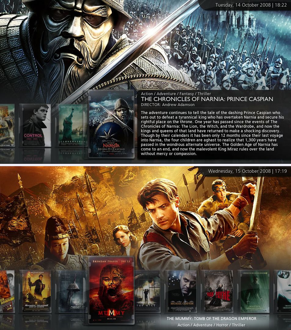
I've been using Volume III for a few days now, and dam, am I impressed. Everything I wanted for this skin, has been attended to. Your attention to detail is insane! The home screen animation and light crest effect goes so well together, I almost shit myself, every time i see it. The color squemes are punishing to the eyes in the best of ways. Dark and Light combine so well, I can't believe how well you've done. It's starting to look a lot more futuristic, which I believe ur purpose was. Using the skin, is smooth and free of glitches, even on my best friends xbox. The Info view is highly impressive and has finally got me away from the showcase view. It's brilliantly done, and the wall info panels adds a well needed twist. I love the touches you've made to make things more interesting. The two-wall info was a surprise. Good Idea! Above all, the OSD feels great and the animation suits every window in there.

Amazing release XB2IRIS! What more can we expect of you! This is amazing. This is what everyone wanted Aeon to become. Thanks so much for everything. You're a creative genius!

I think everyone in here, should start making good requests. This skin is close to perfection, and I'm really getting half of things what XB2IRIS has done with so many important things. Little ideas we should all applaud!

WHO OF YOU IN HERE BELIEVE this skin DESERVES ITS OWN SUB FORUMHuh?
xb2iris Wrote:Image

This is the best view I've ever used in any skin. I Love it! Thanks for this amazing skin! My default by default!

Anyways, I agree THIS SKIN DESERVES ITS OWN SECTION UNDER THE SKIN SECTIONS!

Who here is with us!
My friend showed me this skin a few days ago, so I had to download it!

TY! It's splendid, and to think I've been stuck with MediaStream over the last few months. It's a bit too cluttered in my opinion. Works amazing, but hasn't got that edge this mod has, you know the edge a skin needs to make even the most critical of XBMC users raise their eyebrows in amazement!

This skin forum is so hidden away. Took me awhile to spot it, but thank God I did! Can't you make it easier to find. Put it up on the hierachy of forums. Maybe where the skins categories show!

Thanks a lot though. Was in desperate need of a change, and this was a good change!
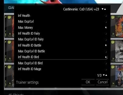
Hi, a little contribution for xbox users.

Fixed the TrainerSettings.xml
Image

PHP Code:
<window id="127">
    <
defaultcontrol>1</defaultcontrol>
    <
visible>Window.IsActive(127)</visible>
    <
coordinates>
    <
system>1</system>
    <
posx>0</posx>
    <
posy>0</posy>
    </
coordinates>
    <
controls>

    <
control type="image">
        <
description>Black Panel</description>
        <
posx>63</posx>
        <
posy>115</posy>
        <
width>595</width>
        <
height>430</height>
        <
texture>black.png</texture>
        <include>
common-fade</include>
    </
control>

    <
control type="label" id="2">
        <
description>Settings Label</description>
        <
align>left</align
        <
posx>75</posx
        <
posy>505</posy>
        <
font>special16</font>
        <
textcolor>d0ffffff</textcolor>
        <include>
common-fade</include>
        <
visible>!Skin.HasSetting(WindowTitle)</visible>
    </
control>

    <
control type="label" id="3">
        <
description>No Settings Label</description>
        <
posx>0</posx>
        <
posy>170</posy>
        <
width>408</width>
        <
align>center</align>
        <
label>12016</label>
        <
font>font12</font>
        <include>
common-fade</include>
    </
control>

    <
control type="spincontrol" id="60">
        <
description>Next page button</description>
        <
posx>610</posx>
        <
posy>470</posy>
        <
subtype>page</subtype>
        <
font>font12</font>
        <
onleft>5</onleft>
        <
onright>28</onright>
        <
ondown>5</ondown>
        <
onup>28</onup>
        <
showonepage>false</showonepage>
        <include>
common-fade</include>
    </
control>

    <
control type="grouplist" id="5">
        <
description>control area</description>
        <
posx>75</posx>
        <
posy>120</posy>
        <
width>570</width>
        <
height>350</height>
        <
itemgap>0</itemgap>
        <
pagecontrol>60</pagecontrol>
        <
onleft>28</onleft>
        <
onright>60</onright>
        <
onup>28</onup>
        <
ondown>28</ondown>
        <include>
common-fade</include>
    </
control>

    <
control type="button" id="7">
        <
description>Default Button</description>
        <
posx>530</posx>
        <
posy>150</posy>
        <
height>31</height>
        <
font>font12</font>
        <
textoffsetx>12</textoffsetx>
        <
aligny>center</aligny>
        <
texturefocus>input-focus.png</texturefocus>
        <
texturenofocus>-</texturenofocus>
    </
control>

    <
control type="radiobutton" id="8">
        <
description>Default RadioButton</description>
        <
posx>530</posx>
        <
posy>150</posy>
        <
height>31</height>
        <
font>font12</font>
        <
texturefocus>input-focus.png</texturefocus>
        <
texturenofocus>-</texturenofocus>
        <
textoffsetx>12</textoffsetx>
        <
aligny>center</aligny>
        <
textureradiofocus>s-check-box.png</textureradiofocus>
        <
textureradionofocus>s-check-boxnf.png</textureradionofocus>
    </
control>

    <
control type="spincontrolex" id="9">
        <
description>Default SpinControlex</description>
        <
posx>530</posx>
        <
posy>150</posy>
        <
height>31</height>
        <
width>300</width>
        <
texturefocus>Button-List.png</texturefocus>
        <
texturenofocus>-</texturenofocus>
        <
textureup>scroll-up.png</textureup>
        <
texturedown>scroll-down.png</texturedown>
        <
textureupfocus>scroll-up-focus.png</textureupfocus>
        <
texturedownfocus>scroll-down-focus.png</texturedownfocus>
        <
font>font12</font>
        <include>
textcolorwhite</include>
        <
disabledcolor>60d0d0d0</disabledcolor>
        <
textoffsetx>12</textoffsetx>
        <
aligny>center</aligny>
        <
reverse>yes</reverse>
    </
control>

    <
control type="sliderex" id="10">
        <
description>Default Slider</description>
        <
posx>1530</posx>
        <
posy>150</posy>
        <
height>31</height>
        <
width>300</width>
        <
texturefocus>Button-List.png</texturefocus>
        <
texturenofocus>-</texturenofocus>
        <
sliderwidth>100</sliderwidth>
        <
sliderheight>20</sliderheight>
        <
texturesliderbar>osd_slider_bg.png</texturesliderbar>
        <
textureslidernib>osd_slider_nibNF.png</textureslidernib>
        <
textureslidernibfocus>osd_slider_nibFO.png</textureslidernibfocus>
        <
font>font12</font>
        <include>
textcolorwhite</include>
        <
disabledcolor>60d0d0d0</disabledcolor>
        <
textoffsetx>12</textoffsetx>
    </
control>

    <
control type="image" id="11">
        <
description>separator image</description>
        <
width>580</width>
        <
height>2</height>
        <
texture border="10,0,10,0">Settings-Divider.png</texture>
        <
colordiffuse>80ffffff</colordiffuse>
        <include>
common-fade</include>
    </
control>

    <
control type="button" id="28">
        <
description>Ok Button</description>
        <
posx>480</posx>
        <
posy>500</posy>
        <
width>80</width>
        <
height>32</height>
        <
label>186</label>
        <
texturefocus>Button-Home2.png</texturefocus>
        <
texturenofocus>Button-List.png</texturenofocus>
        <
align>center</align>
        <
aligny>center</aligny>
        <
onleft>29</onleft>
        <
onright>29</onright>
        <
onup>5</onup>
        <
ondown>5</ondown>
        <include>
DialogInfo</include>
        <include>
Home-Visible</include>
    </
control>

    <
control type="button" id="29">
        <
description>Cancel Button</description>
        <
posx>570</posx>
        <
posy>500</posy>
        <
width>80</width>
        <
height>32</height>
        <
label>222</label>
        <
texturefocus>Button-Home2.png</texturefocus>
        <
texturenofocus>Button-List.png</texturenofocus>
        <
align>center</align>
        <
aligny>center</aligny>
        <
onleft>28</onleft>
        <
onright>28</onright>
        <
onup>5</onup>
        <
ondown>5</ondown>
        <include>
DialogInfo</include>
        <include>
Home-Visible</include>
    </
control>

    </
controls>
</
window

I think we still need OverlayHasTrainer.png & OverlayTrained.png in the texture.xpr.
Hope we can have that in the future.

Thanks.
Thanks for fulfilling my request. The skin looks awsome!

I also find it really easy to make a KIDS section. Just rename MOVIES or CLIPS to KIDS in Strings.xml and put all your kids movies in the Movies/Clips folder and you're done.

I like the new date-panel at the main page. But I would like to disable it for all other views. I'm using the file view, and the date-panel still looks the same as before. If it is changed in the library view, then maby you could change it the same in the file view? Or make a new option to "only show date panel at main page" or something like that. Or tell me what file to look in to manually remove it from other pages. Thanks.