+- Kodi Community Forum (https://forum.kodi.tv)
+-- Forum: Support (https://forum.kodi.tv/forumdisplay.php?fid=33)
+--- Forum: Supplementary Tools for Kodi (https://forum.kodi.tv/forumdisplay.php?fid=116)
+---- Forum: Kodi Remote for iOS Official Forum (https://forum.kodi.tv/forumdisplay.php?fid=193)
+---- Thread: Beta Testflight access to beta version (/showthread.php?tid=359717)
Pages:
1
2
3
4
5
6
7
8
9
10
11
12
13
14
15
16
17
18
19
20
21
22
23
24
25
26
27
28
29
30
31
32
33
34
35
36
37
38
39
40
41
42
43
44
45
46
47
48
49
50
51
52
53
54
55
56
57
58
59
60
61
62
63
64
65
66
67
68
69
70
71
72
73
74
75
76
77
78
79
80
81
82
83
84
85
86
87
88
89
90
91
92
93
94
95
96
97
98
99
100
101
102
103
104
105
106
107
108
109
110
111
112
113
114
115
116
117
118
119
120
121
122
123
RE: Testflight access to beta version - Buschel - 2024-02-27
I confirm the first issue (always full album added). This is a regression from the "longpress season" changes. I just fixed this, but need to revisit one of the refactoring steps I did.
The second issue (around "recently added") I cannot reproduce. Can you share detailed steps?
RE: Testflight access to beta version - amasephy - 2024-02-27
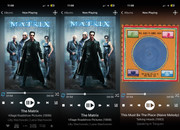
Here’s a revision based on your feedback. Keeping controls and codecs stationary. Still more to come but before I waste time going I the wrong direction please provide any feedback good or bad. 🙂
By the way, apologies for the cropped view, that is an artifact of the image pasting site. You can view the image u altered by going into the original image via the link on that site. Looks fantastic when viewed on my phone.
Changes:
Shift elements to fit movie art
Further Dim and shrink codec labels
Reposition proposed new favorites button.
Fill music art by width.
Fill Movie art by height.
Likely you’ll have to use math to calculate aspect ratio and go off of that for fitting to width or height or you’ll definitely run into unexpected edge cases.
For the gradient - for me it’s about the header and footer screen areas that I’d like using a gradient. I don’t care for the hard edge and I think these areas need to have a different color to give them some definition. I think it provides a little more visual interest having a gradient.
Btw, I would get rid of that Kodi logo that is visible when flipping between now playing and the playlist. IMO it’s just cleaner to leave it out. I know UlfSchmidt has mentioned in the past about there being too many logos visible.
For me adding the codec labels really takes advantage of screen space. The current app implementation is so sparse. Likely a result of growing device sizes. You already know how I feel about older devices holding back newer ones. 🙂


Looking at the images again I’m thinking about swapping the codecs and media title positions. Will post back later with alternative samples.
Edit: I think I like this layout more. The controls are moved into a more comfortable position. Codecs dropped to the bottom as are least important.
Proposing using the Kodi blue for the loop and randomize activated. To make safe for color blind a dot is placed beneath when activated.
Added heart for favorite as a place holder for another button.
Finally, added dynamic background lighting. Keeps the gradient I like while implementing the style background you teased months ago.

RE: Testflight access to beta version - UlfSchmidt - 2024-02-27
(2024-02-27, 22:07)Buschel Wrote: The second issue (around "recently added") I cannot reproduce. Can you share detailed steps?Start the app.
Click on Music.
Click on the three dots.
Click on Recently Added Songs.
Select a song.
Upps, cannot reproduce

Must be a more complex situation that caused this. Will report back again when I can easily reproduce this…
RE: Testflight access to beta version - UlfSchmidt - 2024-02-28
(2024-02-27, 22:13)amasephy Wrote: Here’s a revision based on your feedback. Keeping controls and codecs stationary. Still more to come but before I waste time going I the wrong direction please provide any feedback good or bad. 🙂
…
For me adding the codec labels really takes advantage of screen space.
…
The more I think about it the more I like amasephy's idea of having the codecs always visible, especially when they appear a little bit dimmed. It would also make good use of the space available on iPads. 👍
RE: Testflight access to beta version - Buschel - 2024-02-28
There is no space left. More space can only be achieved by scaling down the cover, this would especially impact landscape mode.
https://ibb.co/Wk7wSHY (landscape)
https://ibb.co/dp00F8r (portrait)
RE: Testflight access to beta version - UlfSchmidt - 2024-02-28
Sure, the cover art has to be shown a little bit smaller, I wouldn’t mind.

Another thought: with the controls moved to the Now Playing screen, it would be important to have some means to reach this view directly. Maybe you can add a dedicated button right to the Remote Control button in the bottom bar?
RE: Testflight access to beta version - amasephy - 2024-02-28
Here I was thinking codecs would easily fit on an iPad screen but just looking at the simulator screenshots it’s obvious that it isn’t so easy. The movie poster art looks great taking advantage of the perfect size of the now playing area.
Yes for iPhone my sample for movie did shrink the movie art but that is the one artwork type that I can see needing to be shrunk a little. With that you gain on music and tv shows.
I hope I’m not creating a problem by creating mockups. I know you want to take the app in a particular direction and you are basically the sole steward of it. Decisions ultimately rest with you. I don’t want to stir up any controversy.
RE: Testflight access to beta version - Buschel - 2024-02-28
Your mockups are more than welcome as they bring in new ideas. I basically also try out design changes to see where this is going.
For example it could be possible to place codec info in the free space in case of square or landscape formed covers… this might bring up complaints about not having this info for movies covers, but it would depend on the cover itself and not of the item type which is played.
RE: Testflight access to beta version - UlfSchmidt - 2024-02-28
Maybe you can make this (whether or not showing codec and other info permanently) customizable via the settings page?
RE: Testflight access to beta version - amasephy - 2024-02-28
Alright, I’ll work on more when I have some time. It’s actually pretty fun playing with the layouts. If they help inspire you to make improvements to the app then all the better.
Personally, the movie codecs are generally the most interesting to me. Movies seem to have to most amount of codecs - HD, 4k, DTS, Dolby etc. I admit I would definitely fall in the camp of disappointed if every other media type got codec labels except movies.
RE: Testflight access to beta version - amasephy - 2024-02-29
Here’s a couple of variations.
Keeping the codecs and expanding the movie art back to original size.
Then removing codec labels.
Rework controls - enlarged play button. Adjusted spacing between skip buttons.
Reposition the element order.
Nothing is earth shattering here - this does align the elements as seen in many other media players. User controls are relocated to where the thumb naturally rests.
Movie title seems fine at the bottom. Title is already visible in the artwork anyway.

RE: Testflight access to beta version - Buschel - 2024-02-29
Do you have some ideas how to deal with the switch to playlist view? From a usability view I prefer to have the same control logic on the bottom for both NowPlaying and playlist view. Toggling the views tipping on the same button position is a very natural use.
I like the Kodi-blue active repeat/random with the dot (I saw Spotify using something like this). In my current icons I was adding the dots in the middle. But I find this harder to recognize and harder to differentiate between "repeat on" and "repeat 1".
Adding a setting to show codec info in NowPlaying is of course a solution. Not sure yet, how to resolve this nicely due to the different aspect ratios of the cover art.
RE: Testflight access to beta version - amasephy - 2024-02-29
Funny you mention the playlist view. Based on how the systems work in Apple Music and YouTube music you could adopt what they do. Avoid flipping the screen. Pull the artwork from the now playing view into the first row and fade in the playlist into the space above the user controls.
I think Apple Music handles this pretty much perfectly. Consider that as a template.
I didn’t mention this as I’m figuring it will be considerable work for you. I do think it is a slicker system than the current implementation in the app.
That is really the only way I can see maintaining the user control space between both views.
As for codecs showing - instead of an info overlay panel (as we currently tap on art to see) maybe just make the artwork area a scrollable panel. Then the user can slide the view up to reveal codecs and other info available about the show. To give it some firmness, you could enable snapping to the artwork instead of a bounce effect.
This way the aspect ratio doesn’t matter as much. When there’s more space, more info is available. When there isn’t, no harm.
Edit: with regards to making the nowplaying screen scrollable… I just looked at Spotify and that does exactly as I envisioned. You scroll the entire pane. The details could be dropped into that area instead of using an overlay.
Tapping the playlist button could work like it does in Apple Music. This would disable the scrollable details area as now the playlist would take up this space.
The currently playing track could have special status and be a larger row.
RE: Testflight access to beta version - UlfSchmidt - 2024-02-29
In my archive, I have for each movie in addition to the cover art also some artwork in 16:9 aspect ratio stored. And as far as I know, all scrapers do so and provide these too. If this would be used in landscape mode on iPads, this would also make room for additional info tags.
RE: Testflight access to beta version - amasephy - 2024-03-01
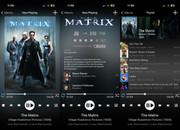
A couple more samples. Existing now playing view be created with new info by scrolling down the movie art and a new playlist view.
Adopted elements that are visible when accessing movie info from movie library but excluded some of the elements that don’t make sense in this context. Also added the codecs.
For playlist view I disabled the background dynamic coloring.
