+- Kodi Community Forum (https://forum.kodi.tv)
+-- Forum: Support (https://forum.kodi.tv/forumdisplay.php?fid=33)
+--- Forum: Skins Support (https://forum.kodi.tv/forumdisplay.php?fid=67)
+---- Forum: Aeon Nox: Silvo (https://forum.kodi.tv/forumdisplay.php?fid=142)
+---- Thread: [RELEASE] Aeon Nox 2.0 (deprecated) (/showthread.php?tid=89151)
Pages:
1
2
3
4
5
6
7
8
9
10
11
12
13
14
15
16
17
18
19
20
21
22
23
24
25
26
27
28
29
30
31
32
33
34
35
36
37
38
39
40
41
42
43
44
45
46
47
48
49
50
51
52
53
54
55
56
57
58
59
60
61
62
63
64
65
66
67
68
69
70
71
72
73
74
75
76
77
78
79
80
81
82
83
84
85
86
87
88
89
90
91
92
93
94
95
96
97
98
99
100
101
102
103
104
105
106
107
108
109
110
111
112
113
114
115
116
117
118
119
120
121
122
123
124
125
126
127
128
129
130
131
132
133
134
135
136
137
138
139
140
141
142
143
144
145
146
147
148
149
150
151
152
153
154
155
156
157
158
159
160
161
162
163
164
165
166
167
168
169
170
171
172
173
174
175
176
177
178
179
180
181
182
183
184
185
186
187
188
189
190
191
192
193
194
195
196
197
198
199
200
201
202
203
204
205
206
207
208
209
210
211
212
213
214
215
216
217
218
219
220
221
222
223
224
225
226
227
228
229
230
231
232
233
234
235
236
237
238
239
240
241
242
243
244
245
246
247
248
249
250
251
252
253
254
255
256
257
258
259
260
261
262
263
264
265
266
267
268
269
270
271
272
273
274
275
276
277
278
279
280
281
282
283
284
285
286
287
288
289
290
291
292
293
294
295
296
297
298
299
300
301
302
303
304
305
306
307
308
309
310
311
312
313
314
315
316
317
318
319
320
321
322
323
324
325
326
327
328
329
330
331
332
333
334
335
336
337
338
339
340
341
342
343
344
345
346
347
348
349
350
351
352
353
354
355
356
357
358
359
360
361
362
363
364
365
366
367
368
369
370
371
372
373
374
375
376
377
378
379
- Martijn - 2011-08-06
fional Wrote:Ok, I'll go grab that - and then getting the Nox skin, is it from the repo or do I do it manually?https://github.com/BigNoid/Aeon-Nox/archives/master
You can download the latest here. You can install from inside xbmc bij installing from .zip
The only things is that it gives it the wrong folder name inside the add-ons folder. But you can rename it to "skin.aeon.nox" (like the other folder that already contains the skin) or just empty the folder and copy all the contents in from the zip file.
EDIT:
When switching to pre-Eden you may need to install some of the pre-eden add-ons as the dharma ones may not work correctly anymore.
- BigNoid - 2011-08-06
Machine-Sanctum Wrote:I think the same goes for the "busy dialog". Maybe it's hardly notisable in 16x10 but on my test pc (1280x1024) it's very obvious. There a lot more images that are stretch out but i don't know if you ever intended to support this screen res. Here's an exampleI do not intend to maintain different aspect ratio versions of the skin, but List view is supposed to scale to every resolution (if no rounded covers or bd cases are selected). In principle this skin is designed to work with 16:9 resolutions.
Mediamenu and posters are stretch out. For me it's not a problem because i normally use 1080i res. But that means that others with 16x10 also experience this problem without maybe noticing. So maybe adding
is a good idea.Code:<aspectratio>keep</aspectratio>
or
<aspectratio align="center">keep</aspectratio>
- Martijn - 2011-08-06
Big_Noid Wrote:I do not intend to maintain different aspect ratio versions of the skin, but List view is supposed to scale to every resolution (if no rounded covers or bd cases are selected). In principle this skin is designed to work with 16:9 resolutions.Thought i should mention it because 16:9 and 16:10 are very close to eachother. To support others is indeed a lot of work and almost the whole world runs on 16:9 nowdays.
For the others:
I know there's some MOD out there of Aeon Nox that is adapted to work under the old 4:3 resolution. But that's of topic.
- Eddage - 2011-08-06
Me again...
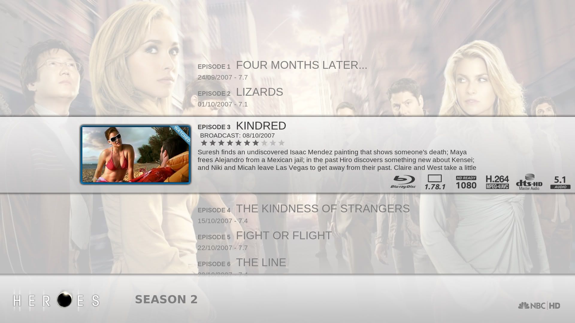
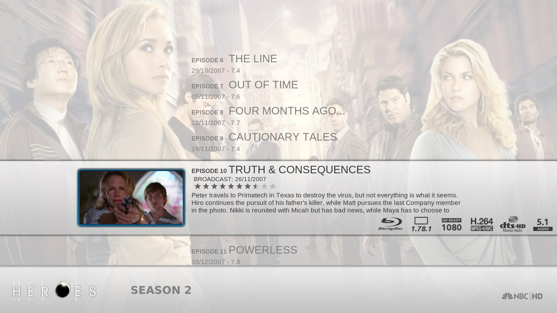
This is what I've managed with my episode view mod...

However there are a few issues I would like to resolve...
1. Is it possible to remove the back button (not just from this view but all views)? If you're using a remote/keyboard then having this button isn't needed and I think it just looks ugly. I've managed to remove the label and the image but it's still there as a list item.
2. How do I reduce the number of items in the list from 6 to 5? I want to have 2 items either side of the focused.
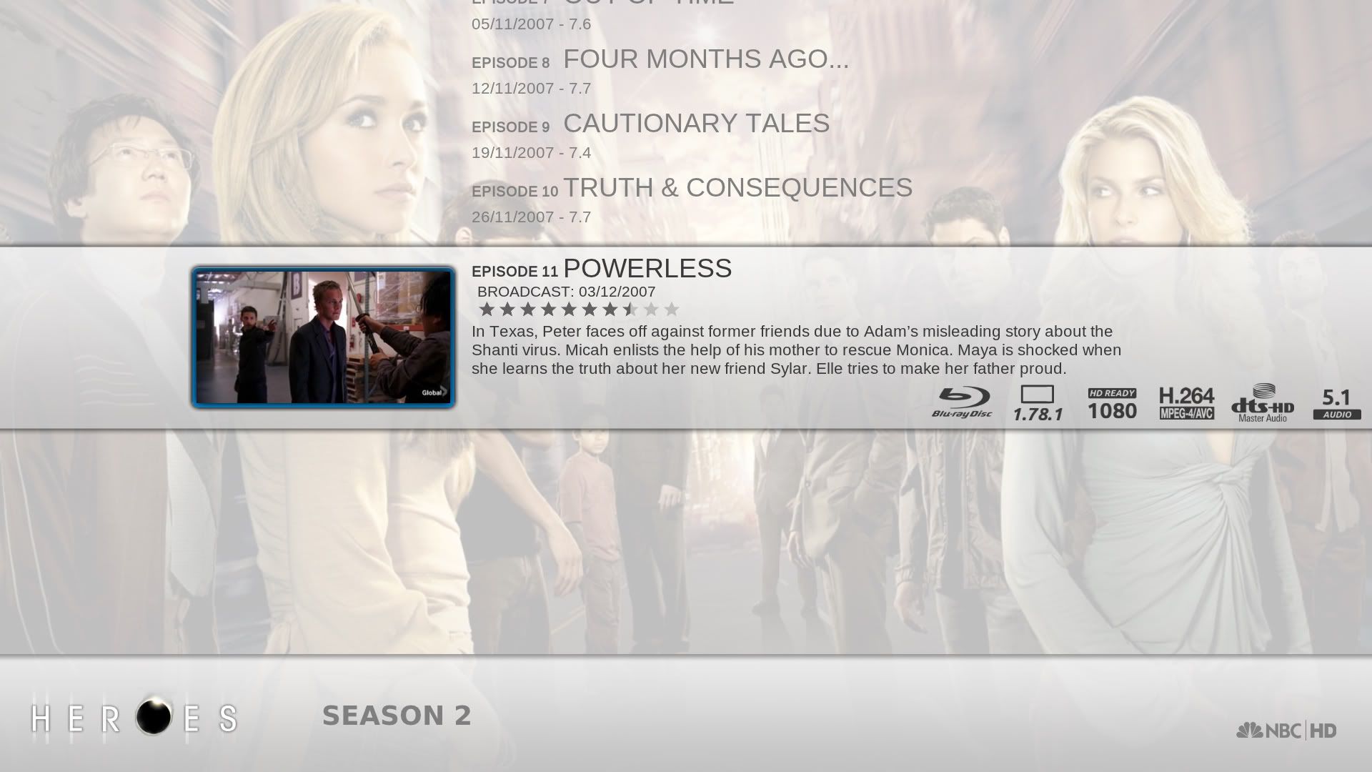
3. Even though this is a fixed list the focused position still moves when at the start or end of the list, eg.

I'm guessing this is so that it always shows the 6 items in the list, however I would like it to always remain in the same spot and so if it's the last episode only show the 2 above and the first episode only the two below.
4. Is it possible to display the seasons total episodes and unwatched total? I would like it to say Season 2, 11 episodes (9 unwatched) at the bottom but can't figure out what label I need to use (if it's even possible)
Quite a few questions, I know, but I'm sure one of you wonderful people will be able to help :p
- SpectreX - 2011-08-06
WOW, great mod. Looks like Aeon meets Alaska, which would be the perfect skin combination for me. Do you plan on releasing this for the general public or is it just a small project for yourself?
- Eddage - 2011-08-06
SpectreX Wrote:WOW, great mod. Looks like Aeon meets Alaska, which would be the perfect skin combination for me. Do you plan on releasing this for the general public or is it just a small project for yourself?
At the moment it's just a small project for myself, my knowledge of the coding is nowhere near substantial enough to do a complete mod which is viable to be released. I imagine that if someone with experience of xbmc skinning would look at my .xml's and recoil in horror after realising how inefficient my coding is :p
However, if, as I continue modding, I learn enough then I would love to eventually be able to release it. Or someone with better knowledge of how the coding works could always help

- Martijn - 2011-08-06
Eddage Wrote:At the moment it's just a small project for myself, my knowledge of the coding is nowhere near substantial enough to do a complete mod which is viable to be released. I imagine that if someone with experience of xbmc skinning would look at my .xml's and recoil in horror after realising how inefficient my coding is :p
However, if, as I continue modding, I learn enough then I would love to eventually be able to release it. Or someone with better knowledge of how the coding works could always help
I planning to do a skin for myself. But for now i just watch and learn.
So far you've done a great job

Indeed there are skinners that could make a more efficient code however most of them started out the same, with trial and error. Trhough time you will learn better ways to do something and the GUI for xbmc will also improve to do more things.
The most important thing i learned with programming:
Before you begin, make a plan what you want and do is structurally. If you don't you will eventually run into a wall off overcoding
- BigNoid - 2011-08-06
Eddage Wrote:Me again...I like this one better than the episode view how it is now. is that listpanel_selectbar on the focused item or a custom image? Would you mind if I rebuild the episode view to look a bit like that, it will be with dark colors in my skin and I would change some details.
This is what I've managed with my episode view mod...
However there are a few issues I would like to resolve...
1. Is it possible to remove the back button (not just from this view but all views)? If you're using a remote/keyboard then having this button isn't needed and I think it just looks ugly. I've managed to remove the label and the image but it's still there as a list item.
2. How do I reduce the number of items in the list from 6 to 5? I want to have 2 items either side of the focused.
3. Even though this is a fixed list the focused position still moves when at the start or end of the list, eg.
I'm guessing this is so that it always shows the 6 items in the list, however I would like it to always remain in the same spot and so if it's the last episode only show the 2 above and the first episode only the two below.
4. Is it possible to display the seasons total episodes and unwatched total? I would like it to say Season 2, 11 episodes (9 unwatched) at the bottom but can't figure out what label I need to use (if it's even possible)
Quite a few questions, I know, but I'm sure one of you wonderful people will be able to help :p
To answer your questions:
1: yes, in xbmc appearance settings under file list options.
2: Play with the <height> of the list to make it longer or shorter
3: Remove the slide animations of the list.
4:
Code:
$INFO[ListItem.Season,$LOCALIZE[20373] ]$INFO[ListItem.Property(TotalEpisodes), , $LOCALIZE[20360]]$INFO[ListItem.Property(UnWatchedEpisodes), (, $LOCALIZE[16101])]- meridius - 2011-08-06
Big_Noid Wrote:Oh, forgot to change back when I was testing something. Forgot about the lock thing, will try to get to that today.
UK ratings are supported. They are expected to be like this in your database:
Code:UK:U UK:PG UK:12 UK:12A UK:15 UK:18
Well, that doesn't look very good
Tried to fix it just now, just curious, what resolution is that, because I can't reproduce it in 16:9 aspectratio.
I have this in my info file that ember creates
<mpaa>12A</mpaa>
<certification>UK:12A</certification>
but it does change the rating logo but its not a uk version its a green square and not the uk version or is this your own uk rating logo ? same for 18 these are red squares
- Eddage - 2011-08-06
Big_Noid Wrote:I like this one better than the episode view how it is now. is that listpanel_selectbar on the focused item or a custom image? Would you mind if I rebuild the episode view to look a bit like that, it will be with dark colors in my skin and I would change some details.
To answer your questions:
1: yes, in xbmc appearance settings under file list options.
2: Play with the <height> of the list to make it longer or shorter
3: Remove the slide animations of the list.
4:Code:$INFO[ListItem.Season,$LOCALIZE[20373] ]$INFO[ListItem.Property(TotalEpisodes), ,$LOCALIZE[20360]]$INFO[ListItem.Property(UnWatchedEpisodes), (, $LOCALIZE[16101])]
Thanks for the response - Feel free to incorporate anything I'm doing into nox. The background strip behind the episode is a custom image I put at the start of the <focusedlayout>
Regarding your responses, If I removed the animations the same thing was happening, I guess this is just how these lists work in XBMC? What I did instead was to adjust the animations and set the time to 0, this basically just moved the whole list down or up if the first/last two episodes are highlighted. However this then leaves me with this issue...

If the last episode is highlighted then it displays the whole of the list above still, which kind of breaks the flow of the view. All I want is for it to display the two previous episodes (so eps 9 and 10 in the screenshot above). The same happens when the first episode is highlighted, I would then only want to show eps 2 and 3 below. I don't know if there is some sort of condition that can be used. Something that says when 'Row(0)' is highlighted 'Row(3)', 'Row(4)' and 'Row(5)' are all hidden
Also the code for the number of episodes/watched didn't work, all it displays is the season, not the episode number info.
Sorry for bombarding you with so many questions!
- BigNoid - 2011-08-06
Eddage Wrote:Thanks for the response - Feel free to incorporate anything I'm doing into nox. The background strip behind the episode is a custom image I put at the start of the <focusedlayout>yeah of course, that only works on tvshow and season level.
Regarding your responses, If I removed the animations the same thing was happening, I guess this is just how these lists work in XBMC? What I did instead was to adjust the animations and set the time to 0, this basically just moved the whole list down or up if the first/last two episodes are highlighted. However this then leaves me with this issue...
If the last episode is highlighted then it displays the whole of the list above still, which kind of breaks the flow of the view. All I want is for it to display the two previous episodes (so eps 9 and 10 in the screenshot above). The same happens when the first episode is highlighted, I would then only want to show eps 2 and 3 below. I don't know if there is some sort of condition that can be used. Something that says when 'Row(0)' is highlighted 'Row(3)', 'Row(4)' and 'Row(5)' are all hidden
Also the code for the number of episodes/watched didn't work, all it displays is the season, not the episode number info.
Sorry for bombarding you with so many questions!
Also set <movement> to 0 to achieve what you want.
- Mugen360 - 2011-08-06
Big View. Can you upload it when its done? I love it
- NiklasK - 2011-08-06
Really love these episode views. Perhaps it should be customized when it comes to the color scheme, maybe a bit more grey-ish to match the existing Aeon Nox style and then have the lighter Alaska-ish color as a separate theme?
Really love this episode view however....
Eddage Wrote:Me again...
This is what I've managed with my episode view mod...
However there are a few issues I would like to resolve...
1. Is it possible to remove the back button (not just from this view but all views)? If you're using a remote/keyboard then having this button isn't needed and I think it just looks ugly. I've managed to remove the label and the image but it's still there as a list item.
2. How do I reduce the number of items in the list from 6 to 5? I want to have 2 items either side of the focused.
3. Even though this is a fixed list the focused position still moves when at the start or end of the list, eg.
I'm guessing this is so that it always shows the 6 items in the list, however I would like it to always remain in the same spot and so if it's the last episode only show the 2 above and the first episode only the two below.
4. Is it possible to display the seasons total episodes and unwatched total? I would like it to say Season 2, 11 episodes (9 unwatched) at the bottom but can't figure out what label I need to use (if it's even possible)
Quite a few questions, I know, but I'm sure one of you wonderful people will be able to help :p
- BigNoid - 2011-08-06
meridius Wrote:I have this in my info file that ember creates
<mpaa>12A</mpaa>
<certification>UK:12A</certification>
but it does change the rating logo but its not a uk version its a green square and not the uk version or is this your own uk rating logo ? same for 18 these are red squares
I think it needs to be the other way around, mpaa should be UK:12A
You're now seeing the German ratings
- RonM - 2011-08-06
First, I must say it's a great skin! Realy beautiful.
However...one thing is bugging me: I just can't get info on subtitles no matter what settings and views I try. I have tested it with two types of media files, with separate srt-file and embedded subtitle stream (both mkv files). All the icons are showing, like 720p, H.264, DTS, etc., but nothing about the subtitle (it is supposed to be added since version 0.70).
What am I missing?

