Guest - Testers are needed for the reworked CDateTime core component. See... https://forum.kodi.tv/showthread.php?tid=378981 (September 29) x
  • 1
  • 30
  • 31
  • 32(current)
  • 33
  • 34
  • 156
Beta Testflight access to beta version
(2021-11-12, 18:53)Buschel Wrote:
(2021-11-12, 18:08)UlfSchmidt Wrote: With respect to year 0, it looks already much better but not everywhere:
Ok, I was only treating the "number" type and not the "string" type. I added this to an existing PR.
(2021-11-12, 18:08)UlfSchmidt Wrote: Maybe you can also suppress zeros in the lists and in the REGIE fields?
Yes, I can. Also added to an existing PR (the REGIE field is now even completely removed, if no proper data is provided like in your "- (0)" case).
Merci mon ami Smile
Reply
(2021-10-30, 15:26)ksooo Wrote: What also should be fixed is to separate between timers (planned recordings) and timer rules. Currently there is only timers, mixing rules and timers in one view, nothing a user can work with.
I was looking into this and did a first draft implementation (see PR#474). I am just puzzled that the API reports the timer rule twice, 1x with istimerrule=NO and 1x with istimerrule=YES. Therefore it shows up twice when I am not having any rule enabled. Is this how it should look like? Does one reflect the rule and the other just the next recording triggered by the rule?
Reply
(2021-11-14, 14:58)Buschel Wrote: I was looking into this and did a first draft implementation (see PR#474). I am just puzzled that the API reports the timer rule twice, 1x with istimerrule=NO and 1x with istimerrule=YES. Therefore it shows up twice when I am not having any rule enabled. Is this how it should look like? Does one reflect the rule and the other just the next recording triggered by the rule?
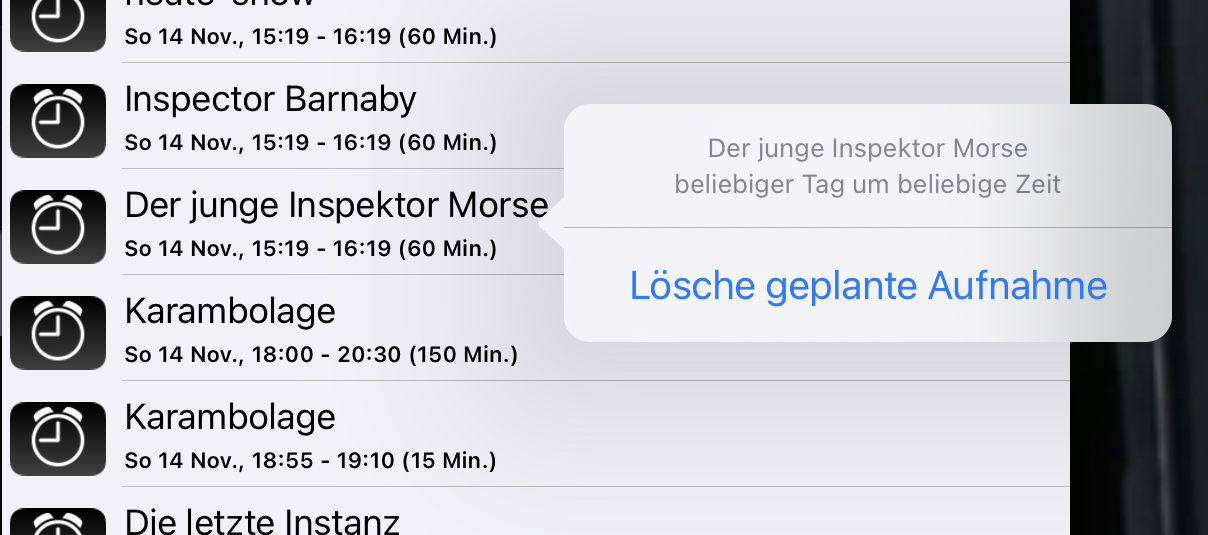
I can only talk about what my Tvheadend client shows, maybe other TV implementations deliver different results. But I also see in fact two entries for all my timers where an actual next recording is scheduled. The second one for the scheduled recording looks okay, but the first one for the timer rule doesn’t handle generic rules (e.g. record at any time of the day) correctly. The correct information is only shown (after tapping once on the item) in the pop-up, so it is there but not well taken into account:
Image

@Buschel, maybe you can also use different icons for rules and planned recordings in the list?
And why is it possible to delete planned future recordings but not completed recordings. An option still missing, maybe because it is not supported by the API?
Thanks, as always!
Ulf
Reply
(2021-11-14, 14:58)Buschel Wrote:
(2021-10-30, 15:26)ksooo Wrote: What also should be fixed is to separate between timers (planned recordings) and timer rules. Currently there is only timers, mixing rules and timers in one view, nothing a user can work with.
I was looking into this and did a first draft implementation (see PR#474). I am just puzzled that the API reports the timer rule twice, 1x with istimerrule=NO and 1x with istimerrule=YES. Therefore it shows up twice when I am not having any rule enabled. Is this how it should look like? Does one reflect the rule and the other just the next recording triggered by the rule?


Are you sure that the API reports the same entity twice? What makes you think this? The title? The title is not unique, the rule and the single timers it schedules might have the same title.

I think what you see is more that one item is the rule, the second actually a timer scheduled by the rule?
Reply
(2021-11-14, 17:01)ksooo Wrote: I think what you see is more that one item is the rule, the second actually a timer scheduled by the rule?
You are right, it is not shown twice. One is the rule and the other one is a recording scheduled by this rule. Is this just the next scheduled recording?
Reply
(2021-11-14, 17:42)Buschel Wrote:
(2021-11-14, 17:01)ksooo Wrote: I think what you see is more that one item is the rule, the second actually a timer scheduled by the rule?
You are right, it is not shown twice. One is the rule and the other one is a recording scheduled by this rule. Is this just the next scheduled recording?


If there is just one, yes, but there can be multiple at one time, depending for example on for how many days in the future epg data are available
Reply
The whole handling of timers in the App does not yet differentiate between scheduled recordings and timer rules. Still working on it.
(2021-11-14, 16:41)UlfSchmidt Wrote: I can only talk about what my Tvheadend client shows, maybe other TV implementations deliver different results. But I also see in fact two entries for all my timers where an actual next recording is scheduled. The second one for the scheduled recording looks okay, but the first one for the timer rule doesn’t handle generic rules (e.g. record at any time of the day) correctly. The correct information is only shown (after tapping once on the item) in the pop-up, so it is there but not well taken into account.
I have this working with my local version already (https://abload.de/img/simulatorscreenshot-if7j15.png). Smile
(2021-11-14, 16:41)UlfSchmidt Wrote: @Buschel, maybe you can also use different icons for rules and planned recordings in the list?
I hope the icons are not a major concern anymore when the summary (e.g. "Every day from 4 PM to 5 PM") makes clear it is a timer rule.
(2021-11-14, 16:41)UlfSchmidt Wrote: And why is it possible to delete planned future recordings but not completed recordings. An option still missing, maybe because it is not supported by the API?
I saw something similar today, but I am not sure what really happened. This will need some more testing on my side.
Reply
(2021-11-14, 16:41)UlfSchmidt Wrote: @Buschel, maybe you can also use different icons for rules and planned recordings in the list?
Here we go: https://abload.de/img/simulatorscreenshot-i04kh7.png
Reply
(2021-11-14, 18:24)Buschel Wrote:
(2021-11-14, 16:41)UlfSchmidt Wrote: @Buschel, maybe you can also use different icons for rules and planned recordings in the list?
Here we go: https://abload.de/img/simulatorscreenshot-i04kh7.png


Please, you need to make separate lists for timers and timer rules! Nobody understands the functionality if you mix rules and timers in one list. I had it like this in Kodi in the first place and got very negative feedback for this.
Reply
(2021-11-14, 18:47)ksooo Wrote: Please, you need to make separate lists for timers and timer rules! Nobody understands the functionality if you mix rules and timers in one list. I had it like this in Kodi in the first place and got very negative feedback for this.
Did you look at the screenshots in PR#474? Would this work from your point of view? The default would show all timers (with dedicated icons), then the user can filter for scheduled recordings and timer rules.
Reply
(2021-11-14, 18:54)Buschel Wrote:
(2021-11-14, 18:47)ksooo Wrote: Please, you need to make separate lists for timers and timer rules! Nobody understands the functionality if you mix rules and timers in one list. I had it like this in Kodi in the first place and got very negative feedback for this.
Did you look at the screenshots in PR#474? Would this work from your point of view? The default would show all timers (with dedicated icons), then the user can filter for scheduled recordings and timer rules.


That’s what I had initially in Kodi and users literally killed me because they did not understand the functionality. You need to supply two different lists, like Kodi default skin does, seriously.
Reply
(2021-11-14, 18:57)ksooo Wrote: That’s what I had initially in Kodi and users literally killed me because they did not understand the functionality. You need to supply two different lists, like Kodi default skin does, seriously.
Ok, thanks for the straight feedback. So you strongly recommend to have two completely separated lists. That makes it more difficult, and it requires a 5th toolbar icon which I wanted to avoid as it causes the toolbar to expand to another page. But let‘s see.
Reply
(2021-11-14, 19:18)Buschel Wrote:
(2021-11-14, 18:57)ksooo Wrote: That’s what I had initially in Kodi and users literally killed me because they did not understand the functionality. You need to supply two different lists, like Kodi default skin does, seriously.
Ok, thanks for the straight feedback. So you strongly recommend to have two completely separated lists. That makes it more difficult, and it requires a 5th toolbar icon which I wanted to avoid as it causes the toolbar to expand to another page. But let‘s see.


Believe me, users will hate you if you don’t bite this bullet. [emoji11]
Reply
(2021-11-14, 19:28)ksooo Wrote: Believe me, users will hate you if you don’t bite this bullet. [emoji11]
This is the current state of affairs: https://abload.de/img/bildschirmfoto2021-11ikjai.png
From left to right: Timers > "More menu" with new option for Timer rules > Timer rules. Already with new thumbs and the timer rules showing the summary.
Reply
(2021-11-15, 00:05)Buschel Wrote:
(2021-11-14, 19:28)ksooo Wrote: Believe me, users will hate you if you don’t bite this bullet. [emoji11]
This is the current state of affairs: https://abload.de/img/bildschirmfoto2021-11ikjai.png
From left to right: Timers > "More menu" with new option for Timer rules > Timer rules. Already with new thumbs and the timer rules showing the summary.
I really hope you will manage to get rid of the inconsistency between 12 hours (timer rules) and 24 hours formats in your final implementation! But I already appreciate this upcoming improvement.
Reply
  • 1
  • 30
  • 31
  • 32(current)
  • 33
  • 34
  • 156

Logout Mark Read Team Forum Stats Members Help
Testflight access to beta version0