• 1
  • 3
  • 4
  • 5(current)
  • 6
  • 7
  • 122
Beta Testflight access to beta version
#61
Doesn’t look that bad in my opinion 😃
Reply
#62
(2021-01-31, 01:04)UlfSchmidt Wrote: Doesn’t look that bad in my opinion 😃
Well, the thumbs should at least be square show the complete cover. Anyway this new feature can be done for a later release, together with other features: e.g. I am playing with broader stackviews for newer iPads in future. But this also needs more testing before it can be rolled out.

https://abload.de/img/simulatorscreenshot-i7ik3r.png (iPad Pro with broader stackview)

Right now the priority should be on providing a version which runs smooth on iOS 14+ and with Kodi 19.
Reply
#63
+1
Reply
#64
Build 2022:
- Use correct height for WebView toolbar on iPhones without Home Button (now consistent with toolbars in other views)
- Minor fix to iPad "corner info" (text field and fullscreen toggle button at the right side of the toolbar)

One request: Can testers please take a look at the visualization of TV station logos in Light Mode and Dark Mode. When using the VU+ PVR plugin and the logo set configured on my VU+ I experience several logos are impossible to read in Light Mode. Also see #151.
Reply
#65
For live TV I’m using tvheadend and, as of today, a black monochrome icon set. While this works very well in light mode, it fails obviously completely in dark mode. In Kodi itself this is also a problem, depending on the skin in use. With Estuary, these logos don’t work at all. But, the reason why I am using dark logos is somewhere back in the good ol’ times, when there was no dark mode. In this past, the iOS Tvheadend app needed dark logos, white logos appeared white on white. Same for my then favorite skin Arctic Zephyr.

Based on this, I can tell you that in light mode, I observe the following:
Black station icons work in list view perfectly, but in grid view of the stations, it seems that light mode is ignored (black on black)

And in dark mode:
My black station icons are in both views almost invisible (dark gray vs. plain black)

Independent from the mode chosen, the following error exists:
Folder symbols are missing in grid view of folders, they are correctly shown only in list view

I fear there is no universal solution, either fans of black icons or fans of white icons will be unhappy. Unless you can implement something like color inversion in case of the wrong icon set...
Reply
#66
Thanks for your reply. In this case we better do not change this in such a simple way. What is definitely possible (also, not now but with a future version) is to check the average color and select an appropriate background color. Something similar is already implemented for the music album info view, where the top bar´s color follows the album, and the text color selected based on this (white or black).
Reply
#67
(2021-01-31, 13:43)Buschel Wrote: Thanks for your reply. In this case we better do not change this in such a simple way. What is definitely possible (also, not now but with a future version) is to check the average color and select an appropriate background color. Something similar is already implemented for the music album info view, where the top bar´s color follows the album, and the text color selected based on this (white or black).
With a very simple automated selection of background color it could look like the below pictures show. The logos are checked for average color, and depending on a fixed threshold either the light or dark background is used. But this is not fully reliable.
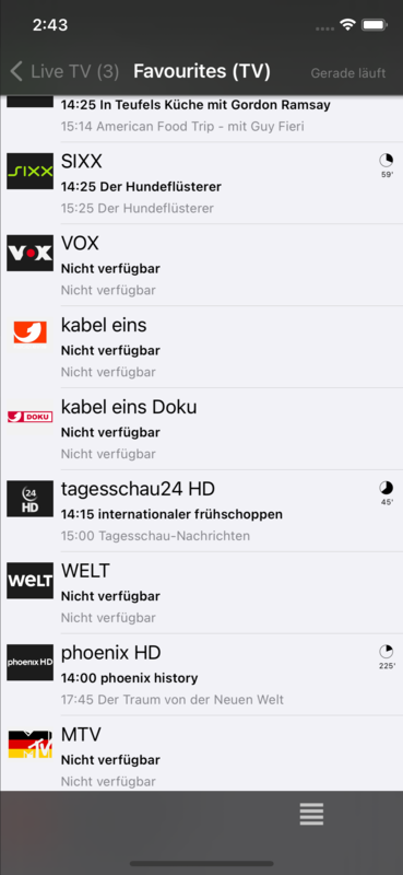
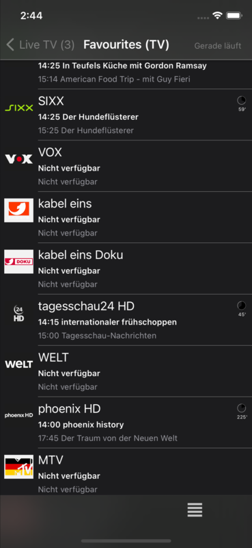
Image Image
Reply
#68
@Buschel sorry I'm a bit late for the party, but this just came to my attention: it's still about the scroll area being covered by the bottom menu. This happens under a selected genre, when listing albums. Notice that in grid view the bottom part of the last row of albums is cropped and on list view the last album is almost entirely hidden, like it was happening with the songs earlier.

Otherwise everything seems great Smile

Image

Image
Reply
#69
(2021-01-31, 16:23)regis.frias Wrote: ..., like it was happening with the songs earlier.
Let´s see if the fix can still be taken in, the PR is raised. While fixing this issue I was coming around another (more critical bug) which I also fixed. But overall I am also quite happy with the result.
Reply
#70
Build 2024:
- Last album in list was partly hidden behind toolbar
- Invisible buttons were actionable in toolbar during Genre view, hide them properly
Reply
#71
Perfect! Ship it Smile
Reply
#72
Build 2024: great! can be shipped as is in my opinion.
just one thing i want to point out, but ofc no show stopper..

the app shows the a wrong artists clearlogo while playing music, i suspect it is pulled silently from fanart or some other site.
the correct one you can see here: https://ibb.co/C1vK5Kb - this is local artist art appearing in the music database, the skin can pick it with ListItem.Art(artist.clearlogo)
the wrong is here: https://ibb.co/tYTxMfz - no idea where this comes from, i've never selected it

everything else is doing fine, thanks a lot @Buschel    +1

EDIT: clearing cache didn‘t help
Reply
#73
Just a very small glitch in Live TV: in detailed view of a TV recording, the name of the station and the name of the recording both are shown (right to the station icon) with a font completely different from the font everywhere else in use in Kodi Remote (with serifs).
Reply
#74
@howie-f, is this the same with the AppStore version of the App (1.5.7)?

@UlfSchmidt, confirmed and fixed via PR. Not sure, if it will make it into the release, but the issue is really minor.
Reply
#75
(2021-02-04, 09:12)Buschel Wrote: is this the same with the AppStore version of the App (1.5.7)?

yes, it‘s the same with 1.5.7 and the current beta. could be a leftover from times when kodi was not able store artist fanart in the music database ( < Leia ? ) .. @DaveBlake might have a clue here
Reply
  • 1
  • 3
  • 4
  • 5(current)
  • 6
  • 7
  • 122

Logout Mark Read Team Forum Stats Members Help
Testflight access to beta version0