• 1
  • 36
  • 37
  • 38(current)
  • 39
  • 40
  • 122
Beta Testflight access to beta version
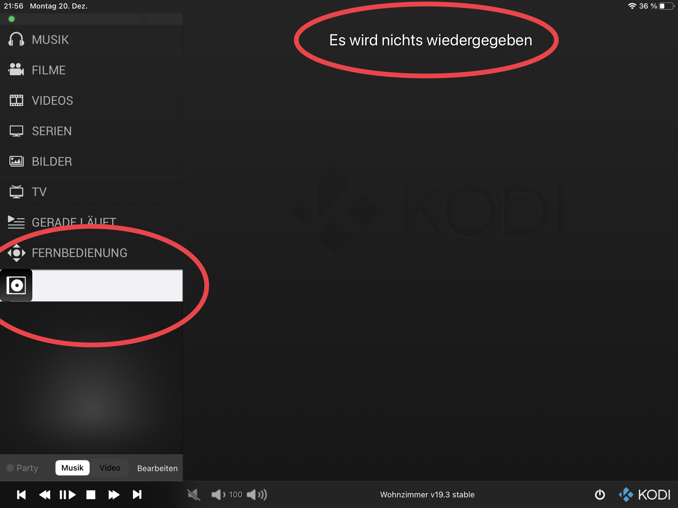
Since a while I was searching for a good way to remove the connection status icon for iPad from the menu list. I found this somehow disconnected from the toolbar where the server list can be opened. Now I came up with this solution. Still not ideal, but in my opinion better than before. If you have good ideas where to place the status icon, let me know.

Screenshots: https://abload.de/img/bildschirmfoto2021-1284jbl.png
Reply
Hi @Buschel,
As I mentioned before, not only the indicator is disconnected from the bottom toolbar, but also the server selection from the on/off button.
Maybe you can group now everything together? If I remember it correctly, you wrote in a previous answer that this is already implemented differently on iPhones…

My recommended solution:
Wouldn’t it be good to simply color the on/off button according to the current status instead of a separate indicator?
  1. White = status unknown
  2. Red = disconnected from server
  3. Green = connection established

And, while you are cleaning up the UI -what I really appreciate- could you remove this ugly text showing up prominently on top of the screen when nothing is playing? And this empty entry in case the playlist is empty?
Image

Thanks in advance, as always…
Ulf
Reply
I can try to change power buttons color and Share few screenshots. The button might be hard to read though and it is not picking up the icon’s design from the server list. But let‘s see…

How do you get this weird empty playlist entry? For me it looks like in the screenshot I just shared in my last post.
Reply
(2021-12-20, 23:12)Buschel Wrote: I can try to change power buttons color and Share few screenshots. The button might be hard to read though and it is not picking up the icon’s design from the server list. But let‘s see…
At least move the LED icon close to the power button, if the coloring option does not show the results I’m expecting.
Quote:How do you get this weird empty playlist entry? For me it looks like in the screenshot I just shared in my last post.
Also not better Wink since this replicates somehow this useless text I mentioned in my previous post.
Maybe the entry is related to the startup video my Kodi skin is playing at startup? But this is the music playlist, which is empty! I have no further clues…
Reply
(2021-12-20, 23:35)UlfSchmidt Wrote: Also not better Wink since this replicates somehow this useless text I mentioned in my previous post.
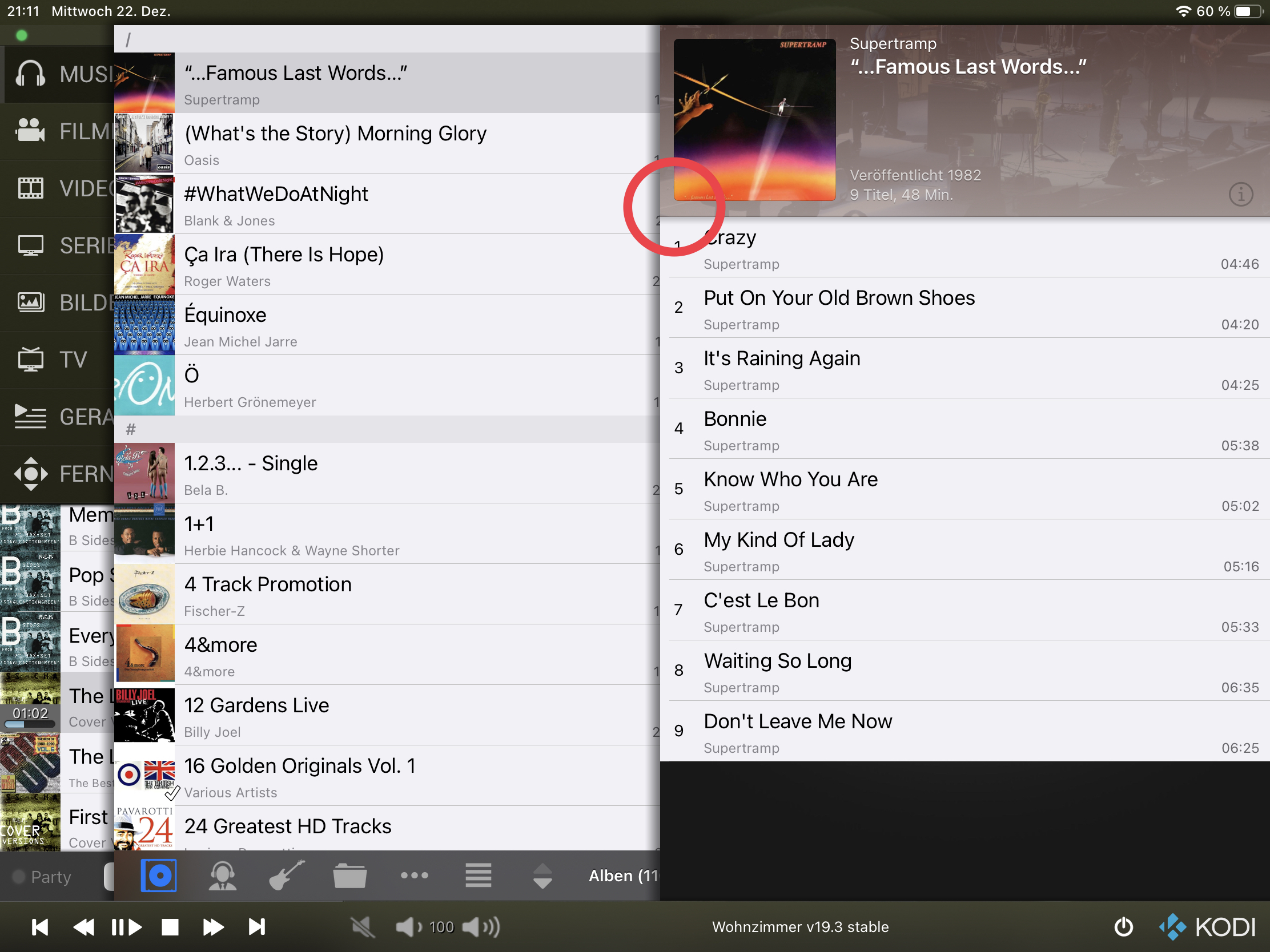
I think it is already a lot better as it does not show the empty playlist item.
(2021-12-20, 23:35)UlfSchmidt Wrote: Maybe the entry is related to the startup video my Kodi skin is playing at startup? But this is the music playlist, which is empty! I have no further clues…
Which skin are you using and where can I configure such startup video ? I will try to reproduce this.

Here are some examples of where the connection logo could be placed:

Image
Reply
I honestly like the colored on/off icon the most. Second best in my opinion is the extra indicator on the very right of the toolbar.

My skin is Aeon Tajo, the option can be found in the second menu entry of the set-up screen.

Ulf
Reply
@UlfSchmidt 

I prefer the version with the connection status on the very right side. I feel the color power button is less readable.

Your assumption that the intro of Aeon Tajo causes the empty playlist entry is correct. Kodi simply reports this playlist entry via the API. Only thing I could do about it is filtering this out based on an assumption: files which start with "special://" (= Kodi path) shall be ignored. I am not sure if this works for other skins, so I need to get a confirmation that this prefix is sufficient to make such a decision.
Reply
Maybe it can then be seen as a minor glitch in the skin, which should empty the playlist after the intro has been shown?
I could obviously ask in the Aeon Tajo thread…
Reply
Yes, why not. I am not sure if this happens with other skins as well.

On your suggestion to remove the "Nothing is playing" text on the NowPlaying screen. I applied this change together with two more changes. First, no transparency for the Kodi logo on the NowPlaying screen (same as on iPhone). Second, more space between icon and "No items found" in playlist. Looks like this now: https://abload.de/img/bildschirmfoto2021-12cnklx.png
Reply
See here for my question in the Aeon Tajo thread…
Reply
Good morning @Buschel,
@manfeed provided a quick patch for his skin and with this modification in place the issue with the playlist is gone. So nothing to change in your App Smile
Reply
Great, thanks for the heads-up. Smile
Reply
@Buschel,
As you may remember I’m not a big fan of rounded corners, so I have them disabled (after a short period of giving them a chance Wink ).
I nevertheless today stumbled upon rounded corners (you have to look close to recognize them, I have to admit):
Image
Reply
Good catch. This happened with build 1.8.2-b4 from early November (released with 1.9). Consider this fixed (GitHub #536).
Reply
Coming back to this fancy text "Keine Einträge gefunden." (even with a dot at the end Sad ) showing an empty playlist. This does not make any sense IMHO for various reasons:
  1. One can only have found something if one searched for it before…
  2. For newcomers it is even not obvious that the area where this text is shown is reserved for playlists
So my strong recommendation is to either remove this text or replace it by something useful, like "Leere Wiedergabeliste".
And what is this grey circle standing for?

Pardon my interruption… Smile
Ulf
Reply
  • 1
  • 36
  • 37
  • 38(current)
  • 39
  • 40
  • 122

Logout Mark Read Team Forum Stats Members Help
Testflight access to beta version0