• 1
  • 60
  • 61
  • 62(current)
  • 63
  • 64
  • 122
Beta Testflight access to beta version
Hi Buschel,

Does the movie sets category on the movies view on the app use a slower function to refresh compared to the full movie list?

When I first went into that view there was initially no movie sets listed. Shortly after I got them to populate but even after subsequent refreshes it drops the list and then repopulates after a slight delay.

Refreshing the full movie list experiences no delay.
Reply
Hi @amasephy,

yes, gathering the movie sets is more complex. For each movie set another command is issued to read the amount of movies in each set. This is required to follow the Kodi UI feature to include / exclude sets with only 1 movie. But this should only occur when rebuilding the cache (e.g. after pull down to sync or an App update). Does this match what you saw?
Reply
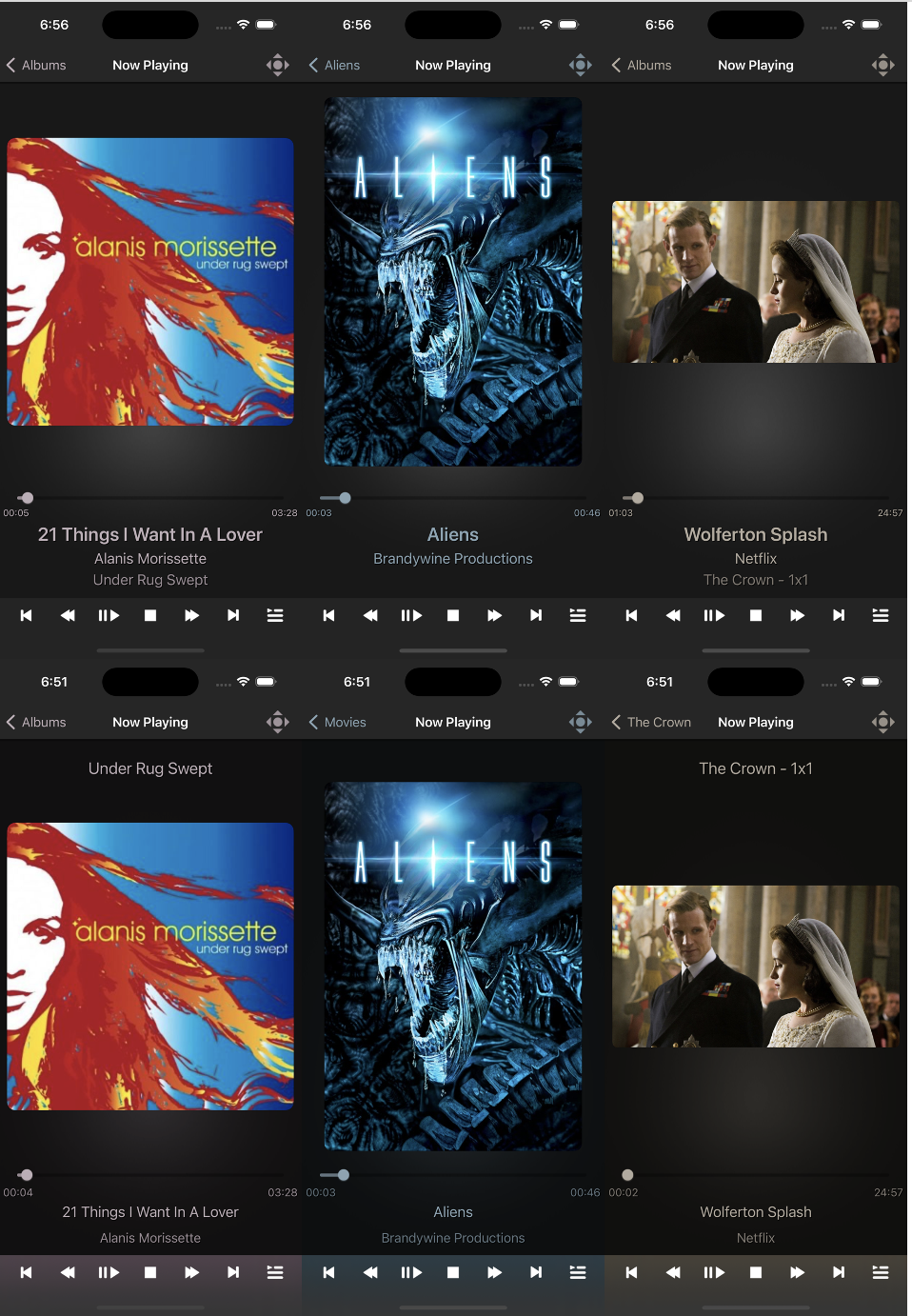
While working on fixing some problems which came in with Xcode 14 I was playing around again with the NowPlaying screen. For me the changed layout looks more natural and the key info is easier to read.  I am also thinking of adding the repeat/shuffle button on this screen as well. This will require to reduce the size of the "vertical" thumbnails (like for movies). The current layout is defined by the thumb of largest height, but to add the repeat/shuffle button the layout must have a fixed bottom position for the thumbnail.

What are your thoughts?

Image

Screenshots iPad 9th Generation: https://abload.de/img/bildschirmfoto2022-09thf9j.png
Reply
Buschel,

Yes that is right. It only happens when refreshing the cache.

A couple of notes about it. There is some other slight behavior difference regardless of the fact that it’s a slightly slower method. When refreshing the full movie list a spinner with the message “refreshing” stays visible until the list is refreshed.

When refreshing the movie list this message either doesn’t appear or is hidden from view nearly immediately and you are presented with a “No items found” for a second or two before the list gets repopulated. It might make sense to keep a spinner until the function finishes like the full movie set and not present the user with the message that there are no movie sets prematurely.

Also, one minor thing I noticed. The baked in Collection cover art for collections with missing cover art appears to be low resolution. Is it possible to get a “retina” grade art asset to replace it?

Edit: on second glance it appears the asset I speak of is being used in the list view and the block view. The block view does not have its own high resolution version.


Regarding the now playing - my opinion is that it looks better. Out of curiosity is there a reason the context back button (upper left corner) has different text between the comparison images?
Reply
My thoughts on the Now Playing screens:
  • Looks better, more natural
  • I assume that there will be changes when touching the Now Playing screen for the Details View? Or when showing any artist logo?
  • Can we use this opportunity to get rid of the (in my opinion) ugly 1x1 for tv series? For album tracks, there is also no track number shown in the Now Playing screen for good reason. So why do so for episodes?
Reply
Thanks, both. I will make these layout changes after the next release -- do not want to risk the release will late changes.
(2022-09-27, 00:23)amasephy Wrote: When refreshing the movie list this message either doesn’t appear or is hidden from view nearly immediately and you are presented with a “No items found” for a second or two before the list gets repopulated. It might make sense to keep a spinner until the function finishes like the full movie set and not present the user with the message that there are no movie sets prematurely.
Good catch! I was not seeing this on my setup as I have to few movies in my list. There is obviously a problem when detecting the end of the post processing. I have a quick fix already, but need to take some time to review and test this properly.
(2022-09-27, 00:23)amasephy Wrote: Edit: on second glance it appears the asset I speak of is being used in the list view and the block view. The block view does not have its own high resolution version.
I did a quick check and the image resolutions are as expected and same as for other default thumbs (e.g. movies). I need to take a deeper look.
(2022-09-27, 00:23)amasephy Wrote: Out of curiosity is there a reason the context back button (upper left corner) has different text between the comparison images?
Oh, while making the screenshots I was for most likely not following the same steps. As you can enter the NowPlay screen from anywhere it might just show different "origins".
(2022-09-27, 05:02)UlfSchmidt Wrote: [assume that there will be changes when touching the Now Playing screen for the Details View? Or when showing any artist logo?
You refer to the overlay when clicking the thumb? Yes, this would change as well when I will find a place for the repeat/shuffle buttons. In this case the overlay will not have the repeat/shuffle buttons at its lower end. I also need to see where I can add the "HiRes" audio icon this this case. I will need to play around with this for a while.
(2022-09-27, 05:02)UlfSchmidt Wrote: Can we use this opportunity to get rid of the (in my opinion) ugly 1x1 for tv series? For album tracks, there is also no track number shown in the Now Playing screen for good reason. So why do so for episodes?
Yes, this can be changed to "The Crown" or "The Crown - S1E1". But keep in mind that in the episode list view still "1x01. Wolferton Splash" is shown. This one I cannot change, Kodi sends this string.
Reply
Thanks Buschel.

On my end at least the art I speak of does not have a crisp outline. It looks blurry as if it’s being upscaled.


To echo UlfSchmidt’s opinion I too dislike the 1x1 format.

My personal vote is the S1E1 format.
Reply
Yes, upscaling can be a topic. I don‘t I have all icons in high resolution, as far as I remember. If this is a problem, I can probably ask someone from the Kodi Team.
Reply
(2022-09-27, 12:45)amasephy Wrote: To echo UlfSchmidt’s opinion I too dislike the 1x1 format.

My personal vote is the S1E1 format.
I guess the "1x1" was used as language independent solution. "S1E1" is derived from Season 1 Episode 1 -- this abbreviation is assuming English (also works for other languages though). On the other the "S1E1" format is also requested when naming the video files before scanning them.
Reply
@amasephy @Buschel
My proposal:
I would really like to see the 1x1 or s1e1 or whatever removed completely from the Now Playing screen. It would be still there in the Playlist, and that remains sufficient. And it would harmonize the behavior with album tracks and their Playlists, where the track number is also only shown in the Playlist, but not in the Now Playing screen.
What do you think?
Reply
Good call on that Buschel. I tend to forget about the the fact that the app has to support many languages.

If Kodi server requests episodes be in the format I prefer for the scan to library function to work it seems like there would be minimal harm but certainly not my call.

Maybe you could make an option that would be user selectable that would use a particular format wherever this string is used in the app? Not looking to make this more complicated than it needs to be for you though!

If that it too much to deal with then I don’t see any harm in going with what @UlfSchmidt likes. You’ll still see the season-episode in the playlist just not on the now playing. Episode title seems sufficient in that context.
Reply
Your point on consistency is a good one, and the playlist definitely still shows the 1x1 style label as sent by Kodi.
Reply
Buschel,

Since we are discussing the Now Playing screen I’m wondering how you feel about changing an aspect of the info overlay that pops up if you tap the current episode art.

Tapping it brings it up. Makes sense. What do you think about simply taping it again to dismiss instead of having to tap on the X. I feel like apps have taught me to do this so when this app doesn’t let me it feels awkward. Maybe pad the loop and random button area to prevent accidental dismal if you decide to test some sort of implementation?
Reply
Good idea in my opinion too! If there are no longer any buttons associated with the overlay, this would make sense.
Reply
Well, there is still another button in the overlay: the clearlogo. If you click this and another clearart is available, it will toggle between them. I always found this feature a bit too well hidden, but I am sure some users will miss this. I should be able to handle this somehow.
Reply
  • 1
  • 60
  • 61
  • 62(current)
  • 63
  • 64
  • 122

Logout Mark Read Team Forum Stats Members Help
Testflight access to beta version0