2013-03-15, 13:08
2013-03-15, 13:10
(2013-03-15, 13:08)Tolriq Wrote: Not really an innovative concept :p
not really a constructive comment

2013-03-15, 14:59
2013-03-15, 21:25
2013-03-16, 08:06
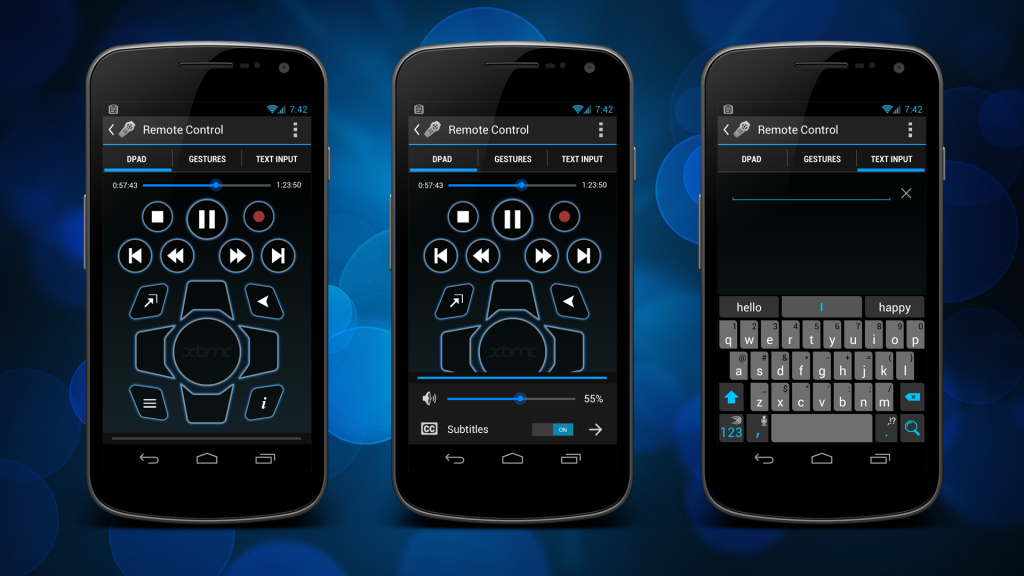
Redone Playlist view changes are List Items have a dark background instead of being transparent.
Also added a persistent "Now Playing" Item to the bottom of all section except the remote control, that allows quick pause/play and clicking the main item would take you to the remote control
Again click here for the really big image (stupid forum)

Also added a persistent "Now Playing" Item to the bottom of all section except the remote control, that allows quick pause/play and clicking the main item would take you to the remote control
Again click here for the really big image (stupid forum)

2013-03-16, 10:57
I really like your designs - they look great
Wouldn't this be better in the notification area?
(2013-03-16, 08:06)Jezz_X Wrote: Also added a persistent "Now Playing" Item to the bottom of all section except the remote control, that allows quick pause/play and clicking the main item would take you to the remote control
Wouldn't this be better in the notification area?
2013-03-16, 12:59
2013-03-18, 03:21
(2013-03-15, 14:59)Jezz_X Wrote:(2013-03-15, 13:08)Tolriq Wrote: Not really an innovative concept :p
Don't recall saying that it was :-P it's just a android standard these days and different from the first way I posted :-)
And just for the record I've never installed your remote app
The only Android apps that do this are Facebook and Youtube. Both of them, in my experience, are horrible.
I prefer the previous version where you would have the button on the actionbar. Great work on the remote part thou, seems much more refined
 Also, I'd say you should use ICS+'s option for rich notifications. It's one of the best features that ever hit Android, so it would be a shame to leave them out because some of the older phones can't run them.
2013-03-18, 07:01
(2013-03-18, 03:21)MartijnGP Wrote: The only Android apps that do this are Facebook and Youtube. Both of them, in my experience, are horrible.
I have about 10 apps (yeah its a rounded guess) on my phone that use this side slide out method, and is basically there so when you scale phone screen size apps up to 10 inch tablet landscape size you can make the side bar visible all the time and maintain the same navigation layout
And just to prove a point here is a few ( because I'm petty like that lol )
Google+ http://imageshack.us/a/img69/1718/screen...815595.png
Beautiful widgets http://imageshack.us/a/img825/2037/scree...816000.png
Series Guide http://imageshack.us/a/img13/4247/screen...816002.png
Google Currents http://imageshack.us/a/img716/5267/scree...816014.png
Pocket Casts http://imageshack.us/a/img18/2369/screen...816055.png
And if you scroll down a little on this page http://developer.android.com/design/patt...onbar.html its under the heading "Drawers"
And a little more info http://www.androiduipatterns.com/2012/06...ation.html
2013-03-18, 11:37
IIRC the sliding menu was first introduced by the facebook team with their ipad facebook app. All the others have taken inspiration from this app (including me).
2013-03-20, 07:05
Imitation is the sincerest form of flattery 
Everything looks great. The only thing I do not like is the remote buttons design but that's just me. I would still use the app 100%

Everything looks great. The only thing I do not like is the remote buttons design but that's just me. I would still use the app 100%
2013-03-21, 20:08
Yeah I love the look of this except the buttons as well. They look like they should be on a Star Trek phaser or something like that from the 90s.
Looking forward to this app though, don't get me wrong!
Is this actually in development or just a concept?
Looking forward to this app though, don't get me wrong!
Is this actually in development or just a concept?
2013-03-22, 03:52
Funny, the buttons are my favorite part. You say it looks like something on a phaser as if that's a bad thing...
Looks really really nice!!!
One question- will you be including any icons, and therefore a method of Searching in the media libraries?
I know this feature is not currently in the XBMC remote app, and has probably been talked about 100 times. But will you be designing with it in mind? (I don't know if they have plans to add this feature). It's the only reason I use Yatse at the moment, a great app but it's called Yatse!! :p fickle I know! But when I look at my phone, what Im looking for is an XBMC icon and the words "XBMC remote"!


