• 1
  • 123
  • 124
  • 125(current)
  • 126
  • 127
Beta Testflight access to beta version
I now checked the translation on iPad and Phone simulator (17.2) as well. I confirm it shows the default English translation instead of the US one in the settings. An iPad/iPod simulator (15.5) worked well.
@kambala, is there anything known about changes in iOS 17 on how the localization in root is used?

On the duplicate searchbars: Anything is possible Smile
I just do not want to spend time on changing this, as I would need the dynamically change the layout for this and re-test many corner cases. It requires to remove the underlying searchbar and move down the pull-to-sync screen, at the same time changing view insets and take into account all the use-cases.
Reply
Hi @Buschel

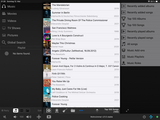
Image

Is this by intention, that there is now always a somehow darkened and useless (previously accessed) menu shown right from the active menu on the iPad? 🤔
If yes, please explain.
If no, I found a regression. Sad

Another thing I also find confusing is that the options to toggle between list and cover view and to define the sort order look completely similar to the different submenus. Is there any possibility to separate these at least a little bit from the submenus? Especially since they appear and disappear depending on the submenu selected… 😳

And a third thing: what has been changed with respect to the search bar? I don’t see any difference… or is this just iPhones?
Reply
1. The weird darkened menu is not by design and I am seeing this the first time. Can you share details on how to get there, and which device and iOS you‘re using?
2. Sorry, I am not sure what you mean. Can you share screenshots to explain? Only thing that was changed (already in earlier builds) is a new icon for playlists which looks similar to the grid/list toggle button. Or is this a comment not related to recent changes?
3. No, searchbars should basically work same. There was internal refactoring done which impacts both iPad and iPhone to reduce the complexity of the implementation and by that avoid some glitches.
Reply
(2024-05-12, 21:59)Buschel Wrote: 1. The weird darkened menu is not by design and I am seeing this the first time. Can you share details on how to get there, and which device and iOS you‘re using?
Just navigate a little bit thru your archive on an iPad with iPadOS 17.4.1. One simple way is to open TV Shows and then toggle between list and cover views. But any other uses of the submenus will do either, e.g. using the "three dots" submenu on Music…
Quote:2. Sorry, I am not sure what you mean. Can you share screenshots to explain? Only thing that was changed (already in earlier builds) is a new icon for playlists which looks similar to the grid/list toggle button.
Maybe I missed this change, but both buttons are so similarly looking and have a completely different functionality. In my opinion not a good choice for an intuitive user experience. Maybe you should color the toggle buttons differently or separate them a little but from the others?
Quote:3. No, searchbars should basically work same. There was internal refactoring done which impacts both iPad and iPhone to reduce the complexity of the implementation and by that avoid some glitches.
OK. Then I can confirm that these still work on iPads as before.
Reply
Ok makes sense. You did say before you don’t want to spend time on fixing the duplicate search bar. I agree, not worth the hassle of opening up regressions. 🙂
Reply
Related to the search bar - on iPad the oversized bar is now fixed. 👍🏻

Also on iPad - I see UlfSchmidts dark panel problem. Just bring up a library view and pull that menu to the left side of the screen. You’ll see the dark pane reveal itself on the right. Probably related to the search bar fix?


On iPhone - in library grid view the search bar is messed up. The cancel button doesn’t appear until you tap inside and focus the search bar. This is not how it worked before. It should match list view behavior.

Edit: I’m surprised none of us have noticed this one! On iPad the order of the playback buttons is wrong on the now playing panel. The seek and skip button positions are reversed. On iPhone there is no problem and the remote control views all match on both devices otherwise.
Reply
1. I can see the "dark panel" problem now as well. Pretty obvious, if you have once seen it. Already found the change which caused it -- unexpected and related to a layout cleanup. Need to dig into it. -> Fixed
2. Oversized searchbar now moved from iPad to iPhone's grid view. I see the same with iPad fullscreen. Not sure, if I can fix it. The last tests I did showed the dimensions were correctly. Looks like another issue of the App running on iOS17 as it works on iOS 15.5. This is one of these whack-a-mole moments. -> Fixed (the searchbar rework made this easy to fix now Smile )
3. The play controls, what shall I say... We're all looking somewhere else Smile -> Fixed
4. Icons in toolbar: It is not easy to find free and well-working icons. The screen where this similarity kicks in most is the Videos menu where playlist button and grid/list toggle button are neighbors. I could switch positions of playlist and add-on button to make it less confusing. I will play around a bit...
Reply
I am quite exited, following your discussion about the oversized search bars, as I never spotted them. Who can point me into the right direction? How to reproduce these on an iPad?
Reply
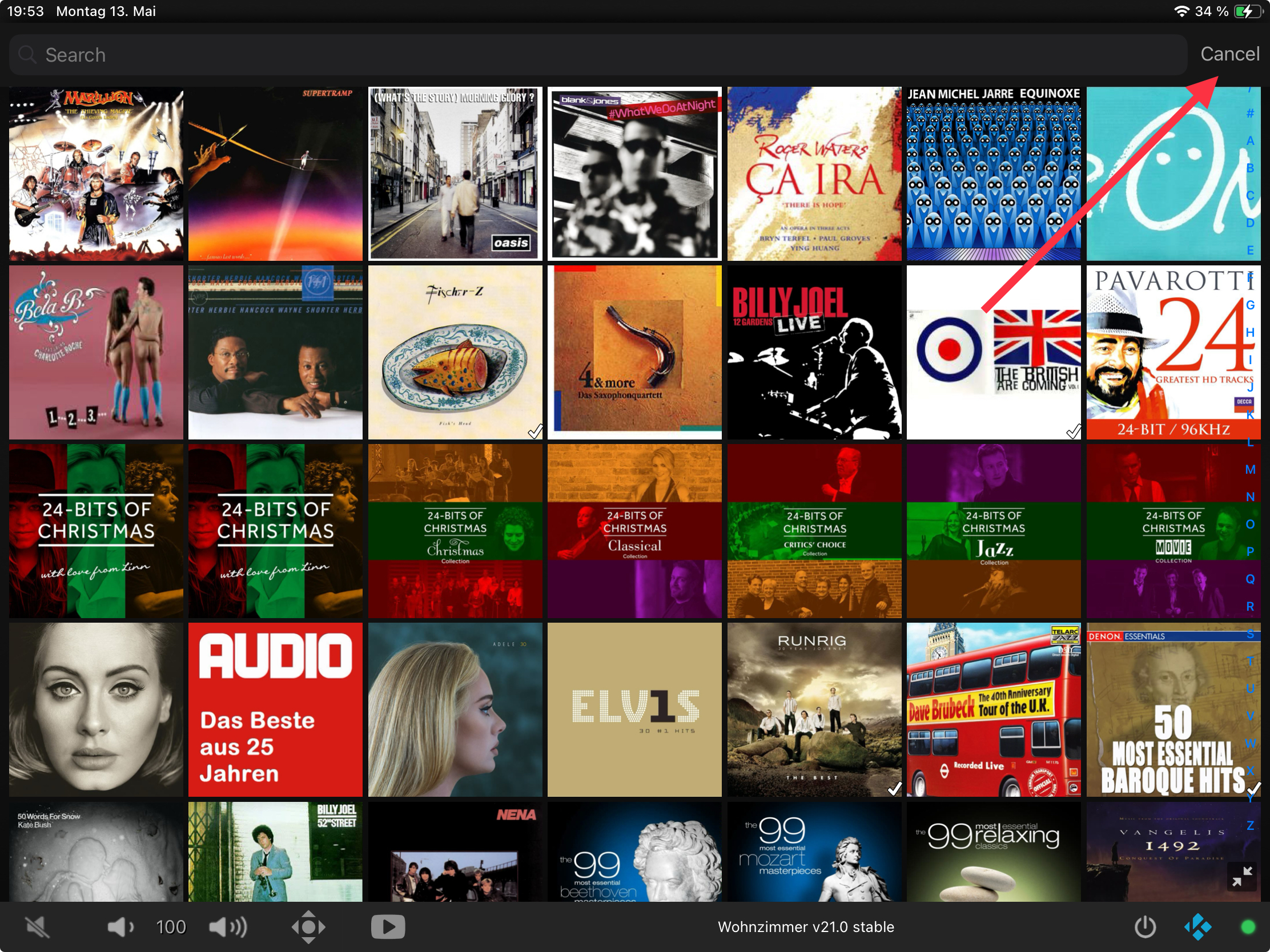
You just need to enter a grid view in fullscreen or stack view and look at the searchbar. It will not show „cancel“ as the bar is wider as the visible area.
Reply
(2024-05-13, 11:37)Buschel Wrote: You just need to enter a grid view in fullscreen or stack view and look at the searchbar. It will not show „cancel“ as the bar is wider as the visible area.

I still don’t understand the issue:
Image
Reply
Which iOS?

Edit: With iOS 17.2 simulator it looks like this: https://ibb.co/1Qrg7tj
Reply
Still on iPadOS 17.4.1
Reply
(2024-05-13, 19:57)Buschel Wrote: Edit: With iOS 17.2 simulator it looks like this: https://ibb.co/1Qrg7tj

Maybe depending on the screen size and/or resolution? This is an iPad Air 3. Gen
Reply
Just loaded the iPad Air 3rd Gen simulator with iOS 17.2. Does show the same issue as in the screenshot I was sharing. Not sure why you're lucky. Maybe you already rolled back to an older app version?
Reply
No! At least I think it’s the current TestFlight version:
Version: 1.15 (4414)

But I just realized that I have to explicitly tap on the search bar to make the Cancel button visible. Is this the whole thing? 😳
Reply
  • 1
  • 123
  • 124
  • 125(current)
  • 126
  • 127

Logout Mark Read Team Forum Stats Members Help
Testflight access to beta version0