2021-07-12, 05:11
the 1.5 speed button doesn't work I tap on it but nothing happens btw for the recent update
(2021-07-12, 07:13)Aaiemron Wrote: The text " Recently added TVshows" is a bit overlapping the border op the poster as you can see.
 I wanted to make margins between one and second row less. And main concept was to Focus on poster, so text don't need to be fully visible

(2021-07-11, 22:27)jokero009 Wrote: I'm sorry that I started bothering you so often..I found another problem( Perhaps you also noticed it...)When switching from 1 to 6 of the widget, this is the problem unfortunately( The posters are cut off and if you go further, it simply does not show the postersBut I just created new icons and added widgets there) So in principle this is not a problem
 Don't worry!) I just created additional icons for the widgets .. But mostly it's very beautiful! In the afternoon it's even more beautiful!) I don't even know why .. Everything works fine) The only one is all kinds of widgets (posters, landscape, banner and etc) All have a black line above and below which spoils the impression a little. I noticed that the posters in your videos are short and very neat and they are not as long as, for example, I see in my home .. I really like such posters as in your video!) Please tell me how to do something similar with posters? And about the black lines ... And I also noticed that when the trailer is turned on, the poster or landscape of the movie in which the trailer is turned on disappears from view in the widgets, that is, it is not fixed along with the trailer)
(2021-07-12, 08:59)jokero009 Wrote: This is no longer criticalDon't worry!) I just created additional icons for the widgets .. But mostly it's very beautiful! In the afternoon it's even more beautiful!) I don't even know why .. Everything works fine) The only one is all kinds of widgets (posters, landscape, banner and etc) All have a black line above and below which spoils the impression a little. I noticed that the posters in your videos are short and very neat and they are not as long as, for example, I see in my home .. I really like such posters as in your video!) Please tell me how to do something similar with posters? And about the black lines ... And I also noticed that when the trailer is turned on, the poster or landscape of the movie in which the trailer is turned on disappears from view in the widgets, that is, it is not fixed along with the trailer)
(2021-07-12, 09:17)jokero009 Wrote: Thanks a lot! And how can I shorten the posters! I noticed that I have them long and large and yours are miniature and neat. You can say such as in the original Netflix)You can try to regenerate skin-shortcuts.

 Now I'll check it and I'll do as you said) But I to my mind I even reinstalled it from scratch and still the posters are different for some reason (But I will try to finish it! Thank you very much for prompting
  If this helps you I'll write right away!)


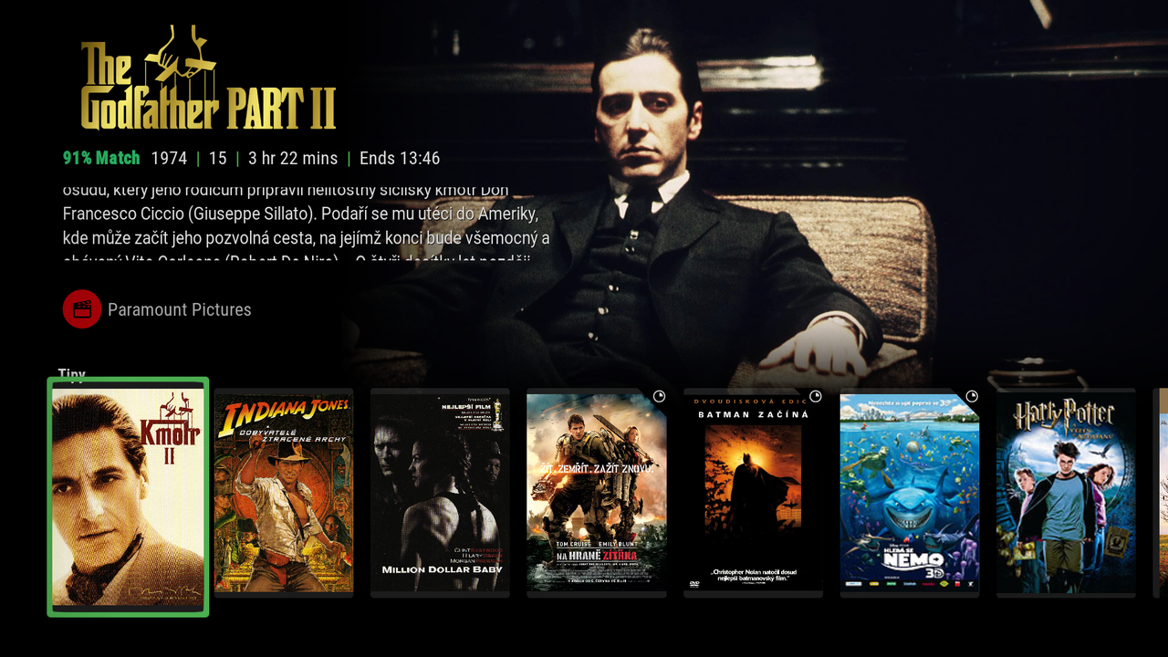
(2021-07-12, 10:40)jokero009 Wrote: I put a poster view on all the widgets and it looks like this now..)I now understand, probably because of the strip, it seems longer and longer than in the video) That is, whether to compare these two screenshots.)Can you enable "Bold" selectbox? Skin settings > furniture > choose between focus border sizes > Bold
The second screenshot is what I did from your video)