• 1
  • 16
  • 17
  • 18(current)
  • 19
  • 20
  • 39
[WIP] Welo - a new skin for XBMC in the making
While the icons are much better than the previous ones. I think I have to agree that they're a bit to bland. But as long as there's an option to turn them off it should be fine. Besides, someone can always come along and start modding everything to how they want it after (That's my intention at least).

liquidskin76 Wrote:Image

This is the only one I find unnecessary. If you want it to stay, I would remove it from behind the "box". Seems odd to have the dialog box as and over lay for an icon.

Hitcher Wrote:Image


This is much more fitting. As I said before though. Icons like this can be modded in later if someone wants to.

Hitcher Wrote:I disagree, this is intentional white space.
I like white space. To much clutter on a TV is a bad thing.
Image
MarkTaunton Wrote:The icons themselves are ok (ish) but they look out of my place in my point of view. The space between the whole thing is too vast.

I just do not think that the icons suit the skin at all. I have for example painted a room red and then think ok it is a good job, but then I realised that I made a mistake and blue would be better.

Personally I hate the icons full stop and prefer the posters, but as they currently are, it all just makes the skin look too dark.

The icons if they do have to stay (spits) need some colour and filling out more.

I honestly do not think that icons work with this skin.

Regards

Mark

I think the icons themselves are ok, but its a bit boring. Its clean though. I dont know if a tv image etc fixes it. It gets less boring, but the icons are really universal.

Anyway, If I should do this I would get crazy with all the choices.

edit: after I posted this I checked the topic start and I think you should definately use the posters in the front row, that mockup looks amazing!
Metsadah Wrote:edit: after I posted this I checked the topic start and I think you should definately use the posters in the front row, that mockup looks amazing!

The posters (recently added or random) was always going to stay and be the default option. No worries there! Nod
liquidskin76,
I think your icon design mockup is perfect. With the ability to retain the recently add movie poster in place of the icon the best compromise between those that like it and those that doesn't. Plus, the icons provide the balance the GUI needs once you go into the system's menu.

The concept with the 3D image with the graphics inside changing is cheesy IMHO and detracts from what I feel this skin is.

Keep up the great work.

-Dazex
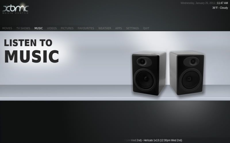
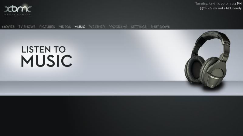
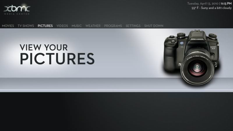
I think realistic looking icons could be a good idea, or chenge the image on a tv depending on what you choose in the menu.

Maybe something like this:

Image
PointOfView Nvidia ION Atom 330 - TRANSCEND 2GB DDR2 DIMM 800MHz - G.SKILL 64GB SSD 2.5
Open Elec Beta4 1.95.4
XBMC Online Manual - HOW-TO post about a problem in a useful manner - Create/View Bug Report
Setup/Fix correct resolution on XBMC/Ubuntu - Usefull linux terminal commands
The-Boxhead Wrote:I think realistic looking icons could be a good idea, or chenge the image on a tv depending on what you choose in the menu.

Maybe something like this:

Image

Agreed. That's pretty
Image
I honestly think realistic/photographic icons might be the way to go for this. Seems to give it more life.

Something like this maybe? Ignore my photoshop skills
Image

I'll stop bombarding you with my opinion now though Laugh
Image
DPickles Wrote:I honestly think realistic/photographic icons might be the way to go for this. Seems to give it more life.

Something like this maybe? Ignore my photoshop skills
Image

I'll stop bombarding you with my opinion now though Laugh

That actually works perfectly, imo.
I like the realistic icons as well.
OK so I can't sleep so had a quick mess around just to show what I mean

1. The watch your videos has been put in the middle so less space
2. A colorful icon was used rather than black and white to break up the skin and give it a bit of colour.

Image
I'm not a newbie. I always act this dumb.

Home Cinema Setup
-------------------
37 inch TV - Intel I3 530 @ 2.9GHZ - 4 Gig Memory - Silverstone home cinema case (silver)
I think giving it some color would look good too... but photo-realistic is definitely more fitting for the overall look & feel of the theme.
I'm not an expert but I play one at work.
MarkTaunton Wrote:Image

Painting Mona Lisa with a mustache? Big Grin


I would also prefer the realistic ones
LOL since everyone is posting mock-ups here is mine:
Image
Image
liquidskin76

If I was you I would give your home icons there own directory and allow the user to easily change them

Something to be said for developing in private lol
Hey X,

Yeah, i've been thinking a similar thing. I think for the release i may leave it icon free, and code it so the user can create a folder called icon in the skin media folder, and place their icons in there.

That way as long as the icon canvas is the correct size and the icons are named correctly they will appear fine.

Cheers
  • 1
  • 16
  • 17
  • 18(current)
  • 19
  • 20
  • 39

Logout Mark Read Team Forum Stats Members Help
[WIP] Welo - a new skin for XBMC in the making4