Posts: 3,379
Joined: Feb 2009
Reputation:
15
mcborzu
Skilled Skinner
Posts: 3,379
Looks very cool as I said before...I did the same thing you did and found it easier to use a skin I like as a base(I used Alaska) rather than use the empty skin. Found it easier to figure stuff out if there was stuff on the screen to manipulate unlike the 'empty' skin.
Anyways keep it up looks good!
Check out Night - A Skin For XBMC
Posts: 1,234
Joined: Nov 2008
Reputation:
5
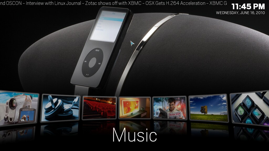
It is nice to see a new take on the homepage, which I personally feel is the hardest concept to come up with.
The only downside of your's is that the focused item is also the furthest one away. Maybe add a slight zoom animation to the focused icon to make it stand out more. Nice looking though.
Posts: 737
Joined: May 2010
Reputation:
6
ha i would love to say that the home menu was my idea but its ported from TGX's blackglassNova thats why i am calling it Nova for now he had a cool home menu but don't like the rest of his skin. this home menu is not the default just the home menu i have been working on i think i have a good idea for the default home menu
Posts: 93
Joined: Jan 2009
Reputation:
0
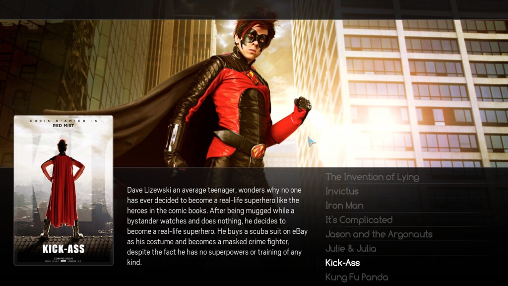
looks really great. I Like your home and list view, nice and clean. I would love to see a bigger wall view. Less fanart and more covers. Although it is a somewhat new approach, but i think it's not that practical to navigate. Good luck with building, anxious to see more views.
Posts: 265
Joined: Dec 2009
Reputation:
0
Looks good from the home screen, but I have to admit that I was at first excited by Night, but after trying it, it was not used again.
It is nothing to do with Night or this mod personally, but if you have a more modern PC, then there are better skins out there.
I have mentioned in some of my posts before that personally I hate simple skins, but one skin that is simple and yet has captured me by it's simpleness is Shade.
I love the front screen though, that is a very nice home display, it is a shame that the rest of the skin, does not match the front display, then you would be onto a winner.
I love the idea of having a bigger trailer display, this is pretty much out of the box thinking, which I love, but sadly for most of it I shall give you an example
Ford make a motor car, but it is in black, but then hey we have suddenly designed the same car, but this time in grey, hey guess what folks, in might be 10 years later, but we have developed the same car, but this time in green, 20 years later, hey folks we have designed the same car but this time in red. Hell it took us a long time to develop the paint, but has it all been worth producing the same car for 20 odd years?
Big up for you for the work you are doing though.
Regards
Mark
Posts: 28
Joined: May 2010
Reputation:
0
Very nice! Keep up the great work. Love the very clean, simplistic design. I'd definitely put the reflection on screenshots 3 and 4 like you have on the homescreen. Keep it clean and keep it fast and you've got yourself a real winner here.
Posts: 3,379
Joined: Feb 2009
Reputation:
15
mcborzu
Skilled Skinner
Posts: 3,379
I googled "blackglassNova", that skin has some nice screens, a lot of low list looks, if you're using that as an inspiration it seems to have a nice look to it...
Check out Night - A Skin For XBMC
Posts: 1,617
Joined: Jul 2009
Reputation:
11
Is that home screen a "working" xbmc screen? I'd love to that animation code if it is!
To learn more, click
here.
Posts: 17,415
Joined: Aug 2007
Reputation:
590
Hitcher
Team-Kodi Member
Posts: 17,415
It doesn't animate from what I've seen.
Posts: 737
Joined: May 2010
Reputation:
6
2010-06-18, 22:46
(This post was last modified: 2010-06-20, 21:33 by ZombieRobot.)
it needs to be animated .........was having trouble with that also needs some font color changed recently added fixed I Replaced the onright and onleft which activated it.and there is a image in the wrong xml its in the home when it should be in home horizontal so its displaying in both home menus.






 i can imagine pressing down and go thru the submenus like alaska... lovely!

