Guest - Testers are needed for the reworked CDateTime core component. See... https://forum.kodi.tv/showthread.php?tid=378981 (September 29) x
Arctic: Zephyr Customizing (Pictures, Codes)
#16
Hey locomot1f,
is it possible for you to do a description of the settings you already got an idea for what elements it is?

Thanks,
Steffen
Reply
#17
(2015-03-08, 02:03)jurialmunkey Wrote: It is a little more complicated as I wasn't really intending for much colour customisation but I'll give you a run down of what each element is.
All the main colour elements come in four strengths varying from very transparent to opaque.

The stuff at the top Black,Red,Blue,Green is just for system stuff, so unimportant - leave this as is.

"Highlight" is the blue colour used throughout the skin.
"Highlight2" is the pink colour used for selected items (e.g. current playing channel in epg)
"Selected" is the colour of text and item will have if it uses the highlight colour for focus boxes.

"Dark" colours are for text elements that sit on the background. e.g. the media flags at the bottom, or unfocused list items, plot in media info etc.
"Light" is used for elements that sit on top of Dark colours, e.g. list focused item text or HD/SD flag in the circle bottom left.

White/Black colours (e.g. Black30 etc.) are used for dialogs.
The exception is Black12 which needs to stay as is and shouldn't be changed (complicated reasons).

Panel is the colour of the panel behind things like the settings windows or the system info, file manager etc.
PanelWhite are the colours used for text etc. when there is this backing panel.

is this what you mean?
Linux Mint 18 LTS 64-bit - Kodi 17 Beta6
Odroid-C2 - Libreelec v7.90.009
Reply
#18
@mag77: How can i use your customizing?
Reply
#19
Love the skin but my favourite view I've been using for ages on Aeon Nox is missing (I admit it probably doesn't really fit the skin).

Either way I've been hacking myself though the XMLs a bit today:

Image

It's still messy but looks at least kind of like what I had in Aeon Nox.
Reply
#20
(2015-04-19, 14:54)desu Wrote: It's still messy but looks at least kind of like what I had in Aeon Nox.

I miss this view too, could you share your work, or even better create a pr at github for inclusion at the skin Smile
Reply
#21
Not sure if jurialmunkey would like to have a view like this in his skin as I feel it's kind out of place and breaks with the way all other views are designed.

Either way, right now its just something I hacked together which is not working perfectly. When I got a little more time I need to figure out some more things about how to get everything done.

If I got everything figured I'll post it here, will probably be a while though.
Reply
#22
(2015-03-06, 14:03)magy77 Wrote: Hey guys,

share your customized acrtic: zephyr with us.
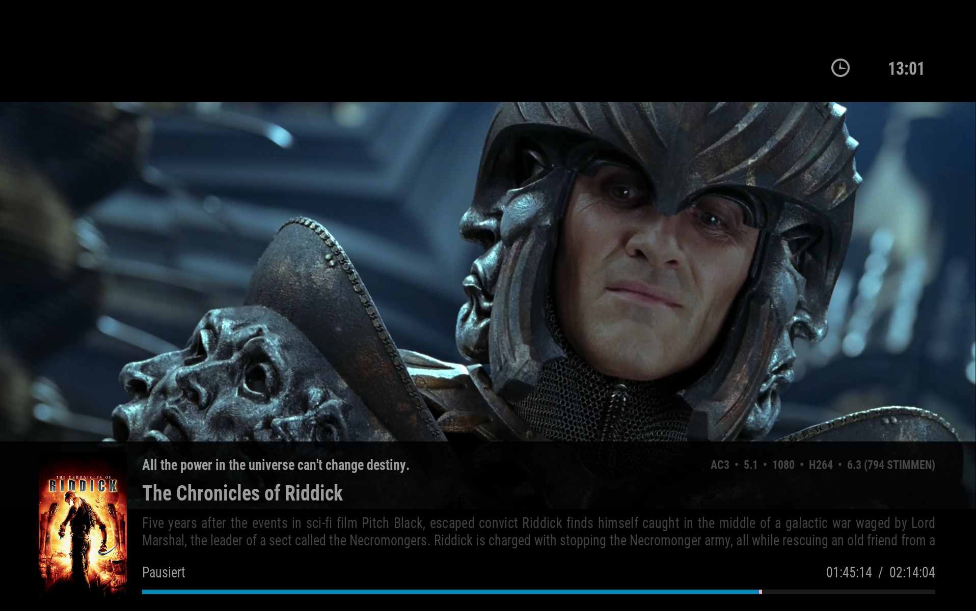
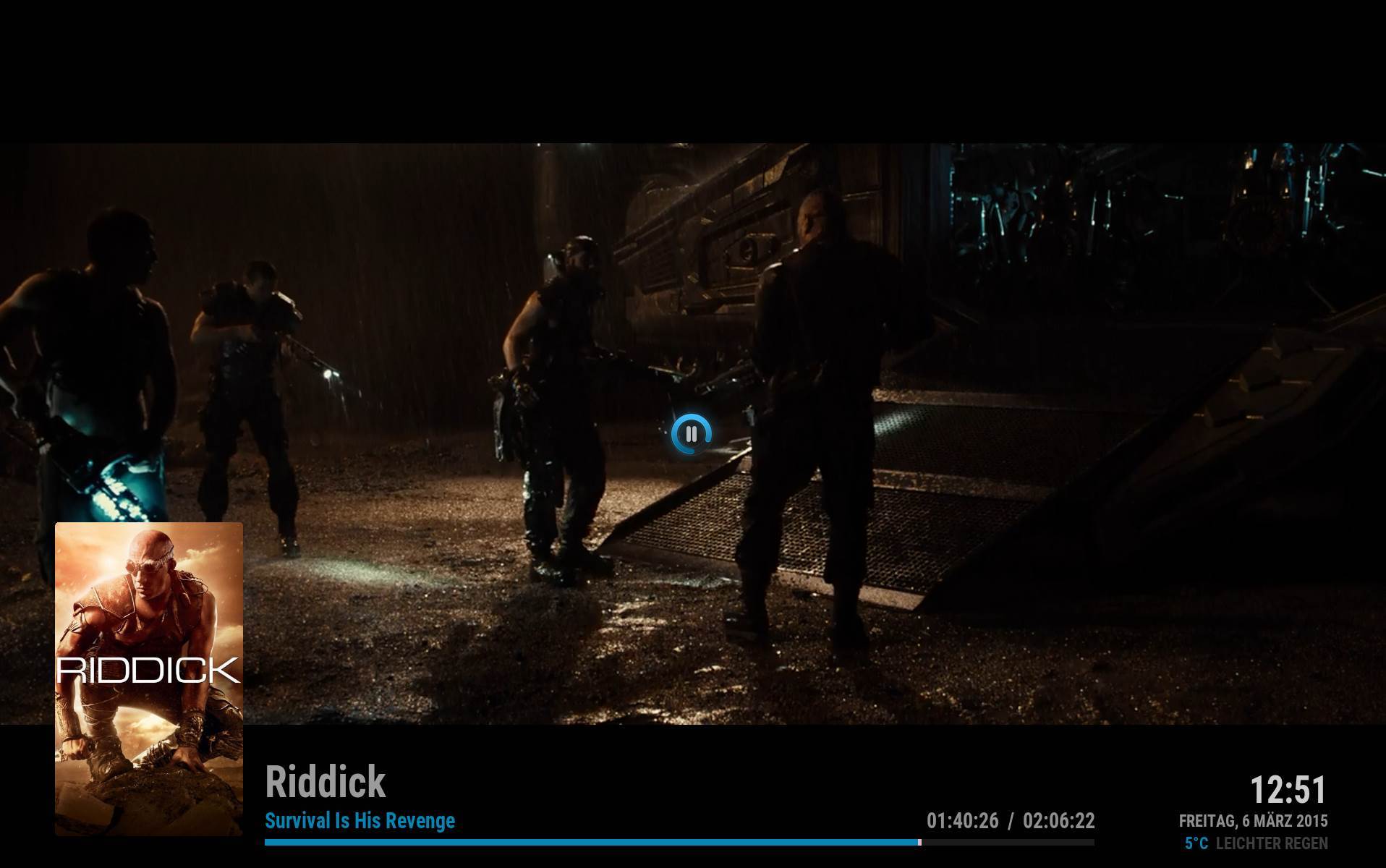
Let me start. so i switched from this:

Image

to this:

Image

Thx to Gary!

How have this pause center of the screen?
Reply
#23
(2015-04-19, 14:54)desu Wrote: Love the skin but my favourite view I've been using for ages on Aeon Nox is missing (I admit it probably doesn't really fit the skin).

Either way I've been hacking myself though the XMLs a bit today:

Image

It's still messy but looks at least kind of like what I had in Aeon Nox.

I really miss this view too, especially for TV shows.

Additionally to this i miss also:
- DVD live cases background
- Possibility to change background transparency... i would like to have more transparency.
Reply
#24
(2015-04-25, 16:10)iorifly Wrote: How have this pause center of the screen?

Did it by myself with some help from jurial
Reply
#25
I think he asked you to remove the pause icon in the middle of the screen. Wink
I am sure he wrote it over some google translator. Wink
Reply
#26
i dont think so, i think he needs the code first Big Grin
Reply
#27
(2015-05-19, 18:15)magy77 Wrote: i dont think so, i think he needs the code first Big Grin

When you mentioned the code... is there any public available?
Reply
#28
@magy77: Hi, do you mind sharing the code of your pause OSD screen?
Thank you in advance Smile
Reply
#29
Someone could gently tell me how to reduce the height the bottom panel in the home? ANd how I enable icons instead of names? Thanks!
Reply
#30
(2015-05-25, 09:28)Crssi Wrote: @magy77: Hi, do you mind sharing the code of your pause OSD screen?
Thank you in advance Smile

Did anyone manage to get the Code from @magy77 ?
Reply

Logout Mark Read Team Forum Stats Members Help
Arctic: Zephyr Customizing (Pictures, Codes)1