• 1
  • 108
  • 109
  • 110(current)
  • 111
  • 112
  • 141
Req Titan skin feature requests
(2016-03-16, 01:56)Morphy99 Wrote: Hi Marcel, is there any way to view the new Jarvis feature "events" which is under system in confluence? I'm using the stable and can't see it or add it as far as I can tell.

It's situated under Settings --> System --> Logging

I will also make sure it will be selectable in the shortcut editor if you want it as a shortcut to your homemenu.
Reply
(2016-03-31, 04:43)MRMLOST Wrote: [align=left]Love Ttian, been using it for last 4 months. Only thing I would like to see added is a manual "refresh wigets" button/icon/script in the header or footer section" I apologize if this has been previously requested but I didn't notice that it was. Nod

The refresh button for widgets should be no longer needed as we've implemented some stuff skin-side and in the skinshortcuts script to auto refresh widgets. This will be available in the next beta of the skin and soon in the stable version of the skin.

If you really need a refresh button, you can add a shortcut to your main menu to Reload skin:
shortcuts editor in skin stetings --> Add --> settings --> Reload skin
Reply
(2016-04-01, 08:04)turmoggy Wrote: Is there an option to open favorites in a full screen window instead of a mini window pop up?

Yes there is, Skin settings --> Configure shortcuts --> Edit menu shortcuts
Press Add --> select Video Library --> Specials --> favourites
Reply
(2016-04-03, 20:51)AEOne Wrote: Could it be possible to have moving pictures inside the artist slideshow during music playback?
I mean like animated music wall background?

Would it be possible for you to create a small video so I can better understand what you mean ?
Reply
(2016-04-06, 22:38)Dion250 Wrote: Yes it's not there. It does exist on the Panel Square layout.. But not the Panel layout. Maybe this is a bug?

It was indeed a bug which I fixed yesterday. I will provide a new skin update asap.
Reply
(2016-04-08, 09:25)AEOne Wrote: Hello Marcel,

sorry for my request again. Angel
But I saw, that you answered yesterday a lot of inquiries and a think not mine. Wink
Dir you read this: http://forum.kodi.tv/showthread.php?tid=...pid2301006?

Could it be possible to realise that?

Thanks, AEOne

Sorry, I overlooked your post earlier and I just replied. If you can provide me a small video of how it should look likr, I'll do my best to create it.
Reply
(2016-03-26, 20:51)brazen1 Wrote: Hi. I don't have any new feature requests, but I've noticed things that should be working are not and thought I'd bring them to your attention here.

These are as of Titan 3.7.5 for v.17 Krypton understanding it is in beta.

(1) Audio and Video settings for the on screen display do not function at all.
(2) Codec info window is overlapped and unreadable.
(3) Movie Info window/actor picture/multi actor pictures/selecting any of the multi images results in black screen and hangs KODI.
(4) Editing artwork is limited to remote artwork only and local artwork is not accessible from any menu.
(5) Prefer Animated Posters (if available) has no affect and must be manually selected using another skin since local artwork is not accessible.

These bugs are not present using the default skin Estuary and all work as intended except #5 since there is no option as you have added in Titan.

This is the feature requests thread ;-)

I have a seperate thread for the Isengard testversion of the skin, would you be so kind to place your questions there ?
The version for Krypton is a very early beta as Krypton's code is still changing heavily with many changes to the skinning engine.
I am working on a bunch of fixes already so a new beta will be available within a few days.
Reply
(2016-04-09, 19:24)marcelveldt Wrote:
(2016-03-31, 04:43)MRMLOST Wrote: [align=left]Love Ttian, been using it for last 4 months. Only thing I would like to see added is a manual "refresh wigets" button/icon/script in the header or footer section" I apologize if this has been previously requested but I didn't notice that it was. Nod

The refresh button for widgets should be no longer needed as we've implemented some stuff skin-side and in the skinshortcuts script to auto refresh widgets. This will be available in the next beta of the skin and soon in the stable version of the skin.

If you really need a refresh button, you can add a shortcut to your main menu to Reload skin:
shortcuts editor in skin stetings --> Add --> settings --> Reload skin

Will there be a option to configure refresh rate? Personally I like to manually refresh, *added shortcut to reload skin in power menu
Reply
(2016-04-08, 15:11)komplex Wrote: Moved the widget to the bottom, placed the label under it and now i have all this empty space up top where the widget row used to be

New behaviour: It will fallback to the "single widget configuration" if only 1 widget exists, so not a bug but by design.
Reply
(2016-04-10, 10:15)marcelveldt Wrote: New behaviour: It will fallback to the "single widget configuration" if only 1 widget exists, so not a bug but by design.

Fixed it by adding a blank smartplaylist widget then removing the label in the skin.titan.jarvisbeta.properties file as you cant leave labels blanks from the skin settings
Back to normal :p
Image
Reply
(2016-04-10, 16:53)komplex Wrote: Fixed it by adding a blank smartplaylist widget then removing the label in the skin.titan.jarvisbeta.properties file as you cant leave labels blanks from the skin settings
Back to normal :p

haha, cool workaround ;-)

Hmmm, you should be able to set the label empty, doesn't that work ?
Reply
(2016-04-10, 18:14)marcelveldt Wrote: haha, cool workaround ;-)

Hmmm, you should be able to set the label empty, doesn't that work ?

If i leave it blank and hit OK it just stays at what it was at
Reply
(2016-04-10, 18:38)komplex Wrote: If i leave it blank and hit OK it just stays at what it was at

Just type one single space to solve it
Reply
hi marcelveldt.

how about an option letting the submenu be the widget selector?
using vertical layout it would be a natural flow, in the "moving to the right" towards the widgets, the submenu shows, then selecting submenu item loads that assigned widget.

when using 1widget only to display as many items as possible the widget selector sometimes feels a bit far to reach in the "corner".

Aint got a clue if its possible and absolutly NOT a must have =)

this skin is awesome anyhow! just something I thought could be a nice feature.

//
Richard
Reply
(2016-04-08, 00:35)marcelveldt Wrote:
(2016-03-17, 22:54)dorf Wrote: Currently, the settings for the home screen allow to either have *one* widget per home menu item (that than fills multiple rows) or *multiple* widgets per menu item (each being displayed in one row). Instead of having a global setting, is it possible to decide this for every menu item?
It wasn't possible to select this per menu item but I managed to get it working a bit like you described...
It will now fallback to the normal "single" widget if there is only 1 widget assigned.
This fix is available in next skin update.

Thank you very much for adding this fix!!

(2016-04-08, 15:11)komplex Wrote: This caused this
Image

Moved the widget to the bottom, placed the label under it and now i have all this empty space up top where the widget row used to be

(2016-04-10, 16:53)komplex Wrote:
(2016-04-10, 10:15)marcelveldt Wrote: New behaviour: It will fallback to the "single widget configuration" if only 1 widget exists, so not a bug but by design.

Fixed it by adding a blank smartplaylist widget then removing the label in the skin.titan.jarvisbeta.properties file as you cant leave labels blanks from the skin settings
Back to normal :p
Image

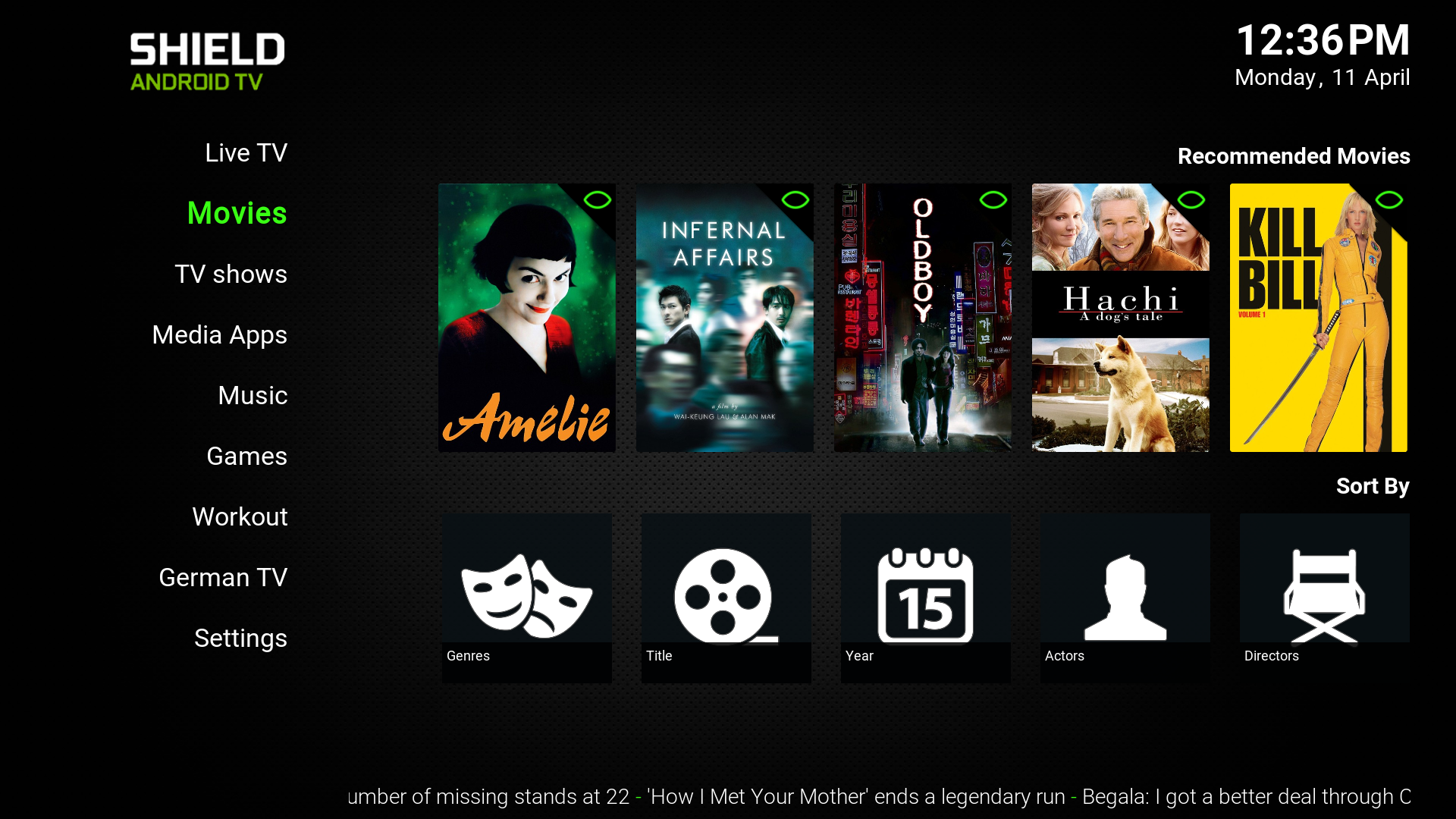
Currently there are 3 differences between "single widget" and "multiple widget"
1) different layout ("single widget" displayed on bottom right of screen, "multiple widgets" displayed on top right of screen)
2) different title design ("single widget" has title below widget, with fine lines below and above the title, "multiple widgets" have title above widget without the fine lines)
3) number of rows per widget ("single widget" displays multiple rows of items per widget, "multiple widgets" display one row of items per widget)

I think the issue is the difference in design and layout. This causes major inconsistencies when browsing the menu when some menu items have one and others have multiple widgets.
One menu item (for example movies) has its widgets in the top right of the screen (because there are 2 widgets present), then you go to the next menu item (for example add-ons) and suddenly here the widget is on far bottom right of the screen (because there is only 1 widget). This alternation between top and bottom orientation looks odd when browsing through the menu.

komplex found a workaround by adding an empty widget to a "single widget", so that that it changes the orientation from bottom to top (see above). This however also causes the single widget to only display one row again, and leaving the rest of the page empty, although the widget might have many more items it could show (for example for TV channels)

Alternative suggestion: Eliminating the the layout and design differences between "single widget" and "multiple widgets"
It would be great if the widget(s) would always be in the top right corner, with the title above it, independent from whether this menu item as a single or multiple widgets. The remaining difference between "single widget" and "multiple widget" would then be the fact that "single widget" would display *multiple rows* for the items in the widget, whereas "multiple widgets" would only display *one row* for each of the widgets.

An example:

BEFORE THE UPDATE:
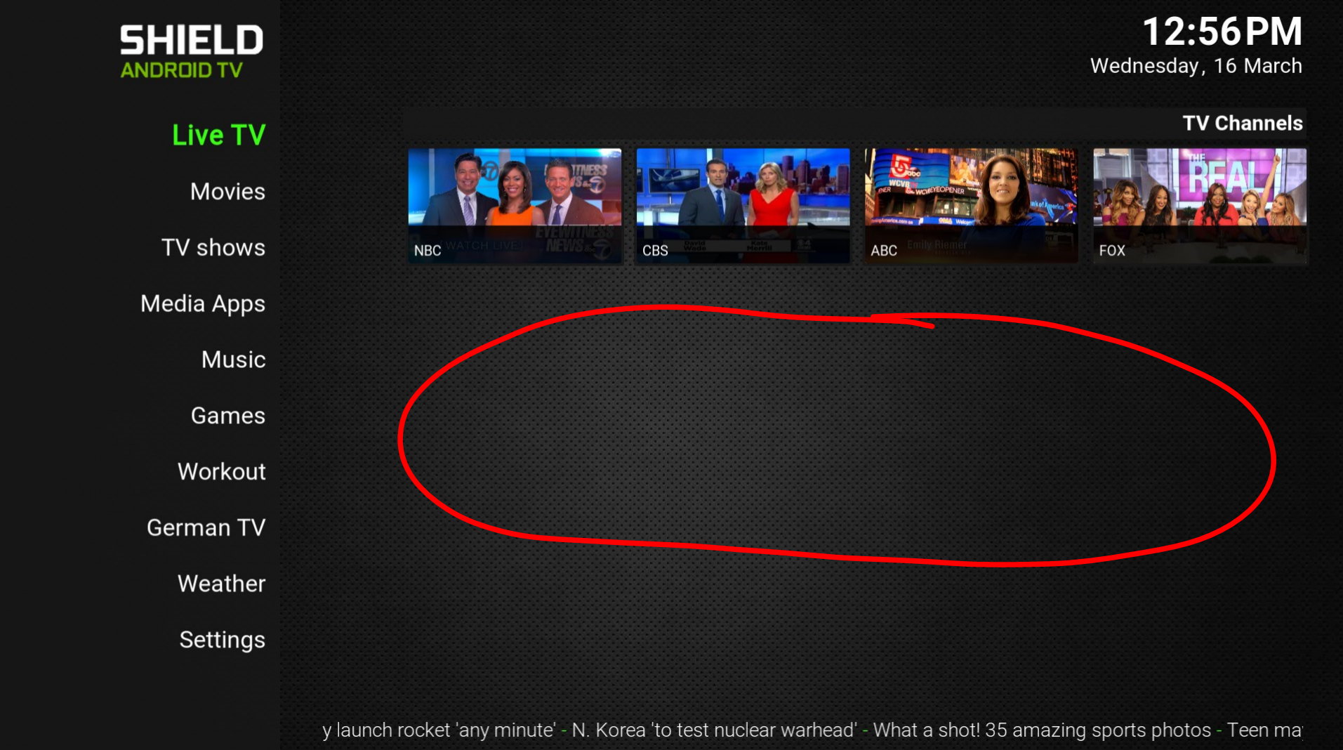
Image
(multiple widgets selected in settings, but only one widget added to menu item = only one row filled although there are many more channels, causing lots of empty space)

NOW, AFTER UPDATE:
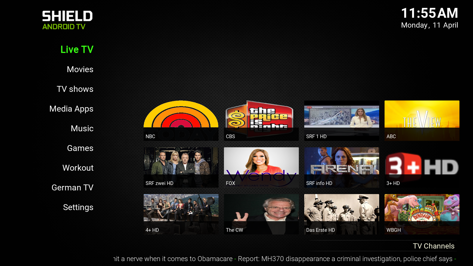
Image Image
A "single widget" now shows multiple rows of tv channels (=great!), but unfortunately, the widget moved all the way to the bottom, with the title below it. For movies, for example, the widgets are on the top right, with the title above the widget = inconsistency)

POSSIBLE SOLUTION:
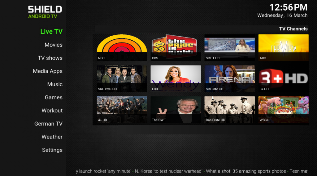
Image Image
"Single widget" has same layout as "multiple widgets" (starting from top right corner with title above). "Single widget" shows multiple rows for that one widget (tv channels). "Multiple widgets" show one row per widget (movies)

Does that make sense?
Reply
  • 1
  • 108
  • 109
  • 110(current)
  • 111
  • 112
  • 141

Logout Mark Read Team Forum Stats Members Help
Titan skin feature requests4