2021-07-18, 05:48
I've pushed out a new beta (2.0.3-b2) (see first post in this thread for links).
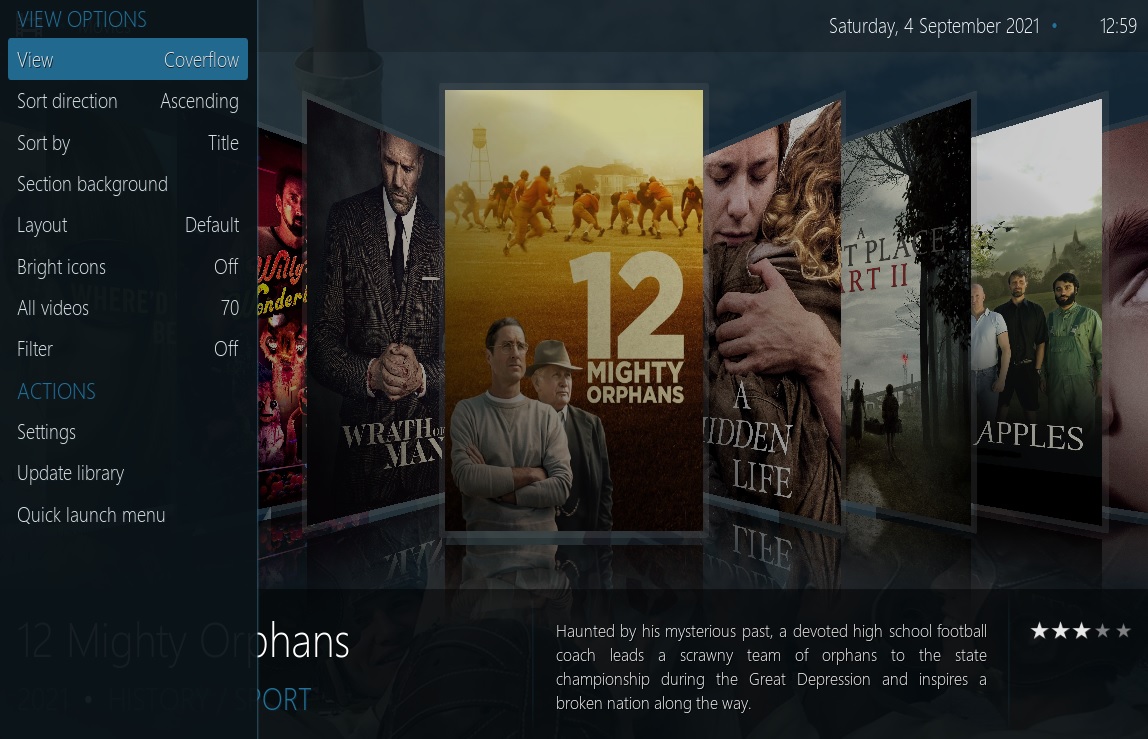
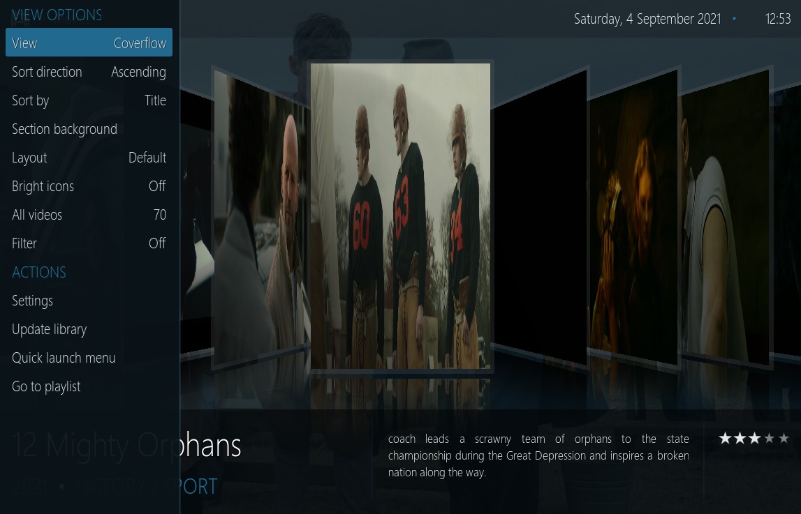
Both InfoWall, and List view now allow you to select a wider selection for "art 2" (the art in the right-side column) , Poster, Banner, Logo, Landscape, Fanart, and Thumbnail can be selected. it also adjusts the layout of the right column depending on which type you pick (banner is really short, while poster is really tall, so the layout needs to be adjusted accordingly to fit them)
Currently the setting is global (if you pick "poster" for List view, it's changed to poster for all List view screens). I'm debating if I should try to make it track the setting on a per content-type basis (tvshow vs movie for instance). If Kodi lets me stick the content type in as a variable into the property name, I'll probabably try it. If kodi won't let me do that, I probably won't (because it would then require 1000's of lines of markup, to have a copy of the image that displays for the individual setting for every possible combination)
I've also been playing with the weather-map section of the weather screens, currently, it adds a left-menu item for each available map (which looks awkward if you add a lot of weather maps). I've created a version [on my local] that just has "Maps" and then lets you enter them an scoll them up and down. I'm not sure if that is more awkward than having a big list on the left-column that scrolls though. Don't know if anyone has thoughts on that? (the weather.noaa weather provider that I maintain (also in my repo) has a lot of maps available -- mostly various satellite imagery) I'm playing with the difference between shrinking them to fit (for example with square radar images) vs expanding them to take up the whole screen (often resulting in needing to trim the top and bottom of the image) Maybe add a setting or something to let the user change the view?
 .
.


