(2013-09-15, 13:07)Baswazz Wrote: (1) The problem i am facing is that you don't have set a static dark or light background, so the icons are not shown how it should.
For example: National Geographic channel logo does have a white text, and white text on a light/white background will blend in.
(2) Movieinfo screen: The text is sometimes hard to read with fanart which has light parts in it.
1. I prefer my logos to be clear rather than have a dark background added to them. This is something that should be up to the user. If you want dark backgrounds on your logos its not hard to modify them in gimp or photoshop to have a dark background layer.
2. You can change the transparency of the background fade by modifying the colour theme xml that corresponds to the colour theme you are using (e.g. "skin.arctic/colours/Dark.xml" for the Dark theme or "Defaults.xml" for the default theme etc.). The part you are looking for is this:
Code:
<color name="Mod_Overlay_Dimfanart">bbeeeeee</color>
The first two digits (the "bb" in this example) are the opacity of the background fade in hexadecimal -- increasing the value will increase the strength of the fade, so you could change it to something like "dd" increase how much the fanart is faded.
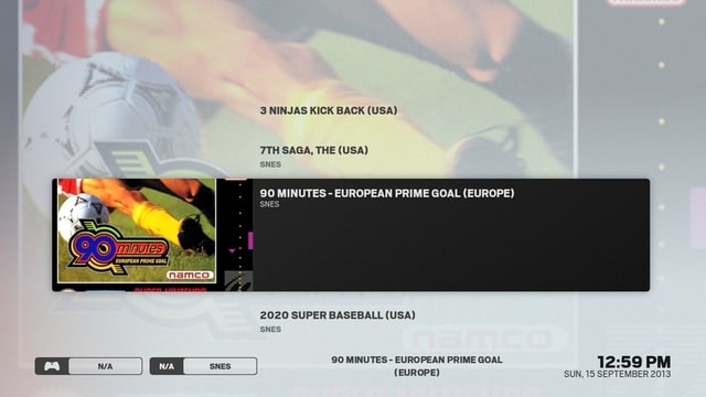
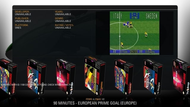
(2013-09-15, 13:13)st graveyard Wrote: This is the view I have in Arctic now :
Although I like this banner type of view, I think it is very limited in the game environment.
It shows the movie and the 3D artwork (3D artwork is common in the rom world).
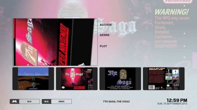
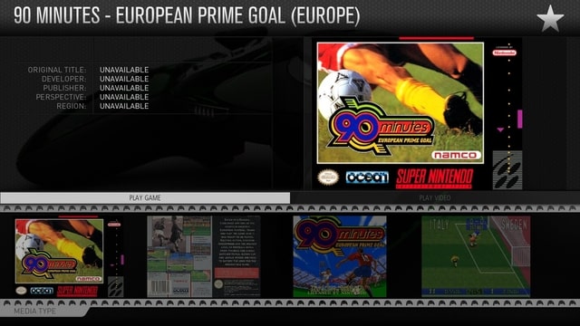
This is the new info view in arctic : The video is not working here, I don't think it is my settings, as the video does work when I switch to MQ skin.
One remark, the new info view looks already nice, but I just want to say that by adding borders around the artwork, it will be hard to have a good fit. As in RCB you have the possible to add screenshots, title screens, cover art (as with my example).
This has a better fit and zoom function (you can move over the 4 different shots and a big version appears in the main space and you have the option to fullscreen them).
Ahah! I finally got a few video previews to scrape with my roms so that I can finally test it and get it working. Check the latest git -- I've added a "trailer" button to the infoscreen which will play the video preview. Also you can now navigate down to the artwork and it will show a larger preview in the big box (I'll add an option in the future to view the artwork fullscreen, just getting a few other things sorted out first).
Also, you do know that the banner view isn't the only view type right? There should currently be 5 different views (Thumbnails, Info Wall, Banners, Covers, and Info). Also, I've modified Covers and Info to no longer have borders so these might be suitable views for your 3d boxart.
(2013-09-15, 13:16)efty.edge Wrote: I tested it a week and it replaced AEON NOX... Only one thing is missing. I've a lot of movie collections and there is no difference between the view of a normal movie and a collection. Can you please add it!?
And can you please hide the arrows in the main menu... Please!!!
Yes there is. In the infotags at the bottom left of the screen, when a movie collection is focused it shows a set icon and the words "movie set".
Latest git has an option to disable the submenu arrows. Disable "Skin Settings > Home > Show submenu arrow"
(2013-09-15, 13:46)ferent Wrote: 1. In movie list, when I select Poster Panel view, after select it, it shows Season Panel in the menu
2. I use Dark theme. When I select a menu, the dark mask around the menu takes one or two seconds, and I don't like this. I think it's due the black mask png size is big and my machine takes this time to load... It's possible to reduce a bit the size?
3. In main panel, with dark theme, the volume numbers are white over a white rectangle. Could be change it to black numbers?
1. Fixed in latest git. Good spotting!
2. You can resize these yourself. They are in the directory: skin.arctic/extras/fade/ -- black2.png and black_content.png -- Leave them in white, because I use a colordiffuse within the skin to turn them black. You could probably get away with reducing the resolution by about 50% without too much visible difference.
3. Fixed in latest git.
(2013-09-15, 13:55)MeMeMe Wrote: I also think there should be some way to recognise a Movie Set collection is not a movie. This is the one drawback of the skin I've found.
See Above. It shows "movie set" in the info tags at bottom left when a set is focused.
(2013-09-15, 16:17)SmithersJ0nes Wrote: The only rating I listed without a "g" was for "14 Blades", on puting the code back and checking I can see this does show the correct "R" rating. As the way your skin interprites the MPAA rating it is the text after the rating letter which is causing the issue. As this isn't visible anywhere it would be better to have the rating solely as the "MPAA rating" without the descriptive text but as different skins do show this info I will always be adding it, as although I love your skin no one knows what they will be using in 12 months time.
I get what you are saying. I am tempted to make the matches stricter; however, I know that as soon as I do I will have a bunch of people complaining that the skin no longer is showing their ratings correctly. Its a catch 22 sort of situation.
I guess the answer for you is to just keep your modified version of Includes_Flags.xml handy and just overwrite it whenever there is an update etc. I doubt there will be many changes in the near future to that file anyway.
(2013-09-15, 16:18)PatrickBateman Wrote: I have some movies, not scanned into the library, on a USB drive with artwork. The only view for this folder (in this skin) is list view, could a few more views be added for viewing directories that are not scanned into the library?
Also, the animations seem to be a tad jittery (not smooth)
The system info says 1920x1080@60 (30fps) is there anyway to make the animations much smoother (like in xp1080). I find navigating the movie info screens, library etc to not be very smooth. In xp1080 they are like silk or butter, here they are not as smooth. Is this perhaps my low powered 6320 and amd dual core CPU? They are low powered but seem to run others fine?
Will you perhaps consider adding an option to remove the ^ arrow from movies/tv/music etc
I'm using the xbmc skin dev repo version, is that the best version?
Ah, the thumbnail view was supposed to be available for files mode too. For some reason the Container.HasFiles condition is only matching if the folder has been added as a source -- it doesn't matter if it hasn't been scanned, just that it was added as a source. I've fixed it in the latest git version (updates will go out to the wip repo version later in the week).
xp1080 has the advantage of using squared artwork which keeps things a lot simpler in terms of required processing of images. However, there are probably a number of areas that could be optimised in Arctic in terms of textures etc which would help with speed - but thats just something that will happen over time as features become more set in place and I can then spend time optimising them -- currently my skinning time is spent towards the skin becoming feature complete. That said, I don't have many problems with animations and my machine is certainly not high powered (core 2 duo 1.86ghz with 1gb ram and a Nvidia7300le -- its about 8 years old now...). Sometimes I find that after switching skins things drag a little bit and restarting xbmc helps with that.
In latest git version there is an option to remove the submenu arrow.
The wip repo version is easier to deal with as you get automatic updates and the textures are compressed into an xbt which helps performance. The downside is that it is usually about a week behind the git version because I don't have direct control over it being updated (I have to send a git pull request to the devs and wait for them to do it).
(2013-09-15, 19:21)relyter Wrote: jurialmunkey
Who is controlling how artist fanart is scaled in fullscreen music player, skin or script.artistslideshow? Because it seems like "scale" is set now, which in case of non16x9 images usually results in cut artist head  "Keep" would be more appropriate here, also this won't increase needlessly low resolution images.
I get what you are saying. However, one of my TVs has a 16:10 aspect ratio so "keep" makes everything have black bars around it, so I much prefer scale. If you want to, you can change it yourself. It is line 372 of 1080i/Includes_WindowContents.xml -- (the multiimage control of the "BackgroundFanartMusicOSD" include).


