(2013-09-16, 18:17)efty.edge Wrote: (1) There is no set icon and not the words "movie set". But if it works as you said, would'nt it be nicer to hide the info tags at the bottom left of the screen and show the words 'movie sets' under the title of the movie set.
(2) By the way, i found a little bug. There is no possibility to disable the 'Motion picture rating country'. I can only switch between the countries...
(3) Can you find a solution to disable the 'Show view header' but show the first character of a movie title if i scroll through my movie library.
(4) The Lovefilm view in TV-Shows shows no unseen episodes. Can you please add this information at the bottom of the show description on the left!?
(5) The hook for a seen episode or movie is IMHO to small. A WATCHED badge, like the one in Aeon Nox might look much better and for movies and tv-shows it should be on the same side, e.g. upper right corner...
(6) The youtube plugin needs more views, because the preview thumbs are to small. Maybe you could use the same views as for movies
(7) And for me the most important one... The Artwork Downloader let me not select a special artwork manually. It only uses a bulk download function for all my movies/shows.
1. I'm guessing you are using a Gotham alpha. Gotham is not currently supported. The skin checks to see if the movie path contains the Sets node of the video-library, and because they have changed in Gotham then they no longer match. I wont be making changes for Gotham support until there is a feature freeze and a stable beta out. Also, all my sets have names which suggest they are sets anyway (e.g. Alien Anthology, The Terminator Collection etc.). I might add it as the sub-label for views that already have a sub-label (like banner list) because there doesn't seem to be much other information available from a set.
2. That's not a bug. There is no reason to disable the rating country -- all it does is tell the skin what language your mpaa labels are in so that it reads them correctly and displays the correct classifications (e.g. US has PG-13, NC-17 etc. whereas UK has 12A, 15, R18 etc.)
3. I can, but its not priority. I assume you are disabling the view header because you are using Gotham so it isn't correctly displaying the proper library name.
4. I have been meaning to add this as its the view I use for tvshows, just had slipped my mind. Will do when I get a chance.
5. Its a check mark. I don't think its too small, but that is why its colour coded -- green is watched, grey unwatched (or in progress) and blue is new. If you are talking about the banner in Aeon Nox that says "watched" -- nope, not going to happen. First, I really dislike that style. But more importantly, it destroys consistency between list and poster views because a watched banner can only go on posters whereas checkmarks, stars and half-circles can go practically anywhere.
6. Whats wrong with using thumbnail view for youtube? You probably just need to turn off "use small thumbs" in the view option menu on the left. Also, there isn't much point adding more views for youtube because I find it never saves them and just defaults back to list view as soon as you make a new search anyway.
7. This is already available. Go to a movie, press "info", goto choose art. A menu slides out where you can choose the artwork type you want to download with artwork downloader (the top option {choose art} uses xbmc's builtin artwork selection, but the specific types underneath use the artwork downloader gui).
(2013-09-16, 19:32)sling Wrote: Is it possible on the home page to see all the shows at tv-shows that I follow?
Now you see e.g. shows that have not yet come to an end, or a list of e.g. all the episodes of prison break which I still need to view.
More convenient is of each show one image you go directly to the series brings.
Not possible currently. You could always create a smart playlist with your favourite tvshows and add it as a submenu item to the tvshows menu.
(2013-09-16, 19:37)st graveyard Wrote: First off, congrats, the RCB implementation looks very promising. Videos are working like a charm now. Here are my remarks :
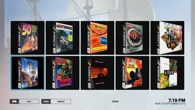
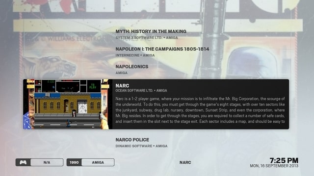
(1) When loading big collections (eg. 3500+ games) the screen flickers (because the games are being loaded). When I compare to MQ4, there is a counter that counts from 1 of 3500 to 3500 of 3500. This might be nice to add so the user knows what is going on...
(2) Can you add the possibility to remove the zoomed fanart from the background and perhaps add a cool game related standard Arctic background?
(3) For some reason the covers are always first loaded even if there is a video (this is apparent in the banner view - see screenshot). I know that you can set RCB to load the covers or other artwork if the video is not available, but it seems there is something wrong in Arctic.
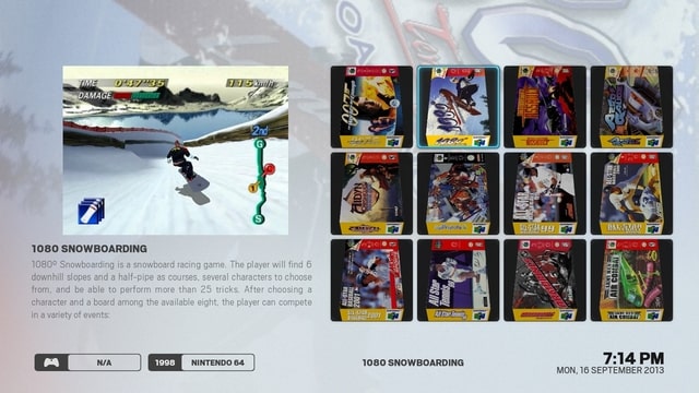
(4) Thumbnail view : I'm not really a fan of this one. Don't really like the black borders. Maybe it could be made better by adding info, maybe not. Maybe this is just for a large cover overview, but it is not my thing.
Info Wall: I like this one. Again, the borders around the covers are too dark (maybe a light gray looks better - a bit like a shadow). On the other hand, around the video on the left, a little bit more polishing could be done, like adding a light border or something. Overal liking this!
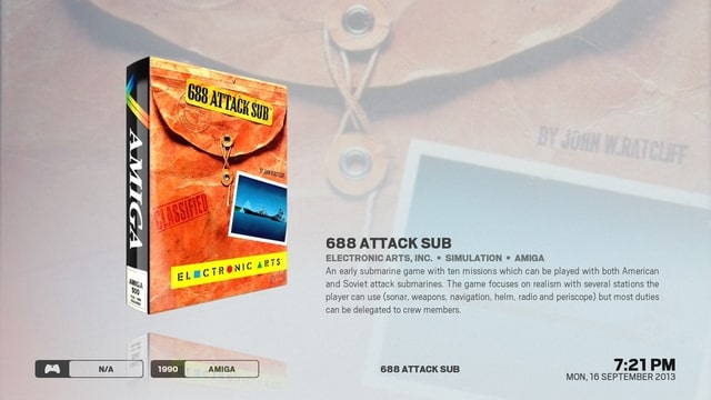
(5) Info : This is so simple and I love it. But we could use a counter (game 5 of 2000 displayed) and I would prefer to see maybe more than 1 game at once on the screen. Still, it looks slick!
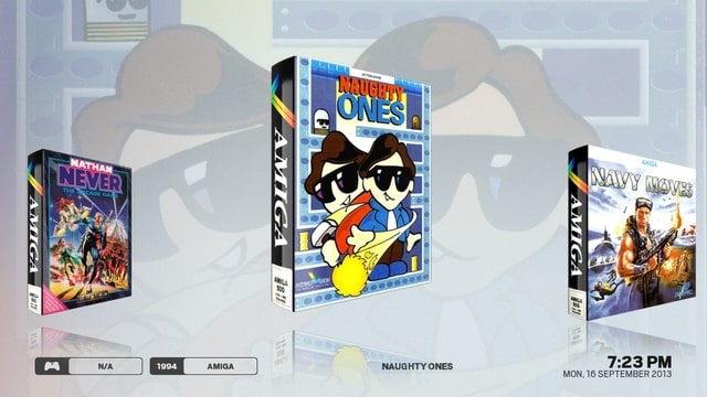
Covers : I like this too. But I would like to see the game info somewhere on screen.
(6) Poster panel (from the movie section) could be a very cool view for the games. Showing the poster on the left side and the movie on the right side. And perhaps give the user the possibility for some info on the top half of the screen. I would kill for that view ;-)
Info poster and Classic info would also look very cool for the game section.
1. I'll look into it.
2. Will do eventually, just want to get the other things sorted first before I start adding more features.
3. The slight delay is intentional. The image behind is not (fixed in latest git, also info wall video background is fixed). I found that having the video load immediately slowed things down for me when scrolling through games because it was trying to load a video every time -- where as having the slight delay means you actually have to stop on the game before the video starts - its only a 1 second delay.
4. The dark background has to be there so that it is consistent with the rest of the skin -- one of the basic thematic elements of the skin is softly rounded, consistently sized rectangles with a soft shadow behind -- when there is weirdly shaped artwork like 3d boxes that do not conform to a rectangular shape then the shadows start looking weird because they have to be rectangular so they form a weird rectangular ring around the artwork, so it needs a background -- I'm already making a pretty big compromise with the covers and info views not having shadows. There's no point in skinning rcb if its going to look completely different to the rest of the skin.
5. I quite like having the info view with just one game on screen at a time. I do have planned something between covers and info (similar to classic info in movies) -- its just the differing aspect ratios of boxart that makes it a real pain (plus finding the time to actually do it -- skinning takes a long long time to do). The counter will happen eventually (it will be like the view header in the top left in other parts of the skin) -- I just haven't got around to it yet.
6. Big issue with poster panel view is aspect ratio of boxart. The reason it looks good is because movie art is consistently sized. I do think a view like that would be good -- the difficulty is implementing it.
(2013-09-16, 20:36)Tripp Wrote: Help! Something must have updated in the skin. When starting XBMC today, artic is all messed up. The white sheer look is gone and it's difficult to read almost all descriptions. Going into skin settings items on the left hand side do not list out. The skin is now pretty much unusable.
Its working fine for me, something must have got corrupted whilst downloading the update. You might have to try a clean reinstall of arctic. Switch to confluence, delete the skin.arctic directory from xbmc's addon dir. Restart your machine then reinstall arctic. Your skin settings should remain because they are stored separately in xbmc's userdata directory.
"Keep" would be more appropriate here, also this won't increase needlessly low resolution images.

