• 1
  • 54
  • 55
  • 56(current)
  • 57
  • 58
  • 73
Release reFocus 1.4.0 for Gotham (deprecated)
(2014-07-06, 17:11)hydog Wrote: Any guides or suggestions on making the Left Bar / Main Menu a little more transparent? I have used the Gray color.xml file that was posted back in the thread, but am missing the older style of reFocus. Otherwise, this is a great skin, and I've used them for years on my devices, and love the support and attention to detail that is spent on this...
In your skin folder, open up colors/Defaults.xml. Change the first two characters in base_2 and base_3 from "ff" to "ee" or "dd", etc. Reload the skin... you will likely have to adjust the transparency values until you get the desired effect.
Reply
(2014-07-07, 16:54)BigNoid Wrote: Nice to see refocus on official repo. What took you so long Tongue

Legal issues Wink Thanks! Smile

(2014-07-07, 19:16)Branphma Wrote: Really awesome skin, fantastic job Jeroen!

I have a question concerning the poster in list view. The resolution seems a bit low. If I change the artwork via the information screen I download a high resolution poster which looks perfectly fine an "hd like".
However after restarting the poster does not look "hd like" anymore. Do I have to change a setting for that or is that intended?
Cheers!

No idea how that could be tbh. The poster shown in the information screen is displayed using the same code as in the library views. So it should be the same poster really. Of course it's scaled down in the library views, but if anything that would actually make any blurriness seem less. Up and downscaling of textures is all handled internally by XBMC.
Could you post a screenshot? Is the result the same in all views? Did you check in Confluence?
Reply
(2014-07-06, 04:40)Unfledged Wrote: I hope Jeroen won't mind me posting this here - if you do, let me know and I'll remove it. I've written an update to the Watchlist script used by this skin, adding two new features for the episode watchlist - displaying the next unwatched episode (as opposed to the first unwatched - for those of us who watch seasons out of order), and displaying the first unwatched episode of recently added series.

This addition is exactly what I wanted but didn't know where to ask. Great stuff, thanks!
Image
Reply
Jeroen,
Any plans on a reFocus Touch version at some point?

Regards,
kk
Reply
(2014-07-08, 18:52)knewknow Wrote: Jeroen,
Any plans on a reFocus Touch version at some point?

Regards,
kk

Never say never, but it's not on my radar at the moment.
Reply
A look at what's next.

So, probably against my better judgement here is a look at some of the changes in the upcoming reFocus 1.4.0 release. Please excuse the somewhat blurry screenshots, not sure what's up with that.

The biggest change in this release will be the revamped widget system. A lot of other changes, including this horizontal menu that I finished weeks ago, were dependant on finalizing this new widgets system. I wanted absolute feature parity between the horizontal menu and the vertical menu, and that was quite a challenge because of skinning engine limitations and usability issues. At the end of the day though, I'm quite pleased Smile

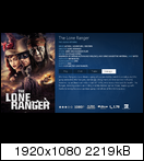
Passive widgets
This is the new horizontal home menu, with what I refer to as "passive widgets" enabled. That means widgets are enabled and configured, but they aren't visible until you call them by pressing up from the main menu (or press right when you use the vertical home menu)

Image

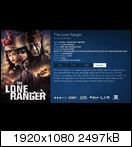
When you do, it will fade and slide the widget into view from the top (or right when you use the vertical menu), and the main menu will hide. This, of course, can't be demonstrated properly with static images.

Image

Pressing down (or back) will slide and fade the widget out of view again.

Notice the indicator in the top left. When the widget is hidden it will show you the widget that is configured for the main menu item you are currently on. It will also show you the first item in that widget and use an icon to indicate which button to press to get to the widget. When the widget is visible and active, it will show you the item count and the icon will indicate the scroll direction.

This all of course adapts to either the horizontal or vertical home menu.

Active widgets
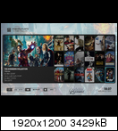
A different widget mode is activated by enabling the "always show widgets" skin setting. Any configured widgets will then always display when focused on the main menu item that widget is tied to:

Image

Like with the passive widgets pressing up or right will take you into the widget here as well. In this case though, the widget is already visible of course and the home menu will slide down the bottom of the screen. Pressing down (or back) will return the home menu back into view.

When you're focused on a main menu item with no widget configured, you will see whatever background image you have set in the skin settings. So, enabling widgets will no longer disable the background image options, and you will be able to enjoy both.

Supported widgets
The skin currently provides these widgets:
  • Episodes watchlist (the first unwatched episode of all shows you're watching)
  • Movies watchlist (all movies you started watching)
  • Recently added videos (a list of the most recently added movies and episodes, all in one list)
  • Recently added movies
  • Recently added episodes
  • Recently added albums
  • Recommended albums
  • Now Playing music
  • Weather (using weather fanart)
  • PLaylist (turn one of the included, or your own smart playists into a widget)

I plan to add more widgets later, like a PVR widget showing you information like scheduled recordings for example.

A screenshot of the now playing widget:

Image

Configuring the widgets
This can be done in the home customization window you're probably familiar with already:

Image

Finally
Needless to say it is possible to disable (or just not configure any) widgets if you have no need for them. Also, the vertical menu is not being replaced. It is, and will always be, the default. It will be styled slightly different to look consistent with the horizontal menu.

The horizontal menu I posted about some time ago is gone and not coming back. Please don't ask about / for it.

A preview release will be available as soon as possible. Basically just about everything I set out to do is done. However I want to give this a good internal test first as I've been close to releasing before only to find out about a major oversight causing me to rewrite large pieces. This all has turned out to be more complex than I expected.
Reply
amazing works, looking forward to testing this new system of widgets! Thank you for the time and the work done for us Smile
Reply
Looks great!
Reply
Y'know, I can't recall ever seeing a horizontal menu whose background doesn't stretch across the whole width of the screen. It's a simple thing, but it gives the menu a striking look. Can't wait to see it in person.
Reply
It looks absolutely incredible Jeroen. Your work continues to astound me.
Reply
@Jeroen: Do You plan to give translators some time before publishing v1.4.0 to final? Personally I'd like to have few days before You'll publish final version. Maybe we could determine such rule for all translators?
Let's say 3 days for beta version and that would be the time for translators to do all strings for their languages and then final version. What do You think?
Reply
(2014-07-09, 15:52)Unfledged Wrote: Y'know, I can't recall ever seeing a horizontal menu whose background doesn't stretch across the whole width of the screen. It's a simple thing, but it gives the menu a striking look. Can't wait to see it in person.

2nd this. It makes the menu look like it's almost imbedded into the background itself. Love it!
Reply
(2014-07-08, 14:10)Jeroen Wrote: No idea how that could be tbh. The poster shown in the information screen is displayed using the same code as in the library views. So it should be the same poster really. Of course it's scaled down in the library views, but if anything that would actually make any blurriness seem less. Up and downscaling of textures is all handled internally by XBMC.
Could you post a screenshot? Is the result the same in all views? Did you check in Confluence?

(1)
The first screenshot shows how the poster looks like after I start up XBMC:
Image

The second screenshot shows how the poster looks after I downloaded it first through "change artwork" dialog. (XBMC has not been shut down since downloading it first)
Image

You can easily tell the difference between the two screenshots. The second one looks way clearer and high resolution. The problem is, that it always goes back to the low resolution version (screen1) when I restart XBMC. I could not test it with Confluence because it does not show the poster in this kind of size.

(2)
I'd like to mark a little visual "bug".

When I highlight the last item on the homescreen list it cuts off the blue edge:

Image

(3)
As I really fall in love with your skin I want to make it my default skin. Therefore I would like to ask you if you considered implementing support for 'script.extendedifo'. So that it gives me more information when I hover over a movie set.

that is how it looks with the skin 'Arctic':
Image


Really appreciate your work. Looking forward for future development.
(sorry for the long post, hope I could make myself clear, as english is not my first languageWink)
Reply
(2014-07-09, 18:40)Branphma Wrote:
(2014-07-08, 14:10)Jeroen Wrote: No idea how that could be tbh. The poster shown in the information screen is displayed using the same code as in the library views. So it should be the same poster really. Of course it's scaled down in the library views, but if anything that would actually make any blurriness seem less. Up and downscaling of textures is all handled internally by XBMC.
Could you post a screenshot? Is the result the same in all views? Did you check in Confluence?

(1)
The first screenshot shows how the poster looks like after I start up XBMC:

The second screenshot shows how the poster looks after I downloaded it first through "change artwork" dialog. (XBMC has not been shut down since downloading it first)

You can easily tell the difference between the two screenshots. The second one looks way clearer and high resolution. The problem is, that it always goes back to the low resolution version (screen1) when I restart XBMC. I could not test it with Confluence because it does not show the poster in this kind of size.

I could be completely wrong, but take a look at the advancedsettings.xml option imageres, which details how large the artwork images XBMC caches are. By default it's 720, but on some systems it's even lower (RaspBMC for example, has it set by default to 540). On a 1080p tv, it's possible the cached images are being saved in a resolution lower than the height of your screen which would explain their low quality.
Reply
It all looks absolutely stunning, I am tremendously excited to get my hands on the next release! Thank you for all the hard work!
Reply
  • 1
  • 54
  • 55
  • 56(current)
  • 57
  • 58
  • 73

Logout Mark Read Team Forum Stats Members Help
reFocus 1.4.0 for Gotham (deprecated)14