(2016-03-08, 15:43)rodalpho Wrote: [ -> ]My biggest problem with Estuary is common to many user-created skins-- it doesn't support the Confluence media views I actually want to use.
I exclusively use the "List" and "Media Info" views. If a skin doesn't support something looking very much like these very simple views, I will never, ever use it.
I'm pretty much in this boat as well. Based just on the images and videos (I haven't installed it yet, so sorry if this is there already), I'd like some kind of list view for TV shows that displays the unwatched episode count in the list view of show names. I'll mod Estuary if needed to do that, but I'd rather not.
And speaking of things that I'd rather not mod Estuary for, if there could be an option to use Artist Slideshow for the fullscreen background when playing music, that would be great. I know the author of AS would appreciate that.

(2016-03-09, 04:57)DaAwesomeP Wrote: [ -> ]I think that the scrollbar should be on the right of dialogs, not the left.

The scrollbar is at the right side?
You should consider adding a toggle option to choose how the video duration is displayed everywhere (hh:mm or xxhxxmin) instead of using some external addons or mod. I'm pretty sure a lot of people will support this. Nice work tho.
(2016-03-09, 05:03)phil65 Wrote: [ -> ] (2016-03-09, 04:57)DaAwesomeP Wrote: [ -> ]I think that the scrollbar should be on the right of dialogs, not the left.
 The scrollbar is at the right side?
Sorry, I got that backwards! I meant that the scrollbar should be on the left. I'll edit my post.
it cant be on the left, options open on the left. every scroll bar ive ever seen is on the right, so its in the right spot.
(2016-03-09, 05:56)mazey Wrote: [ -> ]it cant be on the left, options open on the left. every scroll bar ive ever seen is on the right, so its in the right spot.
I was thinking specifically in popup/dialog boxes where there isn't anything on the left and buttons are on the right.

Hi Developers
Just love this new Estuary theme, its near perfect ! Two suggestions:
1) Some of us use Kodi through the big screen TV, on a PC along with a keyboard and mouse. So frequently we might skip between surfing the Net, watching a recorded program on WMC and using Kodi for example. Can we have either an addition to the Power button or another icon on the top of each page, where we can quickly go between a boxed WINDOWS style screen with minimise button or the FULL SCREEN? With Confluence you have to go deep into Skin to change this and then change back, very tiresome.
2) It may just that I haven't found an addon yet, but have this problem with music. Albums and Singles will not stay separate, but simply merge into the Albums view without my wish. I recently tried to add a bunch of my old mp3 singles but had to delete the source folder because they got horribly mixed with my perfectly edited Albums. Can we differentiate between Albums and Songs (singles) so they remain entirely different folders or lists at the viewing level. This would be huge if you can manage it. I have used other music managers such as iTunes and Media Monkey, but there's something really nice about having movies, music albums and singles, photos all in one app (Kodi).
Hope you can help. thanks so much for Kodi, its massive. Big Grin
The only 2 things that ever made me switch from Confluence to some other skin was the need for a clean look, which we have now with this awesome skin, and the custom main menu items, so i could have Anime separate from TV Shows.
So yea, +1 for custom menus.
Keep up the great work

(2016-03-09, 06:57)moviemania Wrote: [ -> ]1) Some of us use Kodi through the big screen TV, on a PC along with a keyboard and mouse. So frequently we might skip between surfing the Net, watching a recorded program on WMC and using Kodi for example. Can we have either an addition to the Power button or another icon on the top of each page, where we can quickly go between a boxed WINDOWS style screen with minimise button or the FULL SCREEN? With Confluence you have to go deep into Skin to change this and then change back, very tiresome.
If you're using a keyboard and mouse anyway, you could always just hit \ on your keyboard. That switches from fullscreen to windowed mode.
(2016-03-06, 17:30)Ed76 Wrote: [ -> ] (2016-03-06, 16:52)shadow Wrote: [ -> ]Would it be possible to give people the option of using larger text on the screen? I have a 60 inch TV and the smaller of the text like episode and movie descriptions I have to squint to read. I ended up manually modifying Font.xml and in the first normal fonts just changing any number under 30 to 30 then I was able to read everything.
I don't even know what I will do when I setup Kodi for other people since most people I know are in the 50 inch range which would make the text smaller. I could just keep putting them on Aeon Nox but I do like this new skin and would like them to have the option to use it.
I just hate making manual changes because I have to keep them up every time the skin updates.
i agree, for me its also hard to read the text. but only make the fonts bigger is not a nice solution (for me) because then you have less information visible (e.g. in epg description or movie info). a better solution would be a kind of "zoom". but not zooming the whole screen (because then you lost/dont see the informations on the borders of the screen), better would be only zooming the overlying osd (e.g. whole movie information screen or tv epg/channel view) because there is more than enought space for this available.
i also find it hard to read the text especially the white font on the selected/roll over color,
please add a watched marker to the tv - recordeings page
Hi,
I really appreciate the great effort you are putting into Kodi and this new skin. Keep up the good work!
I usually use the "list" view because it gives the best overview.
With the current skin you unfortunately reduced the displayed items in the list from 14 (confluence) to 10.
It would be great if you could keep the 14 items or at least try to have more than 10.
I guess people who use the list view want to have as many items as possible.
Thanks.
chancenvergeber
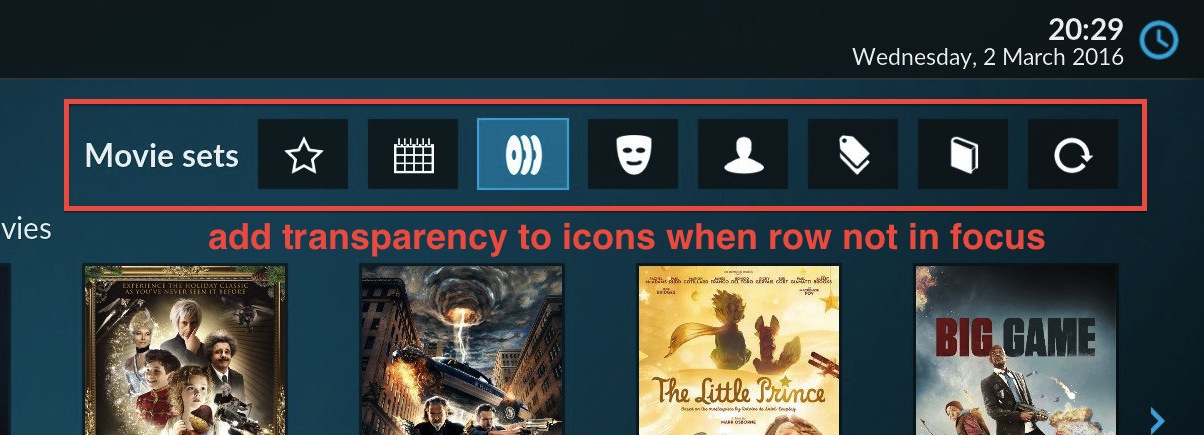
Since a new skin is is a good place for improvements I feel inclined to make some suggestions on how to add some polish to the default skin. Would love to hear from other what they think about the following points:
I like the new home screen, but I feel like it the
visual hierarchy is not as clear as it could be. There are a lot of buttons on screen which all call for the user's attention.
I would suggest that the secondary buttons (like the row of icons on the top right side) become semi-transparent when not in focus. Once the cursor is moved up there, the entire row of icons fades back to a the solid versions.

The idea is to make the additional functions discoverable to new users (by having them visually present on screen), while at the same time have the icons fade more into the background when not used.
(2016-03-04, 16:57)Forage Wrote: [ -> ]I feel that the video player OSD needs some additional love.
I second that. The currently used icons with the circle around them don't fit the rest of the interface anymore.
I'd suggest looking at the BBC iPlayer interface for some inspiration:

There are a couple of UI elements that would fit quite nicely with the new skin:
1. The current position in the progress bar is indicated by a box with two arrows. This is a nice way to make the new seeking feature more discoverable.
2. Icons with there square background are fairly similar to the icons on new home screen I've posted above.
3. Space on the left (where it reads "more episodes") could be used as the position for film poster.

 The scrollbar is at the right side?

