@
BoroSK
Then CE 20 will be the same, i guess. Just to clarify:
- On CoreELEC, the button "Reboot" doesn't work with the original version of this skin - correct? What does it do? Just nothing happens when selecting it? (Just gathering some extra info since i do not have any CoreELEC machines)
- The second button "Restart KODI" is a new button to exit and reopen the app. This button did not exist before, correct? We are not correcting a non working button in this case but we're adding a new one, correct?
- I can check for "service.coreelec.settings" like i do for openelec/libreelec and then just use a different action on click. That shouldnt be the problem.
@
BoroSK
Nevermind - i added some stuff for the next version. I'll ask you again to check when it's released.
@
axbmcuser
I apologize, but I couldn't respond in the evening

1: CE starts from external media (SD card), so there is an option to boot from internal, where there is some android, so in CE there is an option to boot from internal memory.. such an option is in the basic modified skin for CE. mainly so that the user does not have to select the SD card when he wants to boot into Android. it is a special function for CE.
2: that's right, CE is a basic light Linux type system, and the only app is kodi, so the option to restart kodi was added under CE.
one more idea:
You write that you don't use CE box and you have no way to test it.
if there is a problem with autodetection of the OS, then add the option to expand the power menu to the advance settings of your skin.. for example, name it: show CoreElec power menu extra options

@
BoroSK
No need to apologize.
I just wanted to let you know that i came around without further info.
I also added a "CoreELEC" sub menu item for the "SYSTEM" home screen item. (Open/LibreELEC also has such an entry when the addon "service.xxxxELEC.settings" is detected)
New version release will take some time still due to the amount of little changes that i have to merge to all the different skin versions, but it'll come out. :- D
@
altern8tube @
BoroSK @
kerenmac23
I'll re-enable the selection of both views "List" and "List Wide" again for the "Episodes" and "Seasons" containers for the next version.
I'm absolutely
not a fan of doing this, but since it'll only be active when having enabled "Enable Confluence Old Views" (which is disabled by default as per recommendation) i'm okay with it for now, i guess.

@
axbmcuser thanks so much for bringing back "List" view type. i already have "Enable Confluence Old Views" enabled as well to have the "Media Info" view type there for Episodes. this is great to hear! 👍
Quote:1) What's going on with the buttons on right (can't see them in the video since they are off screen)
Do they stay in the correct positions while this loading-"transition" between episode-skipping with the buttons temporarily changing? Feel free to make a quick video like the last one but with the right buttons also visible
sorry i didn't include that in my shot, but there's no change to anything else on the OSD really, which is why i only focused on the relevant buttons that changed.
Quote:2) Are the episodes local files on the device, on a NAS/local network or is it remotely streamed content? (Would be good to know in regards to the loading duration)
in my video example, the files were remotely streamed from the internet. when i'm playing episodes from a local network drive, the loading is much faster which is why i initially mentioned it was a 0.5 second "glitch" in the video player buttons (happens really quick, but noticeable). as u helped to explain, i see now that its actually the longer loading time that makes the change in the video player buttons more obvious. it's not a big issue, but just thought i'd mention it in case it was only a simple fix.
thanks again for replying to me.
@
altern8tube
Quote:,but there's no change to anything else on the OSD really, which is why i only focused on the relevant buttons that changed.
That's good know since every changing+hidden button on the left half has the potential to cause a right button to be visually at a wrong position. I tried to prepare for every situation so this does not ever happen. Seems like it's working out in this case. Good.
I guess we'll leave it at that then for now regarding the loading thing. I'll have some more thoughts as stated, but most likely we will have to accept that this is a limitation of how properties are returned by Kodi in the short loading periods. (which is not wrong by Kodi if one thinks about it.) Still made sense to check what was going on though. Thanks.
I'll focus on porting all latest changes to the other skin versions releasing the new update now.
- The "skip to next episode" button thing is on my list for future evaluation. That'll take some time to figure out what makes sense and how to do it.
Cheers

@
altern8tube
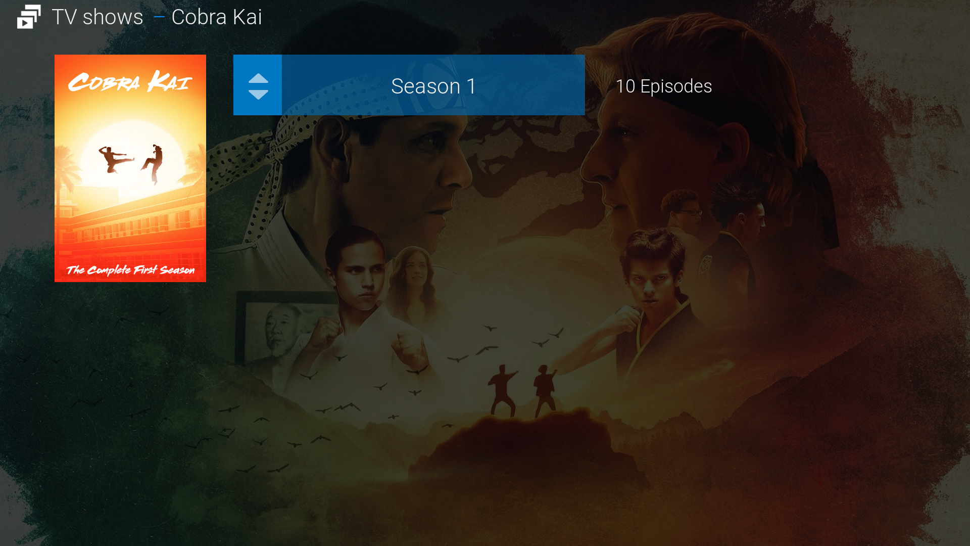
I made some experiments regarding a better default seasons-only view to be used instead of the now used default text view:
Ended up with this. Feels quite good during testing.
I like it simple and everything has to be based depending on a minimal required scraped art for me (only poster+fanart, additionaly season fanart (for shows where it makes sense) + season posters. This is my maximum which should be ever required for default views to work.)

@
BoroSK Thanks a lot for your code. I’ll try it this next weekend. I was on CE Legacy installed to internal without Android but I’ve had to update to CE 19.5 due to a couple of addons. I have installed it to internal again (after flashing Android 7.1) but this time on a dual boot as it is recommended by CE team. Using it from the microSD is a big NO for me, too slow, specially adding things to the library. In my case the “Reboot” works as intended, restarts the box to CE again, but having the option to restart to Android would be nice.
@
axbmcuser Thanks again for your hard work and understanding my petition. I understand that you don’t like it, maybe it’s my problem because I’m not using the nice view type or I’m loosing something else.
Kind regards.
@
kerenmac23
hi, this solution work fine also if CE run internall memory installed (dual boot option on ceemmc) ..
(2023-03-02, 19:22)axbmcuser Wrote: [ -> ]
@
axbmcuser the new proposed Seasons default view looks awesome! love how u have the number of episodes listed at the side as well. 👍
the only personal suggestion i might add is to have all the seasons listed by row, instead of a dropdown. i like having all the information displayed at once, and it saves the user an additional action (click) to see the full list. if u do take this route, perhaps its better to have the Seasons thumbnail image shifted to the right as well. yeah, i know.... it sounds like i'm trying to bring it back closer to the "List" view look doesn't it? hehe 😂
but anyway, really good job and much much better than the current default "Text" view. thanks a lot for doing this!!
@
altern8tube
Had a good laugh regarding your sneaky suggestion joke. : D
Having countless rows with with almost identical text like "Season 1", "Season 2" (up to sometimes 12+) just felt wrong while testing and as you mentioned, we would just end up with another list type view.
I made many tests and this dropdown style menu really feels great, fast-navigatable and non-confusing when you'll try it live. As a side effect the fanart is not heavily overlayed at seasons level and is almost completely visible, which i found also very good while testing.
I also added a rubber-band-type animation when you try to go up when already on the first item (like "Seaons 1") so it feels like it's done in most todays modern UI when "going further" is not allowed.
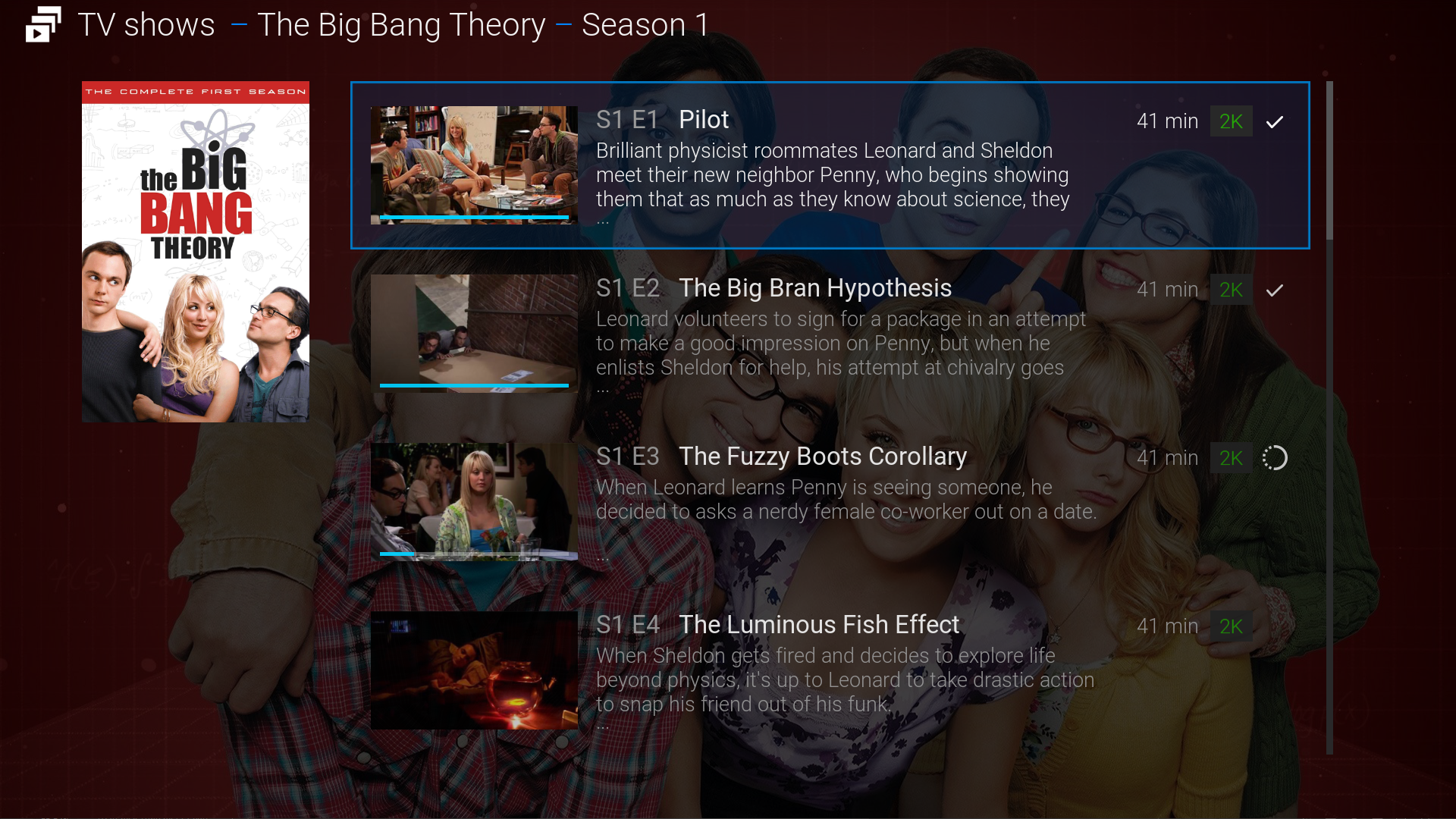
There is also a new default Episodes view which is an more spacey variant adapted from the before used "Modern" view.
Plus there is now a "progress" indicator for the episode which is similar to what is used in typical streaming services UI. Makes it much easier to intantly notice if the episode is already watched and you don't have to wander all to the right with your eyes to look for the checkmark-icon.
Progress:


@
altern8tube
Further sneak peek:
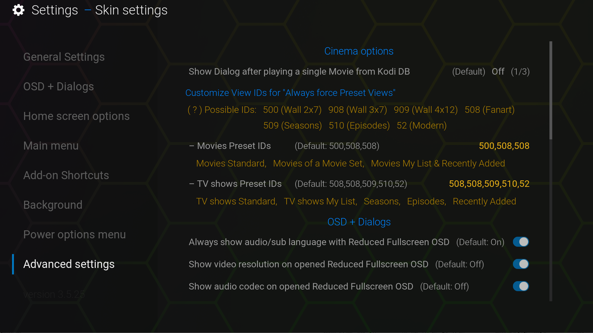
You can now set even more (should be all) relevant view id categories so the configured views are always forced/selected when entering the different windows
(including the deprecated list views which are coming back as already mentioned)

@
axbmcuser WOW. both the new Seasons and Episodes views look brilliant! thank you for listing out the usable View IDs in the Settings screen too. that information is not easy to find, and very helpful for users.
u've really outdone urself. 👏 can't wait to test this out for real on the next version release!


