platte Wrote:Recognizing that it's unconventional (and probably undesirable) to obscure the entire video while paused, here's a quick shot at a pause screen/seekbar.

I also really like this idea but at the same time I also agree with the comment about reading onscreen text while paused. The 'press up/down' to reveal the screen is a great idea and negates this drawback imho.
How about adding the clock, RSS feed and global now playing widget to that screenshot? I think they should be shown everywhere bar fullscreen video...
djh_ Wrote:This is just my suggestion. It's your skin now so don't let me dictate anything.
How about keeping the clock, Now Playing widget and RSS feed the same as for the rest of the skin, then just fading out whatever's left and having the visualisation fade in beneath the white overlay? Then you could fade the rest of the UI out after a set time, maybe, fully exposing the visualiser.
Or just go with what you've got there which is very nice indeed. Great work you guys are doing here.
This is exactly what I'm aiming to do (not that I'm saying all these ideas don't look good) as this was Duncan's vision for Alaska from the start.
Quote:- Ubiquitous elements include Now Playing widget and RSS (visible everywhere, never disturbed by screen transitions)
- Seamless transitions between all windows create single unified environment

Something like this could be cool IMO. The cover and Episode name is in the same position as on the home screen, as is the reddish flare in the LEFT corner.
nvaia Wrote:Also bad ass.
Thanks. It leaves room for other elements to be put in (ie, start/end times) and you can put a progress bar where the RSS feed would be on the home screen.
I'm only assuming transparency can be done like this in OSD's, I'm a complete noob when it comes to skinning XBMC, but I'm working it out slowly.
hmm.. some of my media flags arent showing...
if i view the movie in aeon I get 4 flags for example... but in Alaska only 2 or 3Ik copied the missing images to the alaska flags folder allready. Anyone know where to look?
Hitcher Wrote:This is exactly what I'm aiming to do (not that I'm saying all these ideas don't look good) as this was Duncan's vision for Alaska from the start.
@
Hitcher - This is definite the best solution +1 my vote.
redtapemedia Wrote:
Something like this could be cool IMO. The cover and Episode name is in the same position as on the home screen, as is the reddish flare in the LEFT corner.
Loving the above nice work. I'm going to have to mock up some more screens when I get home, good to see the community coming together on this one.
I like the way joebrady used the whole osd bar as a progress bar.
(
http://i448.photobucket.com/albums/qq210...st-viz.jpg )
medicineuks mockups looks great to. About the outer shadow
Hitcher Wrote:I think the outer shadow should be kept so it's the same as the 'Now playing' elsewhere in the skin.
I agree.
And i agree with redtapemedia about don't over emphasis on red in the osd.
redtapemedia Wrote:If you look at the video on the Aeonproject website for Alaska, the now playing stays static no matter what screen you are on. I think it would be cool to have that carry over to the visualisation screen / OSD.
Sounds interesting and goes well with the idea of seemless transitions.
talisto Wrote:Regarding the music OSD, I think switching to a screen with an info bar and an otherwise full screen visualizer will be a bit jarring with a predominantly white theme. I like the way djh used a translucent white overlay on the fanart in his other mockups, would it be possible to do the same thing with the visualizers? Borrowing a bit from what Plex has done with their Now Playing visualizer mode, I think something like this would be really sweet for an info overlay:


Damn, now there are just too many nice ideas around.
I'd wish for the perfect combination, simply because i don't want to miss out on anything.
here a samll vid to show the screen transitions
http://www.youtube.com/watch?v=05GP8ufRFvk
as for the RSS being "visible everywhere, never disturbed by screen transitions" it is disturbed on all screen transitions and not much can be done about it as it a xbmc thing..
CF2009 Wrote:here a samll vid to show the screen transitions
http://www.youtube.com/watch?v=05GP8ufRFvk
Could you try a couple of things if you have time (and the desire)...
1) Zoom the album (3 or 4 x normal size) but leave the bottom left corner of the album cover in the same position
2) Add the default off white screen over the top of the visualisation (is this possible?)
Thanks!
The transitions are awesome, but somehow the design is too "edged", I'd like something more rounded and with more gradients...
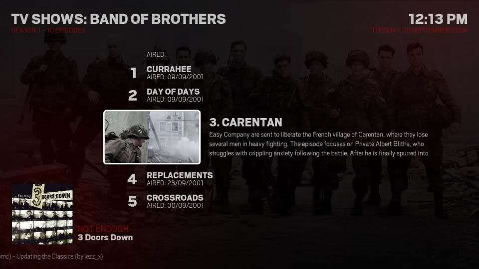
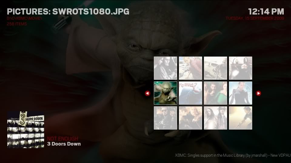
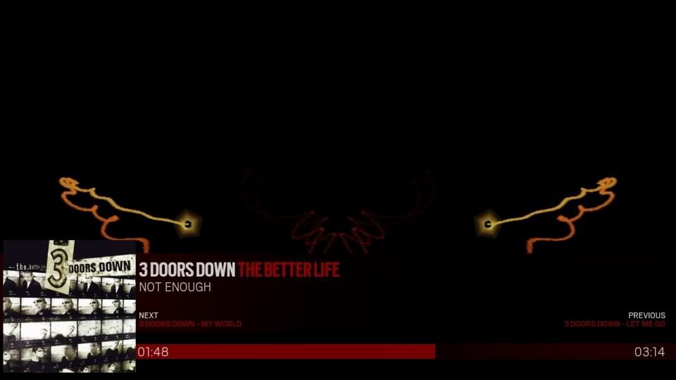
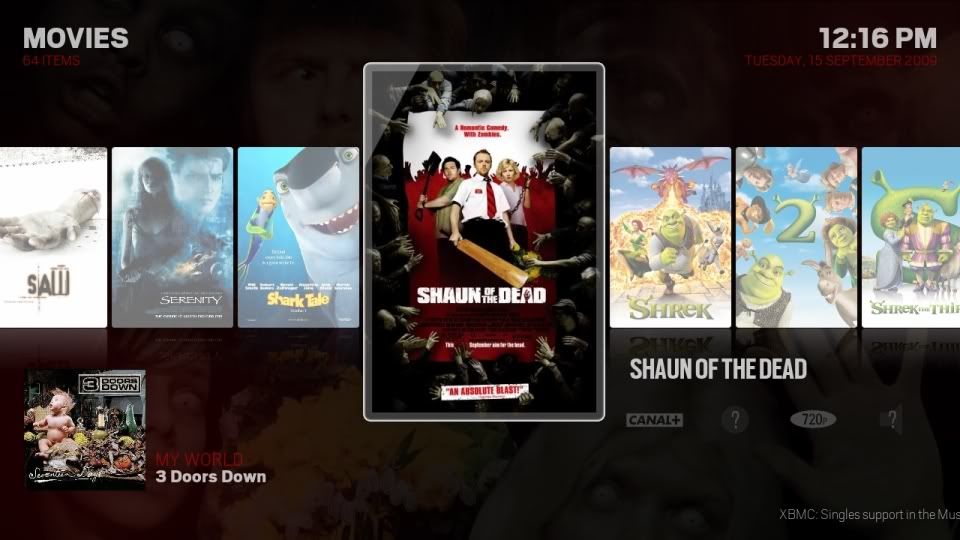
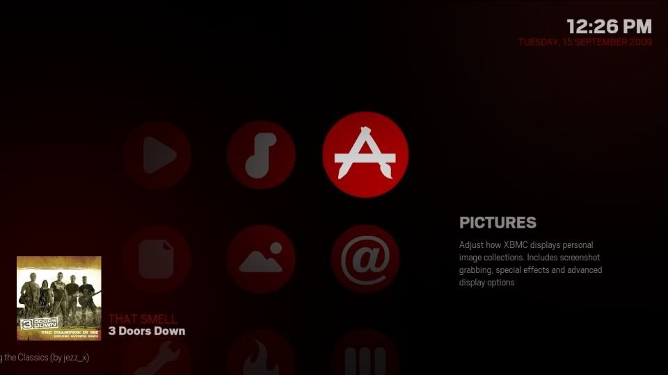
here some more of the red theme i have been play with...


Weavus Wrote:Could you try a couple of things if you have time (and the desire)...
1) Zoom the album (3 or 4 x normal size) but leave the bottom left corner of the album cover in the same position
2) Add the default off white screen over the top of the visualisation (is this possible?)
Thanks!
1) i will have a look...
2) if you like you can do this by opening up
MusicVisualisation.xml and removing the
fade animation from the 1st image control...
CF2009 Wrote:
Wow, its amazing how much that changes the look of the skin. Would be a nice option to have a few of these preset colour schemes in the skin in the future but I think I'll stick to off-white/pink


