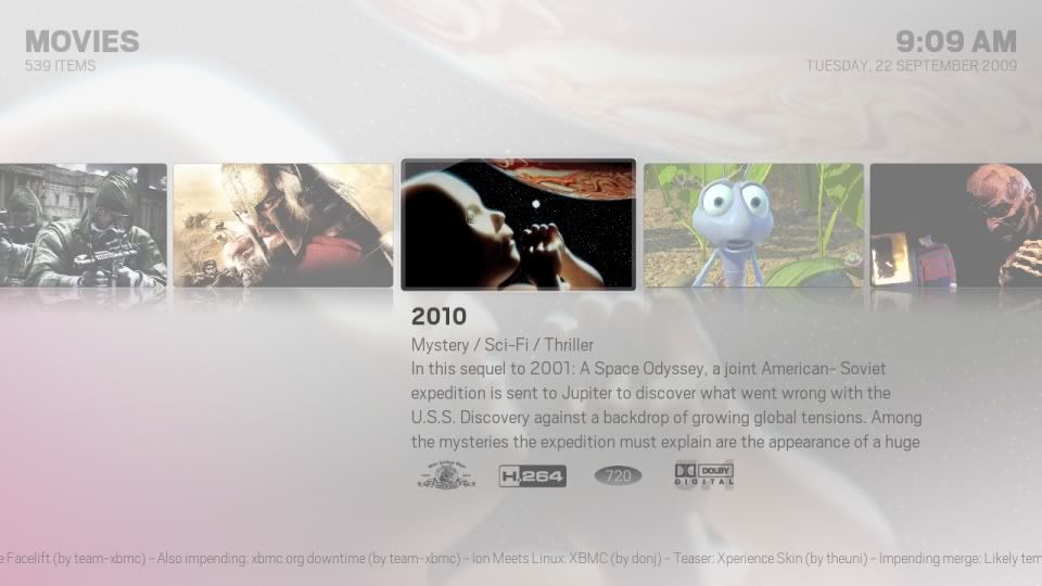
JEEtoP Wrote:The whole thing was shifted to the right, almost so the gap between the list items and the thumb was central.
It's shifted to the left to allow more room for the length of the titles and plot.
JEEtoP Wrote:- The horizontal lines were removed and the thumb corners rounded to match the poster thumbs.
When I've finalised the spacing there might not be a need for the lines but there's no way to have rounded corners like the poster view because of the varying sizes of the thumbs they'd end up looking stretched.
JEEtoP Wrote:The thumbs faded in/out when a different episode is focused.
I've tried having them inside the list control to do just this but I don't like the way they move up and down as you scroll. I'm trying a few tricks out to see if I can get them fading/zooming when placed outside of the list.
JEEtoP Wrote:No media flags - I only think they fit the skin for movies - or having 2 options within the Alaska settings to "Show Movie Media Flags" and "Show TV Show Media Flags"...?
More options for that sort of thing aren't top priority at the moment.
I can't understand all the fuss over the Files view though to be honest. The views that are originally made are still there to use but they're not very practical when you're searching through anything that doesn't have a standard size thumb (Poster, CD, Episode) because the end up squashed or stretched like so -


And without any scaling -

It's simply a fallback view.
Hitcher Wrote:Sorry, I just kept the first 6 out of each category as a teaser (and to keep the size down) but there's of a hundreds of images available separately from GitHub.
Are you speaking in general terms of images being available, or have you resized a whole set and made them available on git?
Thanks,
Hitcher Wrote:It's shifted to the left to allow more room for the length of the titles and plot.
When I've finalised the spacing there might not be a need for the lines but there's no way to have rounded corners like the poster view because of the varying sizes of the thumbs they'd end up looking stretched.
I've tried having them inside the list control to do just this but I don't like the way they move up and down as you scroll. I'm trying a few tricks out to see if I can get them fading/zooming when placed outside of the list.
More options for that sort of thing aren't top priority at the moment.
That's cool, just a few things I thought of. Unfortunately I don't have that much of a technical understanding of the skinning engine - almost exclusively coming from the design point of view.
I think you're right on the files view - the no scaling on the thumbs is a vast improvement and works very well for things like iPlayer.
New Fanart View for Movies

Hope it's ok to post a bug here.
With the latest git, the dolby digital media flag doesn't seem to work.
I can see "2.1", "5.1" etc. and also "DTS" for example, but not the dolby digital logo.
CF2009:
Nice fanart view

There also seems to be a lot of free space in the bottom left for some artwork (poster, fanart, thumbs or trailer even). But that would maybe go against the whole simplicity theme of Alaska, which is what makes this skin so great.
Ayla i bellive posting bugs at this stage is useless. The skin
is in early development stage. Im sure when the skin gets released
in somekinda beta and gets it's own subforum bug reports can start.
Everyone who downloads this skin from github must realize that they
are testing something that is no way near complete.
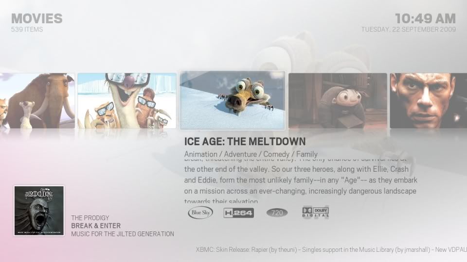
Break&Enter... a trully classic piece of music

Easilly the
most important and groundbreaking album of the 90's !
CF2009 Wrote:the bottom left is for the now playing
Ahh, of course!
I have never used that, that's why it's always empty on my setup

The-Boxhead Wrote:Ayla i bellive posting bugs at this stage is useless. The skin
is in early development stage. Im sure when the skin gets released
in somekinda beta and gets it's own subforum bug reports can start.
Everyone who downloads this skin from github must realize that they
are testing something that is no way near complete.
I fully understand what you mean

But since there's no trac or anything for posting bugs, there's no way of letting Hitcher know if someone finds one.
I would be glad if the users let me know when they spotted something in a skin I was working on.
And I do mean simple, obvious
bugs, not feature requests... I can see how a lot of feature requests could disturb/ruin the design process.
Ayla since development is ongoing there just is to many "bugs"
and many of them are beeing fixed naturally as progress goes forward.
I gues hitcher and Cf2009 will let user know when they wish bug reports..


