joebrady Wrote:Not sure if DJH really had any vision for what the music visualization screen should look like, and I know your not really looking for opinions either, but I'll throw out my 2c anyway...
The preview you gave looks fine to me, but, it also looks pretty much like every other skin IMO. I'd like to see something Big, Bold and Simple.
Just an example, but the top and bottom info bars could be toggled seperately to be either always on, always off, or to just pop up on each song change....
the "cdArt" is one of things what can be added by a modder once the skin is done as Djh did say he was going to make it "Incredibly easy to mod" and i will do my best to make it easy to mod

i will see what i can come up with as i liked having the top bar on aeon to..
Weavus Wrote:Also, I think the OSD should at least include the Album cover if possible to keep it consistent with having it globally displayed everywhere else in the skin.
agreed

Kringlan Wrote:The bar turns a little too gray... perhaps it would look better if it weren't transparent? It doesn't really feel light or bright to me.
agreed i'm not 100% happy with the bar color i will see what i can do..
Wasn't to sure about the OSD screen so thought I would take a shot at it myself. I have stripped the design right back making it as simple as possible.
V1
with outer shadow
 V2
V2
without outer shadow
 V3
V3
outer shadow/ correct font/ smaller banner

The visualizer in the background is from iTunes sorry it was just the quickest to screen grab.
Nice.
I think the outer shadow should be kept so it's the same as the 'Now playing' elsewhere in the skin.
nvaia Wrote:As for the visualizations, I would scrap that. When you think of the ALASKA skin you think of bright, bold, crisp, clean themes. This is to dark, IMO.
You do realise that the visualiser is a part of XBMC and entirely optional.
medicineuk Wrote:Wasn't to sure about the OSD screen so thought I would take a shot at it myself. I have stripped the design right back making it as simple as possible.
Great work. There's no need for all those buttons and codec infos we usually see in skins. That's what Aeon is for. this is by far the best music mockup.
CF2009 Wrote:[align=center]Here is the reworked of the MusicOSD and MusicVisualisation screens....
<Snip>
feedback...
I like it! Very appealing and suits the skins overall theme.. Would it be a unified look through movies, tv shows etc? if so im sold on this..
Hitcher: do you think you could put some pictures on the first post as to where the skin is at, Home screen, library view, osd etc.. and then just periodically update the post, as it progress's.
I got a landscape thumb mod going....

I started this before seeing DJH's new screen, I made the thumb big because the posters we're big...I like them big so far, I probably play with the sizing and see how it goes.Same with the animations.
If hitcher accepts this then great, if not heres what to do:
Download this
Viewtype_Landscape.xml
Add the bolded parts to the corresponding .xml....
MyVideoNav.xml
Quote:<defaultcontrol always="true">50</defaultcontrol>
<allowoverlay>yes</allowoverlay>
<views>50,51,53,76</views>
<controls>
Quote:<include>Global_Filter</include>
<include>Object_MovieInfoLines</include>
<include>Viewtype_Landscape</include>
<include>Viewtype_List</include>
<include>Viewtype_Poster</include>
<include>Viewtype_Episode</include>
Includes.xml
Quote:<include file="Viewtype_Episode.xml" />
<include file="Viewtype_Poster.xml" />
<include file="Viewtype_Landscape.xml" />
<include file="Viewtype_PictureGrid.xml" />
<include file="Viewtype_MusicWall.xml" />
<include file="Viewtype_List.xml" />
<include file="Includes_MediaFlags.xml" />
<include file="Includes_Animations.xml" />
<include file="Includes_Backgrounds.xml" />
CF2009 Wrote:Here is the reworked of the MusicOSD and MusicVisualisation screens....
MusicOSD
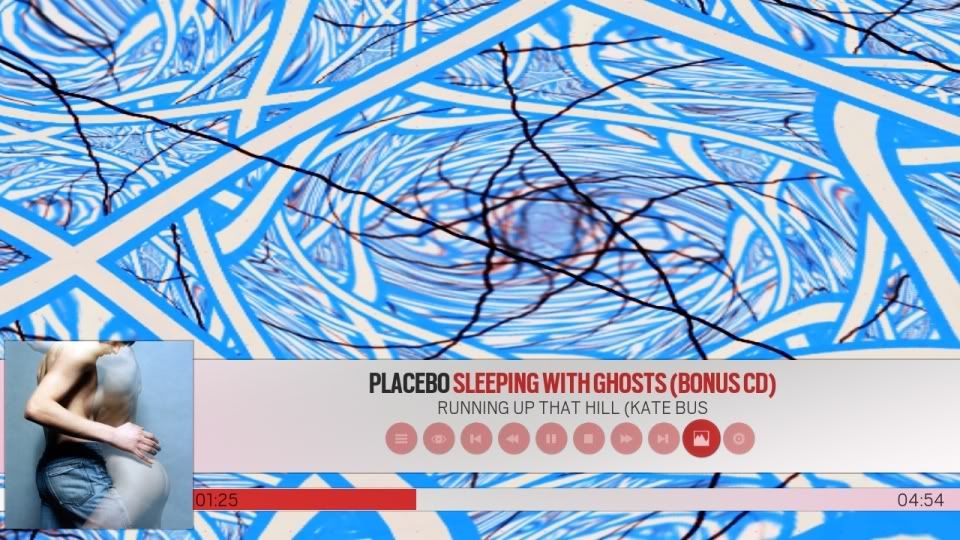 MusicVisualisation
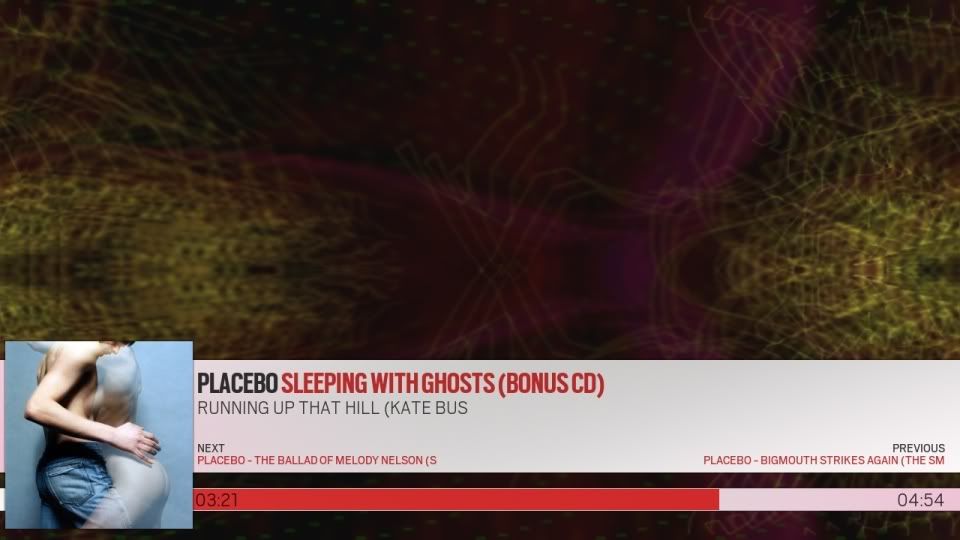
feedback...
I like that, if you do include buttons they just need to fit with the style of buttons already used in Alaska. Looks good!
I wish I knew how to make a visualization. I have a few ideas for visualizations just for the Alaska theme.
tassitassi Wrote:Great work. There's no need for all those buttons and codec infos we usually see in skins. That's what Aeon is for. this is by far the best music mockup.
No buttons on the OSD, is'nt that what the OSD is for as you have MusicVisualisation that has no buttons on it....
I've just uploaded the 2 screens to github, have a look and a play...
Github is a bit slow tonight so it not saying i have posted it yet but i hope it will soon...
http://github.com/cf2009/Alaska/commits/master
CF2009 Wrote:Here is the reworked of the MusicOSD and MusicVisualisation screens....
MusicVisualisation

Next on the right and Previous on the left? I always thought flow went from left to right? Otherwise looks super!!
mcborzu Wrote:I got a landscape thumb mod going....

I would say that it is best for the skin to only support what xbmc supports, Then the modders can add the other things that xbmc doesn't support by default....
but it's up Hitcher just my 2c

edit: it looks good

tuckbodi Wrote:Next on the right and Previous on the left? I always thought flow went from left to right? Otherwise looks super!!
Hmm now i think about it you are right... (i think

)
cf2009: also just noticed to the left of the Cd cover, there is part of the title bar protruding past the image. Any chance to cut it off so it doesn't?
I like the osd you've come up with CF2009, just wondering if perhaps there's too much empasis on red. If you look at the home screen, the skin doesn't have much in the way of pop, it's all very muted. Good work, but maybe rework the colors a bit? I'm gonna have a go at it myself tonight with a different design.


 )
)