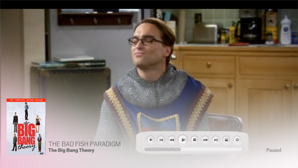
just a very quick idea (yes i used paint) but i was thinking something along these lines

kristvwatcher Wrote:Great work medicineuk. How about you use larger buttons and fade the ones that aren't active? That way it would be more similar to the poster view and easier to operate from a distance.
Quick photoshop sketch:

I like the buttons here. just replace the skip forward with a buttons thats brings up the rest of the options. And use the fade effect instead of this block.
I bellive that would be an awesome look-....
Is GitHub down for everyone right now?
Qroach Wrote:Is GitHub down for everyone right now?
seems like they got some dDos attack going on

Let the dev focus on more important issues than Restart PC or Restart Mac.
I think there's a lot more important things to do right now then that kind of small details.
awesome work on the skin so far! already using it on a daily basis!
I saw the latest screens from hitcher. and I don't understand what i'm doing wrong. He has all the movie flags active in the movie section. I use ember media manager and the second flag doesn't show up in this skin. It does in Aeon.
The second flag is pulled from the video name (ie somefilm.bluray.mkv).
aah i see, so your hitched aeon pulls it form xml files? and alaska pulls it from the filename?
/edit, hmm aeon's second flag is the codec information. anyway to make it use codec info instead of the rip info??
mavgink Wrote:aah i see, so your hitched aeon pulls it form xml files? and alaska pulls it from the filename?
/edit, hmm aeon's second flag is the codec information. anyway to make it use codec info instead of the rip info??
In Aeon the flag for source and codec are in the same place but source overrides codec flag when its in the file name, it would seem that Alaska isn't showing codec flag yet only source
I really liked some of the ideas that people were discussing so I put together some more mockups. The two images below show the OSD clicking on the icon of the far left toggles between the two different sets of buttons. As other people have been saying this makes the design appear a little cleaner and also allows the buttons to be a bit bigger, I think before they would have been a little small.
There's a lot of different ideas flying around and everyone is never going to agree 100%. I'm going to pass the psd's over to Hitcher + redtapemedia and leave them to decide on what works best, as without these coders we wouldn't have a OSD at all


I'd be very curious to see that exact design with just a bit of a gradient fade out from bottom to top. (Still looks great; I've just got my mind set on gradients for this skin.)
natew Wrote:I'd be very curious to see that exact design with just a bit of a gradient fade out from bottom to top. (Still looks great; I've just got my mind set on gradients for this skin.)
+1, same here.
Quick question for you Hitch, I have been messing around with the fonts but can't make the home page font look like this:

Any suggestions on how I can change this myself?
This is coming along nicely! Hitcher your doing a top job on this! I do wonder though, do you have a day job?

lol


 lol
lol