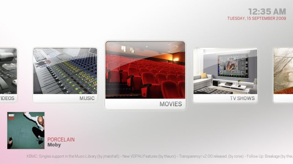
redtapemedia Wrote:perhaps there's too much empasis on red.
Says
redtapemedia

I agree too, a softer look might suit the skin better. But more importantly, it's great to have multiple people offer input so we can all see what cool ideas are out there. Great job to everyone so far
redtapemedia Wrote:I like the osd you've come up with CF2009, just wondering if perhaps there's too much empasis on red. If you look at the home screen, the skin doesn't have much in the way of pop, it's all very muted. Good work, but maybe rework the colors a bit? I'm gonna have a go at it myself tonight with a different design.
rausch101 Wrote:Says redtapemedia 
I agree too, a softer look might suit the skin better. But more importantly, it's great to have multiple people offer input so we can all see what cool ideas are out there. Great job to everyone so far
I was just thinking i used to much red to.. but then i started adding some red to the home screen to see what it would look like

:p
(just playing)

i did have a go with a softer red but it looked pink

mcborzu Wrote:I got a landscape thumb mod going....

I started this before seeing DJH's new screen, I made the thumb big because the posters we're big...I like them big so far, I probably play with the sizing and see how it goes.Same with the animations.
If hitcher accepts this then great, if not heres what to do:
Download this Viewtype_Landscape.xml
Add the bolded parts to the corresponding .xml....
MyVideoNav.xml
Includes.xml
This is great! Where do you find landscape TV show pics? I looked around but couldn't find any.
rausch101 Wrote:Says redtapemedia 
Haha

If you look at the video on the Aeonproject website for Alaska, the now playing stays static no matter what screen you are on. I think it would be cool to have that carry over to the visualisation screen / OSD. As far as the controls (play pause etc,) go, I'm not sure. It's challenging coming up with concepts to match djh's vision, but If we all put our heads together I hope we can find something most of us agree on!
This site has all the Landscape thumbs you need....
http://www.xbmcstuff.com/
@
CF2009
I like that subtle touch of red on the date, simple yet eye catching...
mcborzu Wrote:This site has all the Landscape thumbs you need....http://www.xbmcstuff.com/
@CF2009
I like that subtle touch of red on the date, simple yet eye catching...
I personally don't like it that much. I think we should be sticking to djh's vision, and not including any mods and the like in the "core" skin. If people wanna mod then they're obviously free to, just think we should try and avoid "everything and the kitchen sink" in the skin.
I personally like medicineuk much better.
redtapemedia Wrote:I personally don't like it that much. I think we should be sticking to djh's vision, and not including any mods and the like in the "core" skin. If people wanna mod then they're obviously free to, just think we should try and avoid "everything and the kitchen sink" in the skin.
I think there should be a seperate thread for alternate views, mods, etc... for Alaska.
This way we can keep this clutter free for hitcher to navigate through the Alaska thread.
Regarding the music OSD, I think switching to a screen with an info bar and an otherwise full screen visualizer will be a bit jarring with a predominantly white theme. I like the way djh used a translucent white overlay on the fanart in his other mockups, would it be possible to do the same thing with the visualizers? Borrowing a bit from what Plex has done with their Now Playing visualizer mode, I think something like this would be really sweet for an info overlay:


talisto Wrote:Regarding the music OSD, I think switching to a screen with an info bar and an otherwise full screen visualizer will be a bit jarring with a predominantly white theme. I like the way djh used a translucent white overlay on the fanart in his other mockups, would it be possible to do the same thing with the visualizers? Borrowing a bit from what Plex has done with their Now Playing visualizer mode, I think something like this would be really sweet for an info overlay:


This is an excellent idea, and it looks beautiful!
talisto Wrote:Regarding the music OSD, I think switching to a screen with an info bar and an otherwise full screen visualizer will be a bit jarring with a predominantly white theme. I like the way djh used a translucent white overlay on the fanart in his other mockups, would it be possible to do the same thing with the visualizers? Borrowing a bit from what Plex has done with their Now Playing visualizer mode, I think something like this would be really sweet for an info overlay:


yes, i like it too. that with some nice animation to fit to the static nowplaying overlay would look great i think.
talisto Wrote:Regarding the music OSD, I think switching to a screen with an info bar and an otherwise full screen visualizer will be a bit jarring with a predominantly white theme. I like the way djh used a translucent white overlay on the fanart in his other mockups, would it be possible to do the same thing with the visualizers? Borrowing a bit from what Plex has done with their Now Playing visualizer mode, I think something like this would be really sweet for an info overlay:


Looks great and it fits in much better with the rest of the skin!
+1
Fits the theme, big and easy to mod.
This is just my suggestion. It's your skin now so don't let me dictate anything.
How about keeping the clock, Now Playing widget and RSS feed the same as for the rest of the skin, then just fading out whatever's left and having the visualisation fade in beneath the white overlay? Then you could fade the rest of the UI out after a set time, maybe, fully exposing the visualiser.
Or just go with what you've got there which is very nice indeed. Great work you guys are doing here.

 :p
:p


